Design tokens: colors, type scale, shapes, elevation, motion and spacing. Read them through guillaume::getActiveTheme and the helpers of guillaume/theme.hpp. More...
Classes | |
| class | ShapeScale |
| Turns a ShapeRole into a corner radius in dp, scaled by one "roundness" value. More... | |
| struct | ElevationToken |
| What one elevation level looks like: how much the surface is tinted and how large and dark its shadow is. More... | |
| class | ElevationScale |
| The six elevation levels of a theme: one ElevationToken per ElevationLevel. More... | |
| class | StateLayerScale |
| The opacity of each StateLayer, 0 to 1. More... | |
| class | MotionScale |
| The animation timings of a theme: one length per MotionDuration, plus which easing curve to use for which kind of movement. More... | |
| class | SpacingScale |
| Spacing constants: the 4 dp grid every margin and gap is a multiple of, and the minimum size of something a user can hit. More... | |
| struct | FocusRing |
| Dimensions of the ring drawn around the entity that has the keyboard focus. More... | |
| struct | TypeToken |
| One text style: everything needed to measure and draw a piece of text. More... | |
| class | Typescale |
| The text styles of a theme: one TypeToken per TypeRole. More... | |
Enumerations | |
| enum class | ShapeRole : std::size_t { None , ExtraSmall , Small , Medium , Large , ExtraLarge , Full , Count } |
| The corner radii a widget can ask for, by name. More... | |
| enum class | ElevationLevel : std::size_t { Level0 , Level1 , Level2 , Level3 , Level4 , Level5 , Count } |
| How far a surface is raised above the background, in six steps. More... | |
| enum class | StateLayer : std::size_t { Hovered , Focused , Pressed , Dragged , DisabledContent , DisabledContainer , Count } |
| The interaction states that change how a widget is drawn. More... | |
| enum class | MotionDuration : std::size_t { Short1 , Short2 , Short3 , Short4 , Medium1 , Medium2 , Medium3 , Medium4 , Long1 , Long2 , Long3 , Long4 , ExtraLong1 , ExtraLong2 , ExtraLong3 , ExtraLong4 , Count } |
| The named animation lengths of Material Design 3. The values given are the defaults. More... | |
| enum class | TypeRole : std::size_t { DisplayLarge , DisplayMedium , DisplaySmall , HeadlineLarge , HeadlineMedium , HeadlineSmall , TitleLarge , TitleMedium , TitleSmall , LabelLarge , LabelMedium , LabelSmall , BodyLarge , BodyMedium , BodySmall , Default , Count } |
| The named text styles of Material Design 3: what a piece of text is, not how big it is. More... | |
| enum class | FontWeight : std::uint16_t { Regular = 400 , Medium = 500 } |
| Font weights available to the typescale. The value is the usual numeric weight (400 regular, 500 medium). More... | |
Functions | |
| const std::string & | fontPath (FontWeight weight) |
| Get the font file shipped with the library for a weight. | |
Detailed Description
Design tokens: colors, type scale, shapes, elevation, motion and spacing. Read them through guillaume::getActiveTheme and the helpers of guillaume/theme.hpp.
Enumeration Type Documentation
◆ ElevationLevel
|
strong |
How far a surface is raised above the background, in six steps.
A higher level gets a larger shadow and a stronger tint of its surface color. See ElevationToken for the values.
Definition at line 130 of file tokens.hpp.
◆ FontWeight
|
strong |
Font weights available to the typescale. The value is the usual numeric weight (400 regular, 500 medium).
| Enumerator | |
|---|---|
| Regular | Roboto Regular. |
| Medium | Roboto Medium. |
Definition at line 71 of file typescale.hpp.
◆ MotionDuration
|
strong |
The named animation lengths of Material Design 3. The values given are the defaults.
Short durations suit small changes (a state layer fading in), long ones suit large surfaces moving across the screen. Resolve a token with guillaume::getMotionDuration, which returns seconds.
Definition at line 290 of file tokens.hpp.
◆ ShapeRole
|
strong |
The corner radii a widget can ask for, by name.
The values are those of Material Design 3 with the default roundness. Resolve a role with guillaume::getShapeRadius.
Definition at line 42 of file tokens.hpp.
◆ StateLayer
|
strong |
The interaction states that change how a widget is drawn.
For the first four, the widget draws a translucent overlay (a "state layer") of its content color on top of itself; the last two are the opacities applied to a disabled widget. The values given are the defaults.
Definition at line 223 of file tokens.hpp.
◆ TypeRole
|
strong |
The named text styles of Material Design 3: what a piece of text is, not how big it is.
A widget asks for a role (TitleLarge for a dialog title, LabelLarge for a button label, BodyMedium for running text) and the theme answers with a TypeToken. Five families (Display, Headline, Title, Label, Body), each in three sizes, plus Default. The values given are the defaults: font size / line height, in dp.
The list mirrors react-native-paper's MD3TypescaleKey plus its default entry.
- See also
- Typescale
Definition at line 47 of file typescale.hpp.
Function Documentation
◆ fontPath()
| const std::string & guillaume::theme::fontPath | ( | FontWeight | weight | ) |
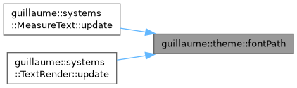
Get the font file shipped with the library for a weight.
- Parameters
-
weight The font weight.
- Returns
- The path of the font file, relative to the resource root: fonts/Roboto-Medium.ttf for Medium, fonts/Roboto-Regular.ttf otherwise.
Definition at line 52 of file typescale.cpp.