Loading...
Searching...
No Matches
fab_style.hpp File Reference
Style tables of the floating action buttons (FAB): container size, font sizes, corner radius and colors for each size and variant. More...
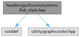
#include <cstddef>#include <utility/graphic/color.hpp>
Include dependency graph for fab_style.hpp:
This graph shows which files directly or indirectly include this file:

Go to the source code of this file.
Namespaces | |
| namespace | guillaume::systems::fab_style |
| Maps a FAB size and variant to Material 3 metrics and scheme colors, for the regular and the extended FAB alike. | |
| namespace | guillaume |
| A C++20 UI framework for desktop and XR, built as an entity-component-system. | |
| namespace | guillaume::systems |
| Rules. Every class here runs each frame on the entities that have the components it declares. | |
| namespace | guillaume::systems::fab_style::detail |
| The table lookups behind the templates, taking the enumerator as an index. Call the templated functions of fab_style instead. | |
Functions | |
| float | guillaume::systems::fab_style::detail::containerSize (std::size_t size) |
| Width and height of the container at its default size. | |
| float | guillaume::systems::fab_style::detail::iconFontSize (std::size_t size) |
| Font size of the icon of a regular FAB. | |
| float | guillaume::systems::fab_style::detail::labelFontSize (std::size_t size) |
| Font size of the label and icon of an extended FAB. | |
| float | guillaume::systems::fab_style::detail::borderRadius (std::size_t size) |
| Corner radius of the container. | |
| utility::graphic::Color32Bit | guillaume::systems::fab_style::detail::containerColor (std::size_t variant, bool lowered) |
| Fill color of the container. | |
| utility::graphic::Color32Bit | guillaume::systems::fab_style::detail::contentColor (std::size_t variant) |
| Color of the icon and of the label. | |
| template<typename SizeType> | |
| float | guillaume::systems::fab_style::getContainerSize (SizeType size) |
| Width and height of the container of a FAB at its default size: 40 dp for Small, 56 dp for Medium, 96 dp for Large. | |
| template<typename SizeType> | |
| float | guillaume::systems::fab_style::getIconFontSize (SizeType size) |
| Font size of the icon of a regular FAB: 24 dp for Small and Medium, 36 dp for Large. | |
| template<typename SizeType> | |
| float | guillaume::systems::fab_style::getLabelFontSize (SizeType size) |
| Font size shared by the label and the icon of an extended FAB: 18 dp for Small, 24 dp for Medium, 36 dp for Large. | |
| template<typename SizeType> | |
| float | guillaume::systems::fab_style::getBorderRadius (SizeType size) |
| Corner radius of the container: the Medium, Large and ExtraLarge shape of the active theme for a Small, Medium and Large FAB. | |
| template<typename VariantType> | |
| utility::graphic::Color32Bit | guillaume::systems::fab_style::getContainerColor (VariantType variant, bool lowered) |
| Fill color of the container of a FAB. | |
| template<typename VariantType> | |
| utility::graphic::Color32Bit | guillaume::systems::fab_style::getContentColor (VariantType variant) |
| Color of the icon and of the label of a FAB: Primary for the Surface variant, the "on container" role of the others. | |
Detailed Description
Style tables of the floating action buttons (FAB): container size, font sizes, corner radius and colors for each size and variant.
The functions of guillaume::systems::fab_style are pure lookups: they return a metric in dp or a color of the active theme and touch no component. systems::FloatingActionButton and systems::ExtendedFloatingActionButton call them from their apply functions. guillaume/entities/fab_style.hpp re-exports the same names for the widget classes.
Definition in file fab_style.hpp.
