Rules. Every class here runs each frame on the entities that have the components it declares. More...
Namespaces | |
| namespace | button_style |
| Maps a common button size, shape and color style to Material 3 metrics and scheme colors. | |
| namespace | fab_style |
| Maps a FAB size and variant to Material 3 metrics and scheme colors, for the regular and the extended FAB alike. | |
| namespace | placement |
| Helpers that position a child relative to its parent by writing the child's components::Transform. | |
| namespace | style |
| Color helpers shared by the widget systems. | |
Classes | |
| class | Animation |
| Moves every running animation forward by the time of one frame. More... | |
| class | AppBar |
| Styles an app bar and lays out its navigation button, title and action buttons in a row. More... | |
| class | ArcRender |
| Draws a part of a ring (an arc with a thickness and flat ends) for every entity that has a components::Arc. More... | |
| class | Backdrop |
| Fades the backdrop of a modal widget in and keeps it behind its owner. More... | |
| class | Badge |
| Sizes and colors a badge (the small dot or counter drawn over another widget) and fades it in and out. More... | |
| class | Button |
| Input and content rules shared by every button variant: press, release, toggle, click and long press. More... | |
| class | Card |
| Styles a card, animates its elevation while pressed and arranges its cover, title, content and actions sections. More... | |
| class | Checkbox |
| The rules of a checkbox: toggling it, coloring its box and placing its label. More... | |
| class | Chip |
| The rules of a chip: pressing it, selecting it, closing it, coloring it and arranging its icons and label. More... | |
| class | Clip |
| Turns the bound of an entity into the rectangle the engine clips drawing to. More... | |
| class | CommonButton |
| Colors, sizes and lays out a common button: the elevated, filled, tonal, outlined and text buttons, and the segments of a segmented button. More... | |
| class | Dialog |
| Styles a dialog panel, stacks its icon, title, message and action row, and shows or hides the backdrop behind it. More... | |
| class | Divider |
| Turns the configuration of a divider (a thin horizontal separator line) into the geometry that is drawn. More... | |
| class | Drag |
| Turns "button held while the pointer moves" into a drag gesture. More... | |
| class | ElevationRender |
| Draws the soft shadow of every entity that has a components::Elevation. More... | |
| class | EllipseRender |
| Draws a filled ellipse (a disc when the bound is square) for every entity that has a components::Ellipse. More... | |
| class | ExtendedFloatingActionButton |
| Colors, sizes and lays out an extended floating action button: a FAB that shows a label beside its icon and can collapse to the icon alone. More... | |
| class | FloatingActionButton |
| Colors, sizes and lays out a floating action button (FAB): the raised square button carrying the main action of a screen. More... | |
| class | FloatingActionButtonMenu |
| Opens and closes a floating action button menu (speed dial): a trigger button that reveals a column of action buttons above it. More... | |
| class | Focus |
| Decides which single entity has the keyboard focus. More... | |
| class | FocusRingRender |
| Draws the focus indicator: an outline around the entity that has the keyboard focus. More... | |
| class | GlyphRender |
| Draws the icon of every entity that has a components::Glyph. More... | |
| class | HandButton |
| Tracks which XR controller buttons are held on which entities. More... | |
| class | HandEventSystem |
| Base of the XR hand input systems: the wiring they share. More... | |
| class | HandRaySystem |
| Base of the hand input systems that point at an entity: a gesture counts for the entity the hand ray hits. More... | |
| class | HandMotion |
| Tracks which entities an XR hand is pointing at. More... | |
| class | HandPinch |
| Marks the entities an XR hand pinches (thumb and index brought together while pointing at them). More... | |
| class | HandPoke |
| Marks the entities an XR hand pokes (a fingertip pushed toward them). More... | |
| class | HandSqueeze |
| Receives XR hand squeeze events (the grip of a controller). More... | |
| class | HandThumbRest |
| Receives XR thumb-rest events (the thumb touching the rest pad of a controller). More... | |
| class | HandThumbStick |
| Receives XR thumb-stick events (the joystick of a controller). More... | |
| class | HandTrigger |
| Receives XR trigger events (the index trigger of a controller). More... | |
| class | IconButton |
| Colors, sizes and lays out an icon button: a round button that shows a single icon and no label. More... | |
| class | ImageRender |
| Draws the picture of every entity that has a components::Image, stretched over its bound. More... | |
| class | KeyboardControl |
| Applies editing keys (arrows, Home, End, Delete, Backspace) to editable text. More... | |
| class | Layout |
| Arranges the children of a container in a row or a column and sizes the container around them. More... | |
| class | LineRender |
| Draws a horizontal stroke, solid or dashed, for every entity that has a components::Line. More... | |
| class | List |
| Styles a list, stacks its rows and folds its accordions. More... | |
| class | LoadingIndicator |
| Draws an indeterminate loading indicator: a rotating arc (circular variant) or a bar sliding along a track (linear variant). More... | |
| struct | MeasureGlyphCacheKey |
| Key of the size cache of MeasureGlyph: everything a measured icon size is looked up by. More... | |
| class | MeasureGlyph |
| Computes the size of every icon and writes it into its Bound, so the layout knows how much room the icon takes. More... | |
| struct | MeasureMeshCacheKey |
| Key of the size cache of MeasureMesh: the path of the model file. More... | |
| class | MeasureMesh |
| Computes the size of every 3D model and writes it into its Bound, so the layout knows how much room the model takes. More... | |
| struct | MeasureTextCacheKey |
| Key of the size cache of MeasureText: everything a measured size is looked up by. More... | |
| class | MeasureText |
| Computes the size of every text and writes it into its Bound, so the layout knows how much room a label takes. More... | |
| class | Menu |
| Styles a menu, sizes its rows to the widest one and places the menu below or above its anchor. More... | |
| class | MeshRender |
| Draws the 3D model of every entity that has a components::Mesh. More... | |
| class | MouseButton |
| Tracks which mouse buttons are held on which entities. More... | |
| class | MouseMotion |
| Tracks which entities the mouse pointer is over. More... | |
| class | NavigationBar |
| Styles a navigation bar, shares its width between its destinations and keeps exactly one of them selected. More... | |
| class | NavigationBarDestination |
| Styles one destination of a navigation bar (an icon in a pill with a label under it and an optional badge) and places those children. More... | |
| class | NavigationDrawer |
| Styles a navigation drawer, stacks its entries in a column and keeps exactly one of its destinations selected. More... | |
| class | NavigationDrawerDestination |
| Styles one destination of a navigation drawer and places its icon, label and trailing text. More... | |
| class | Overlay |
| Keeps the stack of open overlays (dialogs, menus, snackbars) and closes the top one on Escape or when its delay runs out. More... | |
| class | ProgressIndicator |
| Draws a progress indicator: a track and a fill that shows a value from 0 to 1, as a bar or as a ring. More... | |
| class | RadioButton |
| The rules of a radio button: selecting it, coloring its ring and placing its dot and label. More... | |
| class | RadioGroup |
| The rules of a radio group: a list of radio buttons of which at most one is selected. More... | |
| class | RectangleRender |
| Draws the background of an entity: a filled rectangle with rounded corners and an optional border. More... | |
| struct | RenderHandle |
| What a render system remembers about the engine object it created for one entity. More... | |
| class | RenderHandleMap |
| The engine objects one render system owns, keyed by entity identifier. More... | |
| class | RingRender |
| Draws a full ring (a circle outline with a thickness) for every entity that has a components::Ring. More... | |
| class | ScrimRender |
| Draws a scrim: a flat, usually translucent rectangle covering the whole bound of an entity. A modal backdrop is drawn this way. More... | |
| class | Scroll |
| Scrolls content with the mouse wheel. More... | |
| class | Search |
| Styles a search field and lays out the children that its query, loading state and trailing icon call for. More... | |
| class | SegmentedButton |
| Arranges a segmented button: a row of joined toggle buttons of which one (Single mode) or several (Multi mode) are selected. More... | |
| class | Selection |
| Keeps at most one child selected in each selection group. More... | |
| class | Snackbar |
| Styles a snackbar (a short message with an optional action that disappears on its own) and handles its dismissal. More... | |
| class | StyleState |
| Summarizes the input state of an entity into its components::StyleState, the one component widget systems read to choose a look. More... | |
| class | SurfaceTone |
| Gives a surface the color and the shadow that match its elevation level in the active theme. More... | |
| class | Switch |
| The rules of a switch: turning it on and off, coloring its track and placing its thumb, thumb icon and label. More... | |
| class | TextField |
| Styles a text field, arranges its label, input, affixes, icons and supporting text, and reports what the user typed. More... | |
| class | TextInput |
| Adds typed text to editable text. More... | |
| class | TextRender |
| Draws the string of every entity that has a components::Text. More... | |
| class | Tooltip |
| Styles a tooltip, shows it after its anchor has been hovered for a while and places it next to that anchor. More... | |
| class | Typography |
| Turns the type-scale role of a text (Body Large, Label Medium, ...) into the font metrics of the active theme. More... | |
Functions | |
| void | registerCoreSystems (ecs::SystemRegistry &systemRegistry, event::EventBus &eventBus, utility::Engine &engine, std::shared_ptr< utility::RessourceProvider > ressourceProvider) |
| Register every built-in system of the library in a registry. | |
| bool | isInteractive (const ecs::ComponentRegistry ®istry, const ecs::Entity::Identifier &entityIdentifier) |
| Whether an entity accepts input. | |
| utility::math::Vector2F | hitMargin (const ecs::ComponentRegistry ®istry, const ecs::Entity::Identifier &entityIdentifier) |
| Extra hit area of an entity around its Bound, in dp. | |
| bool | hitTest (const utility::graphic::RayF &ray, const utility::graphic::PoseF &pose, const components::Bound &bound, const utility::math::Vector2F &margin) |
| Whether a ray crosses the rectangle of an entity, grown by a margin. | |
| utility::graphic::Color32Bit | schemeColor (SchemeColorRole role) |
| Look up a color role in the color scheme of the active theme. | |
| utility::graphic::Color32Bit | schemeColor (SchemeColorRole role) |
| Look up a color role in the color scheme of the active theme. | |
| utility::graphic::Color32Bit | schemeColor (SchemeColorRole role) |
| Look up a color role in the color scheme of the active theme. | |
| utility::graphic::Color32Bit | transparentColor (void) |
| The color written to hide a fill or an outline without removing its component. | |
| utility::graphic::Color32Bit | disabledContentColor (void) |
| Color of the icon, label or outline of a disabled widget. | |
| utility::graphic::Color32Bit | schemeColor (SchemeColorRole role) |
| Look up a color role in the color scheme of the active theme. | |
| utility::graphic::Color32Bit | transparentColor (void) |
| The color written to hide a fill or an outline without removing its component. | |
| utility::graphic::Color32Bit | disabledContainerColor (void) |
| Fill color of the container of a disabled widget. | |
| utility::graphic::Color32Bit | disabledContentColor (void) |
| Color of the icon, label or outline of a disabled widget. | |
| utility::graphic::Color32Bit | schemeColor (SchemeColorRole role) |
| Look up a color role in the color scheme of the active theme. | |
| utility::graphic::Color32Bit | transparentColor (void) |
| The color written to hide a fill or an outline without removing its component. | |
| utility::graphic::Color32Bit | schemeColor (SchemeColorRole role) |
| Look up a color role in the color scheme of the active theme. | |
| utility::graphic::Color32Bit | disabledContentColor (void) |
| Color of the icon, label or outline of a disabled widget. | |
| utility::graphic::Color32Bit | schemeColor (SchemeColorRole role) |
| Look up a color role in the color scheme of the active theme. | |
| utility::graphic::Color32Bit | transparentColor (void) |
| The color written to hide a fill or an outline without removing its component. | |
| utility::graphic::Color32Bit | disabledContentColor (void) |
| Color of the icon, label or outline of a disabled widget. | |
| utility::graphic::Color32Bit | schemeColor (SchemeColorRole role) |
| Look up a color role in the color scheme of the active theme. | |
| utility::graphic::Color32Bit | transparentColor (void) |
| The color written to hide a fill or an outline without removing its component. | |
| utility::graphic::Color32Bit | schemeColor (SchemeColorRole role) |
| Look up a color role in the color scheme of the active theme. | |
| utility::graphic::Color32Bit | transparentColor (void) |
| The color written to hide a fill or an outline without removing its component. | |
| utility::graphic::Color32Bit | schemeColor (SchemeColorRole role) |
| Look up a color role in the color scheme of the active theme. | |
| utility::graphic::Color32Bit | disabledContentColor (void) |
| Color of the icon, label or outline of a disabled widget. | |
| utility::graphic::Color32Bit | schemeColor (SchemeColorRole role) |
| Look up a color role in the color scheme of the active theme. | |
| utility::graphic::Color32Bit | transparentColor (void) |
| The color written to hide a fill or an outline without removing its component. | |
| utility::graphic::Color32Bit | disabledContentColor (void) |
| Color of the icon, label or outline of a disabled widget. | |
| utility::graphic::Color32Bit | schemeColor (SchemeColorRole role) |
| Look up a color role in the color scheme of the active theme. | |
| utility::graphic::Color32Bit | transparentColor (void) |
| The color written to hide a fill or an outline without removing its component. | |
| utility::graphic::Color32Bit | schemeColor (SchemeColorRole role) |
| Look up a color role in the color scheme of the active theme. | |
| utility::graphic::Color32Bit | transparentColor (void) |
| The color written to hide a fill or an outline without removing its component. | |
| utility::graphic::Color32Bit | schemeColor (SchemeColorRole role) |
| Look up a color role in the color scheme of the active theme. | |
| utility::graphic::Color32Bit | transparentColor (void) |
| The color written to hide a fill or an outline without removing its component. | |
| utility::graphic::Color32Bit | disabledContainerColor (void) |
| Fill color of the container of a disabled widget. | |
| utility::graphic::Color32Bit | disabledContentColor (void) |
| Color of the icon, label or outline of a disabled widget. | |
| utility::graphic::Color32Bit | schemeColor (SchemeColorRole role) |
| Look up a color role in the color scheme of the active theme. | |
| utility::graphic::Color32Bit | transparentColor (void) |
| The color written to hide a fill or an outline without removing its component. | |
| utility::graphic::Color32Bit | disabledContainerColor (void) |
| Fill color of the container of a disabled widget. | |
| utility::graphic::Color32Bit | disabledContentColor (void) |
| Color of the icon, label or outline of a disabled widget. | |
| utility::graphic::Color32Bit | schemeColor (SchemeColorRole role) |
| Look up a color role in the color scheme of the active theme. | |
| utility::graphic::Color32Bit | transparentColor (void) |
| The color written to hide a fill or an outline without removing its component. | |
| utility::graphic::Color32Bit | schemeColor (SchemeColorRole role) |
| Look up a color role in the color scheme of the active theme. | |
| utility::graphic::Color32Bit | transparentColor (void) |
| The color written to hide a fill or an outline without removing its component. | |
Detailed Description
Rules. Every class here runs each frame on the entities that have the components it declares.
A system reads and writes components by entity identifier and never needs an entity object. Systems are grouped by phase:
- Event: turn input into component state (Focus, hover and button interaction, Button, Selection).
- Measure: compute intrinsic sizes (MeasureText, MeasureGlyph, Typography).
- Layout: arrange and style. Layout places children; each widget system (Checkbox, Menu, ...) styles its widget and places what Layout does not.
- Render: upload geometry to the engine (the *Render systems).
Widget systems expose their rules as static functions taking a registry and an identifier (systems::Checkbox::toggle(registry, id)), so they can be called outside the frame loop and tested without entity objects. Shared helpers live in systems::style, systems::interaction and systems::placement.
- See also
- guillaume::systems::registerCoreSystems for the registration order.
Function Documentation
◆ disabledContainerColor() [1/3]
|
inline |
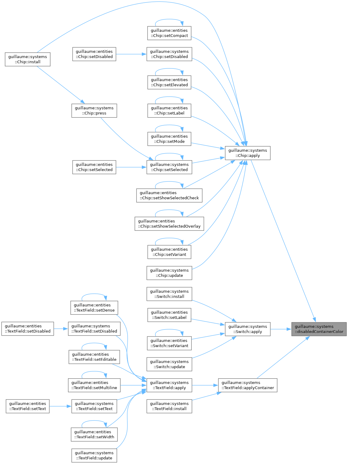
Fill color of the container of a disabled widget.
- Returns
- The OnSurface color of the active scheme at the theme::StateLayer::DisabledContainer opacity (12% in Material 3).
Definition at line 143 of file style_helpers.hpp.
◆ disabledContainerColor() [2/3]
|
inline |
Fill color of the container of a disabled widget.
- Returns
- The OnSurface color of the active scheme at the theme::StateLayer::DisabledContainer opacity (12% in Material 3).
Definition at line 143 of file style_helpers.hpp.
◆ disabledContainerColor() [3/3]
|
inline |
Fill color of the container of a disabled widget.
- Returns
- The OnSurface color of the active scheme at the theme::StateLayer::DisabledContainer opacity (12% in Material 3).
Definition at line 143 of file style_helpers.hpp.
◆ disabledContentColor() [1/8]
|
inline |
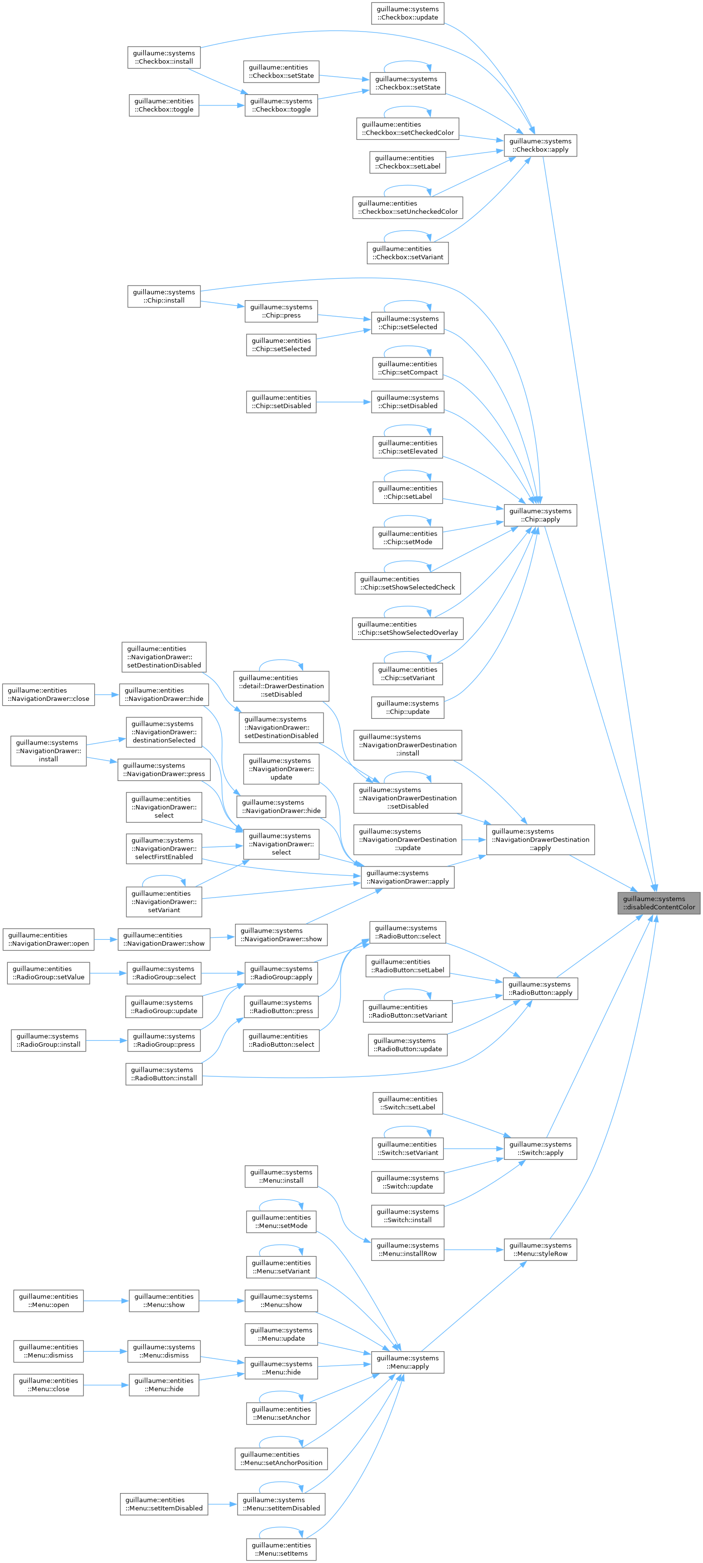
Color of the icon, label or outline of a disabled widget.
- Returns
- The OnSurface color of the active scheme at the theme::StateLayer::DisabledContent opacity (38% in Material 3).
Definition at line 131 of file style_helpers.hpp.
◆ disabledContentColor() [2/8]
|
inline |
Color of the icon, label or outline of a disabled widget.
- Returns
- The OnSurface color of the active scheme at the theme::StateLayer::DisabledContent opacity (38% in Material 3).
Definition at line 131 of file style_helpers.hpp.
◆ disabledContentColor() [3/8]
|
inline |
Color of the icon, label or outline of a disabled widget.
- Returns
- The OnSurface color of the active scheme at the theme::StateLayer::DisabledContent opacity (38% in Material 3).
Definition at line 131 of file style_helpers.hpp.
◆ disabledContentColor() [4/8]
|
inline |
Color of the icon, label or outline of a disabled widget.
- Returns
- The OnSurface color of the active scheme at the theme::StateLayer::DisabledContent opacity (38% in Material 3).
Definition at line 131 of file style_helpers.hpp.
◆ disabledContentColor() [5/8]
|
inline |
Color of the icon, label or outline of a disabled widget.
- Returns
- The OnSurface color of the active scheme at the theme::StateLayer::DisabledContent opacity (38% in Material 3).
Definition at line 131 of file style_helpers.hpp.
◆ disabledContentColor() [6/8]
|
inline |
Color of the icon, label or outline of a disabled widget.
- Returns
- The OnSurface color of the active scheme at the theme::StateLayer::DisabledContent opacity (38% in Material 3).
Definition at line 131 of file style_helpers.hpp.
◆ disabledContentColor() [7/8]
|
inline |
Color of the icon, label or outline of a disabled widget.
- Returns
- The OnSurface color of the active scheme at the theme::StateLayer::DisabledContent opacity (38% in Material 3).
Definition at line 131 of file style_helpers.hpp.
◆ disabledContentColor() [8/8]
|
inline |
Color of the icon, label or outline of a disabled widget.
- Returns
- The OnSurface color of the active scheme at the theme::StateLayer::DisabledContent opacity (38% in Material 3).
Definition at line 131 of file style_helpers.hpp.
◆ hitMargin()
|
inline |
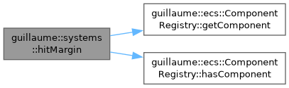
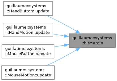
Extra hit area of an entity around its Bound, in dp.
A small control (an 18 dp checkbox box) sets an accessibility margin so it can be hit on a larger touch target without being drawn larger. The margin is read from components::MouseHoverInteraction when the entity has one, otherwise from components::HandHoverInteraction.
- Parameters
-
registry The registry holding the components. entityIdentifier The entity to read the margin of.
- Returns
- The margin added on each side: x on the left and on the right, y above and below. (0, 0) when the entity has neither hover component.
Definition at line 84 of file hit_test.hpp.
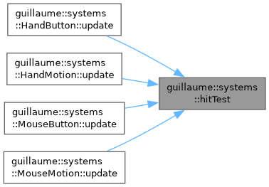
◆ hitTest()
|
inline |
Whether a ray crosses the rectangle of an entity, grown by a margin.
The rectangle starts at the pose position, has the size of the bound and lies in the plane given by the pose orientation. With a margin, its origin is moved back by the margin along the orientation's right and up axes and its size grows by twice the margin.
- Parameters
-
ray The pointer or hand ray, in world space. pose The world pose of the entity: the origin corner of its rectangle and its orientation. bound The size of the entity, in dp. margin The margin added on each side, in dp, as returned by hitMargin().
- Returns
- True when the ray hits the grown rectangle.
Definition at line 138 of file hit_test.hpp.
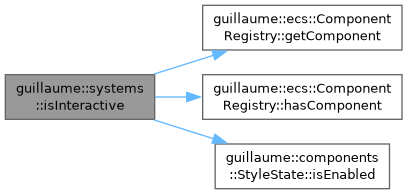
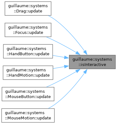
◆ isInteractive()
|
inline |
Whether an entity accepts input.
An entity without a components::StyleState always does; an entity with one follows its enabled flag. The input systems call this before hit-testing, so a disabled widget is never hovered, pressed, dragged or focused.
- Parameters
-
registry The registry holding the components. entityIdentifier The entity to test.
- Returns
- False only when the entity has a StyleState that is disabled.
Definition at line 61 of file hit_test.hpp.
◆ registerCoreSystems()
| void guillaume::systems::registerCoreSystems | ( | ecs::SystemRegistry & | systemRegistry, |
| event::EventBus & | eventBus, | ||
| utility::Engine & | engine, | ||
| std::shared_ptr< utility::RessourceProvider > | ressourceProvider ) |
Register every built-in system of the library in a registry.
This function is the one list of the built-in systems: a new one is added in sources/systems/core_systems.cpp, nowhere else.
A frame runs the phases in the order Event, Measure, Layout, Render (see ecs::Phase). The registry keeps one list per phase, so the order of registration only matters between systems of the same phase, where it is the order they run in. The constraints the list respects:
- Measure: systems::Typography first, because it resolves the font metrics systems::MeasureText measures with.
- Event: the systems that turn events into interaction components (MouseMotion, MouseButton, the hand systems) before Focus and StyleState, which read those components. Drag runs after MouseMotion and MouseButton but before the hand systems, so it sees a hand button press one frame after it happened.
- Layout: systems::Layout before the widget systems (Checkbox, Menu, ...), which place the children Layout does not arrange from the bounds it has just resolved.
- Layout: a destination system before the system of the bar or drawer that owns it (NavigationBarDestination before NavigationBar, NavigationDrawerDestination before NavigationDrawer).
- Parameters
-
systemRegistry The registry receiving the systems. eventBus The event bus the input systems subscribe to. engine The engine used by the input, measuring and rendering systems. It must outlive the registered systems. ressourceProvider The provider the measuring and rendering systems load fonts, images and meshes from.
- Exceptions
-
std::out_of_range If a system reports a phase the registry does not know (ecs::SystemRegistry::registerNewSystem).
- See also
- ecs::SystemRegistry
- ecs::Phase
Definition at line 96 of file core_systems.cpp.

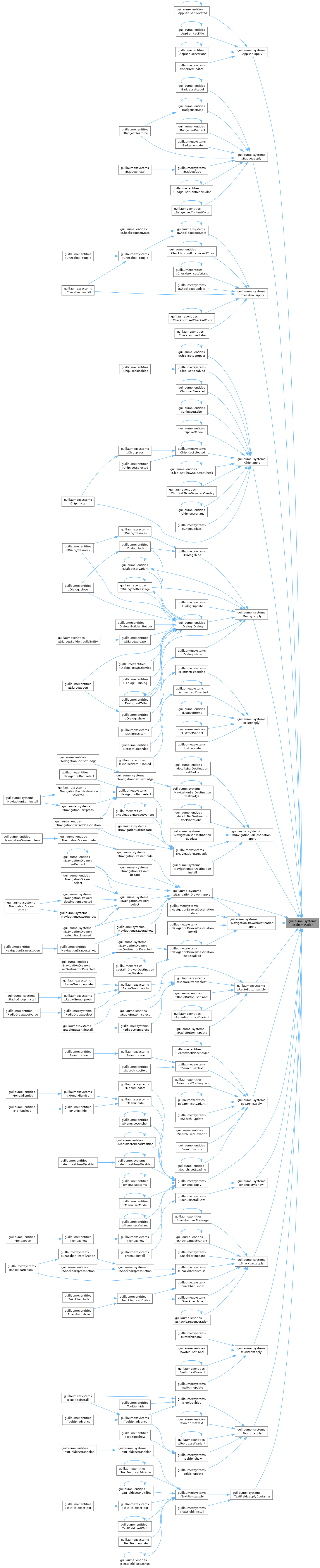
◆ schemeColor() [1/17]
|
inline |
Look up a color role in the color scheme of the active theme.
- Parameters
-
role The role to resolve, for example SchemeColorRole::Primary.
- Returns
- The color the active theme assigns to that role.
- See also
- guillaume::getActiveColor
Definition at line 96 of file style_helpers.hpp.
◆ schemeColor() [2/17]
|
inline |
Look up a color role in the color scheme of the active theme.
- Parameters
-
role The role to resolve, for example SchemeColorRole::Primary.
- Returns
- The color the active theme assigns to that role.
- See also
- guillaume::getActiveColor
Definition at line 96 of file style_helpers.hpp.
◆ schemeColor() [3/17]
|
inline |
Look up a color role in the color scheme of the active theme.
- Parameters
-
role The role to resolve, for example SchemeColorRole::Primary.
- Returns
- The color the active theme assigns to that role.
- See also
- guillaume::getActiveColor
Definition at line 96 of file style_helpers.hpp.
◆ schemeColor() [4/17]
|
inline |
Look up a color role in the color scheme of the active theme.
- Parameters
-
role The role to resolve, for example SchemeColorRole::Primary.
- Returns
- The color the active theme assigns to that role.
- See also
- guillaume::getActiveColor
Definition at line 96 of file style_helpers.hpp.
◆ schemeColor() [5/17]
|
inline |
Look up a color role in the color scheme of the active theme.
- Parameters
-
role The role to resolve, for example SchemeColorRole::Primary.
- Returns
- The color the active theme assigns to that role.
- See also
- guillaume::getActiveColor
Definition at line 96 of file style_helpers.hpp.
◆ schemeColor() [6/17]
|
inline |
Look up a color role in the color scheme of the active theme.
- Parameters
-
role The role to resolve, for example SchemeColorRole::Primary.
- Returns
- The color the active theme assigns to that role.
- See also
- guillaume::getActiveColor
Definition at line 96 of file style_helpers.hpp.
◆ schemeColor() [7/17]
|
inline |
Look up a color role in the color scheme of the active theme.
- Parameters
-
role The role to resolve, for example SchemeColorRole::Primary.
- Returns
- The color the active theme assigns to that role.
- See also
- guillaume::getActiveColor
Definition at line 96 of file style_helpers.hpp.
◆ schemeColor() [8/17]
|
inline |
Look up a color role in the color scheme of the active theme.
- Parameters
-
role The role to resolve, for example SchemeColorRole::Primary.
- Returns
- The color the active theme assigns to that role.
- See also
- guillaume::getActiveColor
Definition at line 96 of file style_helpers.hpp.
◆ schemeColor() [9/17]
|
inline |
Look up a color role in the color scheme of the active theme.
- Parameters
-
role The role to resolve, for example SchemeColorRole::Primary.
- Returns
- The color the active theme assigns to that role.
- See also
- guillaume::getActiveColor
Definition at line 96 of file style_helpers.hpp.
◆ schemeColor() [10/17]
|
inline |
Look up a color role in the color scheme of the active theme.
- Parameters
-
role The role to resolve, for example SchemeColorRole::Primary.
- Returns
- The color the active theme assigns to that role.
- See also
- guillaume::getActiveColor
Definition at line 96 of file style_helpers.hpp.
◆ schemeColor() [11/17]
|
inline |
Look up a color role in the color scheme of the active theme.
- Parameters
-
role The role to resolve, for example SchemeColorRole::Primary.
- Returns
- The color the active theme assigns to that role.
- See also
- guillaume::getActiveColor
Definition at line 96 of file style_helpers.hpp.
◆ schemeColor() [12/17]
|
inline |
Look up a color role in the color scheme of the active theme.
- Parameters
-
role The role to resolve, for example SchemeColorRole::Primary.
- Returns
- The color the active theme assigns to that role.
- See also
- guillaume::getActiveColor
Definition at line 96 of file style_helpers.hpp.
◆ schemeColor() [13/17]
|
inline |
Look up a color role in the color scheme of the active theme.
- Parameters
-
role The role to resolve, for example SchemeColorRole::Primary.
- Returns
- The color the active theme assigns to that role.
- See also
- guillaume::getActiveColor
Definition at line 96 of file style_helpers.hpp.
◆ schemeColor() [14/17]
|
inline |
Look up a color role in the color scheme of the active theme.
- Parameters
-
role The role to resolve, for example SchemeColorRole::Primary.
- Returns
- The color the active theme assigns to that role.
- See also
- guillaume::getActiveColor
Definition at line 96 of file style_helpers.hpp.
◆ schemeColor() [15/17]
|
inline |
Look up a color role in the color scheme of the active theme.
- Parameters
-
role The role to resolve, for example SchemeColorRole::Primary.
- Returns
- The color the active theme assigns to that role.
- See also
- guillaume::getActiveColor
Definition at line 96 of file style_helpers.hpp.
◆ schemeColor() [16/17]
|
inline |
Look up a color role in the color scheme of the active theme.
- Parameters
-
role The role to resolve, for example SchemeColorRole::Primary.
- Returns
- The color the active theme assigns to that role.
- See also
- guillaume::getActiveColor
Definition at line 96 of file style_helpers.hpp.
◆ schemeColor() [17/17]
|
inline |
Look up a color role in the color scheme of the active theme.
- Parameters
-
role The role to resolve, for example SchemeColorRole::Primary.
- Returns
- The color the active theme assigns to that role.
- See also
- guillaume::getActiveColor
Definition at line 96 of file style_helpers.hpp.
◆ transparentColor() [1/13]
|
inline |
The color written to hide a fill or an outline without removing its component.
- Returns
- Black with an alpha of 0.
Definition at line 155 of file style_helpers.hpp.
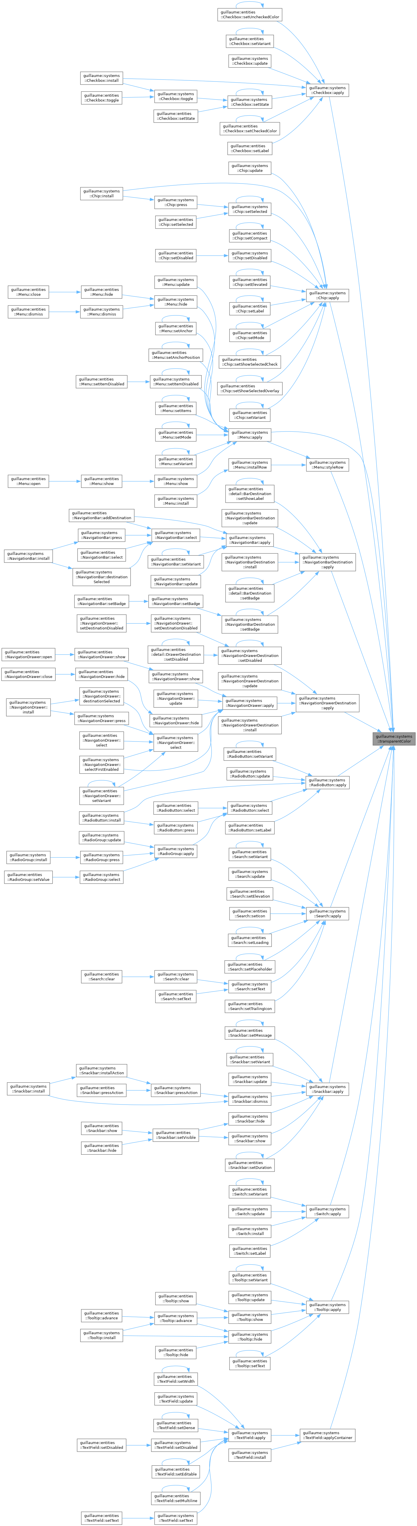
◆ transparentColor() [2/13]
|
inline |
The color written to hide a fill or an outline without removing its component.
- Returns
- Black with an alpha of 0.
Definition at line 155 of file style_helpers.hpp.
◆ transparentColor() [3/13]
|
inline |
The color written to hide a fill or an outline without removing its component.
- Returns
- Black with an alpha of 0.
Definition at line 155 of file style_helpers.hpp.
◆ transparentColor() [4/13]
|
inline |
The color written to hide a fill or an outline without removing its component.
- Returns
- Black with an alpha of 0.
Definition at line 155 of file style_helpers.hpp.
◆ transparentColor() [5/13]
|
inline |
The color written to hide a fill or an outline without removing its component.
- Returns
- Black with an alpha of 0.
Definition at line 155 of file style_helpers.hpp.
◆ transparentColor() [6/13]
|
inline |
The color written to hide a fill or an outline without removing its component.
- Returns
- Black with an alpha of 0.
Definition at line 155 of file style_helpers.hpp.
◆ transparentColor() [7/13]
|
inline |
The color written to hide a fill or an outline without removing its component.
- Returns
- Black with an alpha of 0.
Definition at line 155 of file style_helpers.hpp.
◆ transparentColor() [8/13]
|
inline |
The color written to hide a fill or an outline without removing its component.
- Returns
- Black with an alpha of 0.
Definition at line 155 of file style_helpers.hpp.
◆ transparentColor() [9/13]
|
inline |
The color written to hide a fill or an outline without removing its component.
- Returns
- Black with an alpha of 0.
Definition at line 155 of file style_helpers.hpp.
◆ transparentColor() [10/13]
|
inline |
The color written to hide a fill or an outline without removing its component.
- Returns
- Black with an alpha of 0.
Definition at line 155 of file style_helpers.hpp.
◆ transparentColor() [11/13]
|
inline |
The color written to hide a fill or an outline without removing its component.
- Returns
- Black with an alpha of 0.
Definition at line 155 of file style_helpers.hpp.
◆ transparentColor() [12/13]
|
inline |
The color written to hide a fill or an outline without removing its component.
- Returns
- Black with an alpha of 0.
Definition at line 155 of file style_helpers.hpp.
◆ transparentColor() [13/13]
|
inline |
The color written to hide a fill or an outline without removing its component.
- Returns
- Black with an alpha of 0.
Definition at line 155 of file style_helpers.hpp.
