Colors, sizes and lays out an extended floating action button: a FAB that shows a label beside its icon and can collapse to the icon alone. More...
#include <headers/guillaume/systems/extended_floating_action_button.hpp>


Public Member Functions | |
| ExtendedFloatingActionButton (void) | |
| Create the system for the Layout phase, matching entities that have both a components::ExtendedFloatingActionButton and a components::Button. | |
| ~ExtendedFloatingActionButton (void) override=default | |
| Default destructor. | |
| void | update (const ecs::Entity::Identifier &entityIdentifier) override |
| Frame entry point: call apply on one button. | |
| Public Member Functions inherited from guillaume::ecs::SystemFiller< components::ExtendedFloatingActionButton, components::Button > | |
| SystemFiller (Phase phase) | |
| Create the system and set its signature from ComponentTypes. | |
| virtual | ~SystemFiller (void)=default |
| Virtual destructor. | |
| Public Member Functions inherited from guillaume::ecs::System | |
| System (Phase phase) | |
| Create a system that runs in a given phase, with an empty signature. | |
| virtual | ~System (void)=default |
| Virtual destructor. | |
| Phase | getPhase (void) const noexcept |
| Get the phase of the frame in which the system runs. | |
| Entity::Signature | getSignature (void) const noexcept |
| Get the component types an entity must declare to be visited by this system. | |
| void | routine (ecs::ComponentRegistry &componentRegistry, ecs::EntityRegistry &entityRegistry, const ecs::EntityTreeTraveler &traveler) |
| Run the system once over a scene: prepare(), update() on each matching entity, cleanup(). | |
| void | bindComponentRegistry (ecs::ComponentRegistry &componentRegistry) |
| Bind a component registry so update() can be called directly, without routine(). | |
| void | unbindComponentRegistry (void) |
| Drop the binding made by bindComponentRegistry(). | |
| virtual void | prepare (void) |
| Called once per pass, before the first update(). | |
| virtual void | cleanup (void) |
| Called once per pass, after the last update(). | |
Static Public Member Functions | |
| static void | install (ecs::ComponentRegistry ®istry, const ecs::Entity::Identifier &identifier) |
| Make an entity behave as an extended floating action button. | |
| static float | iconFontSize (const ecs::ComponentRegistry ®istry, const ecs::Entity::Identifier &identifier) |
| Get the font size of the icon for the configured size. | |
| static utility::graphic::Color32Bit | contentColor (const ecs::ComponentRegistry ®istry, const ecs::Entity::Identifier &identifier) |
| Get the color of the icon and label of the button when it is enabled and visible. | |
| static void | elevation (ecs::ComponentRegistry ®istry, const ecs::Entity::Identifier &identifier) |
| Write the shadow level of the button into its components::Elevation. | |
| static void | styleState (ecs::ComponentRegistry ®istry, const ecs::Entity::Identifier &identifier) |
| First half of apply: write the elevation and the colors. | |
| static void | geometry (ecs::ComponentRegistry ®istry, const ecs::Entity::Identifier &identifier) |
| Second half of apply: write the size and the corner radius of the button and place its icon and label. | |
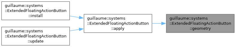
| static void | apply (ecs::ComponentRegistry ®istry, const ecs::Entity::Identifier &identifier) |
| Style and lay out one button at once: styleState, then geometry. | |
Additional Inherited Members | |
| Protected Member Functions inherited from guillaume::ecs::System | |
| template<InheritFromComponent... ComponentTypes> | |
| void | setSignature (void) |
| Replace the signature by the one made of the given component types. | |
| ecs::EntityRegistry & | getEntityRegistry (void) |
| Get the entity registry of the scene being processed. | |
| const ecs::EntityRegistry & | getEntityRegistry (void) const |
| Get the entity registry of the scene being processed, read-only. | |
| ecs::ComponentRegistry & | getComponentRegistry (void) |
| Get the component registry of the scene being processed. | |
| const ecs::ComponentRegistry & | getComponentRegistry (void) const |
| Get the component registry of the scene being processed, read-only. | |
| template<InheritFromComponent ComponentType> | |
| bool | hasComponent (const ecs::Entity::Identifier &entityIdentifier) const |
| Tell whether an entity has a component, in the bound registry. | |
| template<InheritFromComponent ComponentType> | |
| ComponentType & | getComponent (const ecs::Entity::Identifier &entityIdentifier) |
| Get a component of an entity from the bound registry, to read or modify it. | |
| template<InheritFromComponent ComponentType> | |
| const ComponentType & | getComponent (const ecs::Entity::Identifier &entityIdentifier) const |
| Get a component of an entity from the bound registry, read-only. | |
| template<InheritFromComponent ComponentType> | |
| bool | requireComponent (const ecs::Entity::Identifier &entityIdentifier) |
| Tell whether an entity has a component, and log a warning naming the entity and the component when it does not. | |
Detailed Description
Colors, sizes and lays out an extended floating action button: a FAB that shows a label beside its icon and can collapse to the icon alone.
This is the variant half of a button; systems::Button owns the input half (press, callbacks) and calls back into apply through the restyle function of components::Button.
- Reads: components::ExtendedFloatingActionButton (variant, size, custom size, mode, lowered, extended), components::Button (visible, label, color overrides, icon and label children), the hover, press and enabled state, the components::Bound of the measured children, the active theme.
- Writes: the button's components::Color, components::Elevation, components::Bound and the corner radius of its components::Borders, the hover margin that makes up the touch target, and on the children: color, font, label text and components::Transform.
- Phase: Layout, registered after systems::Layout. The children were measured in the Measure phase of the same frame.
The width follows the label: 16 dp, the icon, 12 dp, the label, 20 dp. Collapsed (setExtended(false)), or when the label measures nothing, the button is a square holding the centered icon; the label child stays in the tree and is drawn transparent.
- See also
- guillaume::components::ExtendedFloatingActionButton, guillaume::systems::Button, guillaume::systems::fab_style, guillaume::systems::FloatingActionButton
Definition at line 64 of file extended_floating_action_button.hpp.
Constructor & Destructor Documentation
◆ ExtendedFloatingActionButton()
| guillaume::systems::ExtendedFloatingActionButton::ExtendedFloatingActionButton | ( | void | ) |
Create the system for the Layout phase, matching entities that have both a components::ExtendedFloatingActionButton and a components::Button.
Definition at line 52 of file extended_floating_action_button.cpp.

Member Function Documentation
◆ apply()
|
static |
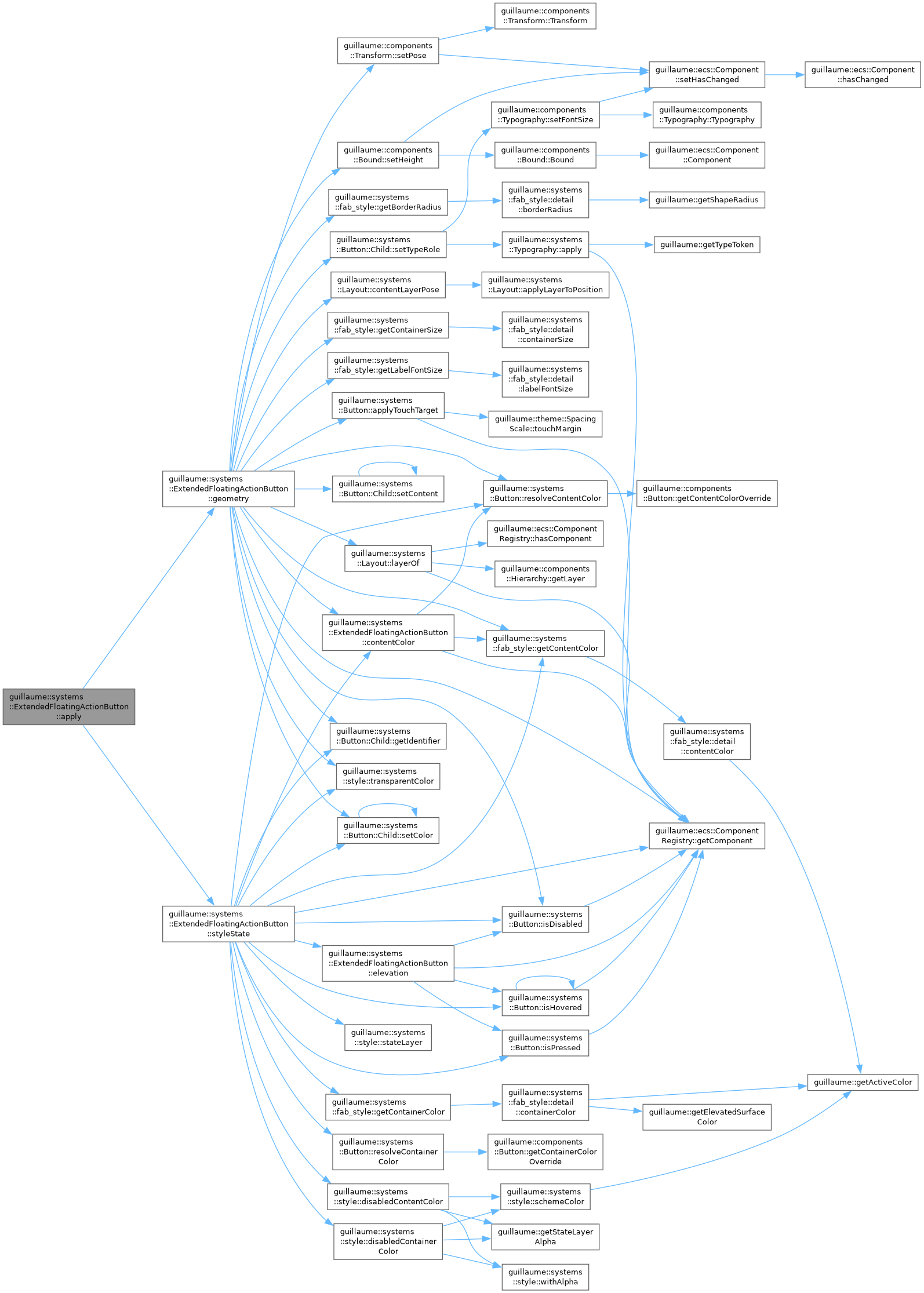
Style and lay out one button at once: styleState, then geometry.
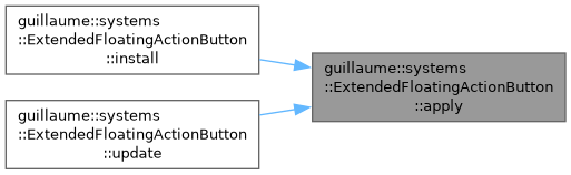
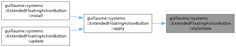
The frame calls it through update. Call it yourself after changing components::ExtendedFloatingActionButton or components::Button when the result must be visible before the next Layout phase; systems::Button does on every hover, press and release.
- Parameters
-
registry The registry holding the components. identifier The button entity. It must have the components listed in the class description.
- Exceptions
-
std::runtime_error If the configured size or variant is not a valid enumerator.
Definition at line 315 of file extended_floating_action_button.cpp.
◆ contentColor()
|
static |
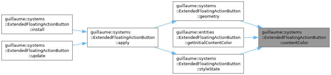
Get the color of the icon and label of the button when it is enabled and visible.
- Parameters
-
registry The registry holding the components. identifier The button entity.
- Returns
- The content color override of components::Button when one is set, the color of the variant otherwise.
- Exceptions
-
std::runtime_error If the configured variant is not a valid enumerator.
Definition at line 81 of file extended_floating_action_button.cpp.

◆ elevation()
|
static |
Write the shadow level of the button into its components::Elevation.
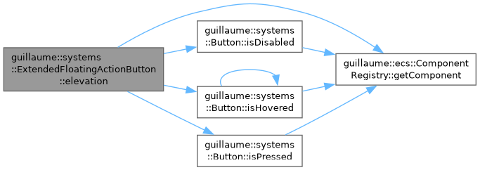
Level 3 at rest, or level 1 when the FAB is lowered; one level higher while hovered and not pressed; level 0 when the button is disabled, not visible or in the Flat mode. styleState calls it first, so apply covers it.
- Parameters
-
registry The registry holding the components. identifier The button entity.
Definition at line 94 of file extended_floating_action_button.cpp.

◆ geometry()
|
static |
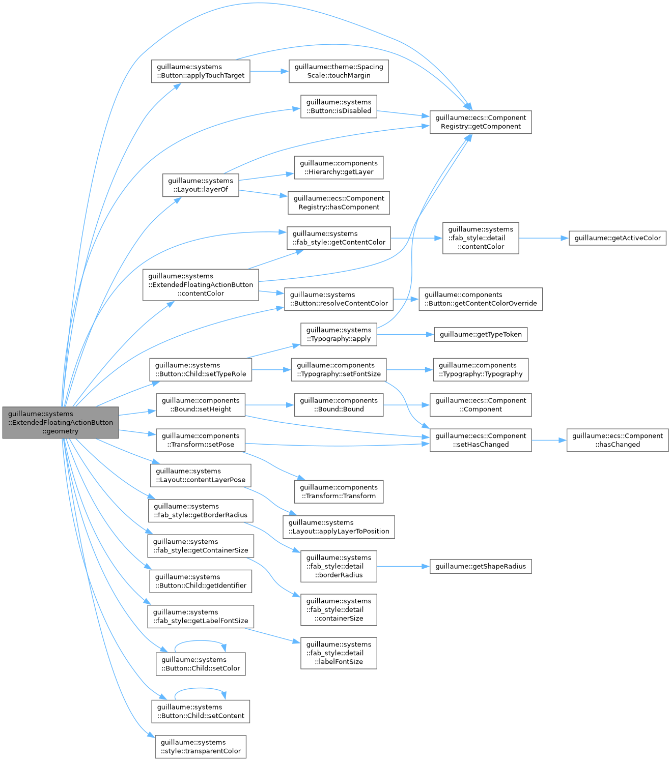
Second half of apply: write the size and the corner radius of the button and place its icon and label.
The height is the custom size of components::ExtendedFloatingActionButton when set, else the container size of the size setting; the corner radius is the custom size divided by 3.5, or the radius of the size setting. With the label shown, the width is 16 dp, the icon and a 12 dp gap when the icon measures something, the label, then 20 dp. Otherwise the button is a square of that height with the icon centered and the label hidden. The label gets the LabelLarge type role; icon and label share one font size.
A button with neither an icon nor a label only gets its corner radius: its components::Bound is left untouched.
- Parameters
-
registry The registry holding the components. identifier The button entity.
Definition at line 205 of file extended_floating_action_button.cpp.
◆ iconFontSize()
|
static |
Get the font size of the icon for the configured size.
In an extended FAB the icon uses the same font size as the label (fab_style::getLabelFontSize), not the icon size of a regular FAB. The widget class uses it to create the icon child at the right size.
- Parameters
-
registry The registry holding the components. identifier The button entity.
- Returns
- The font size, in dp: 18 for Small, 24 for Medium, 36 for Large.
- Exceptions
-
std::runtime_error If the configured size is not a valid enumerator.
Definition at line 71 of file extended_floating_action_button.cpp.


◆ install()
|
static |
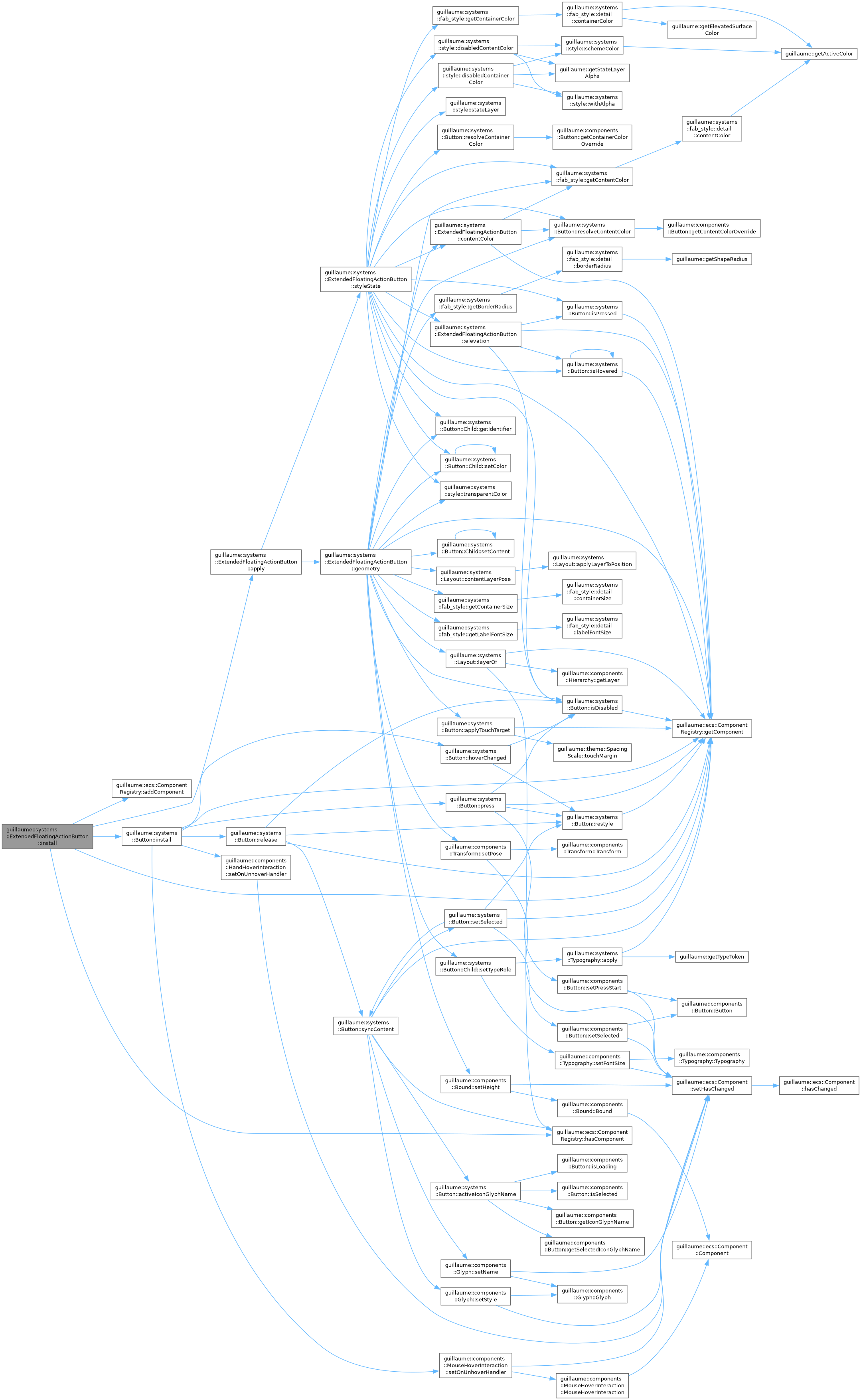
Make an entity behave as an extended floating action button.
Adds a components::Elevation at level 0 when the entity has none, wires input through systems::Button::install, and stores apply in components::Button as the restyle function, so a hover or a press redraws the button without waiting for the Layout phase. Call it once when the entity is built; entities::ExtendedFloatingActionButton does it for you.
- Parameters
-
registry The registry holding the components. It must outlive the entity. identifier The button entity. It must already have its components::Button and the hand and mouse hover and button interaction components.
Definition at line 58 of file extended_floating_action_button.cpp.
◆ styleState()
|
static |
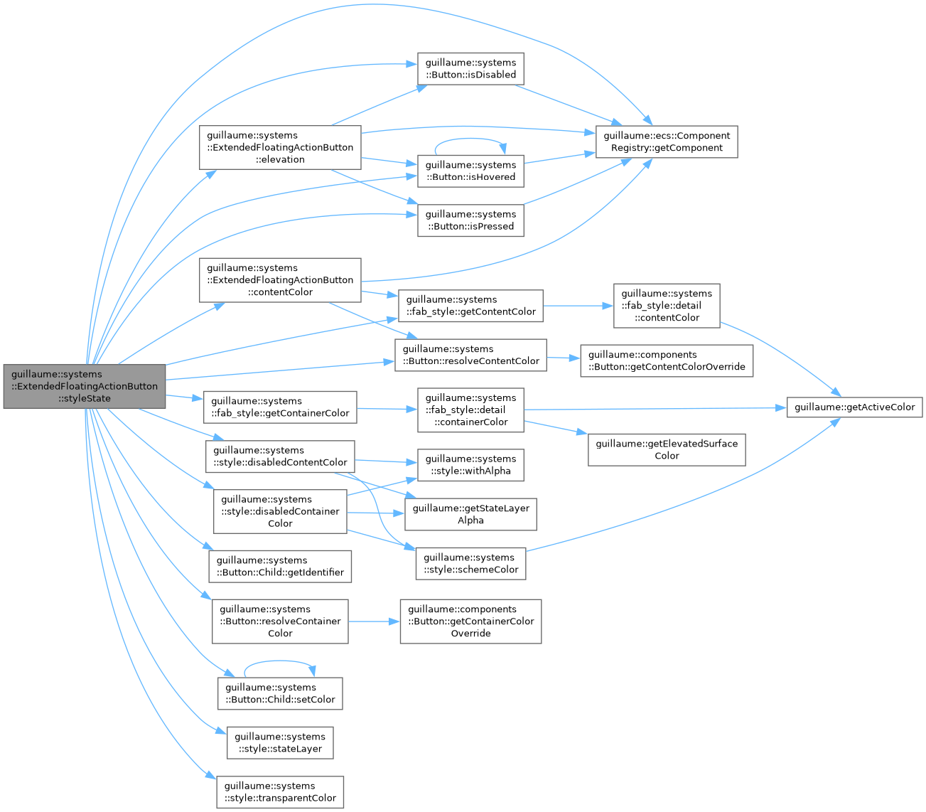
First half of apply: write the elevation and the colors.
- Not visible: container, icon and label become fully transparent.
- Disabled: the container takes the disabled container color, icon and label the disabled content color.
- Otherwise: container and content colors come from fab_style for the variant, replaced by the color overrides of components::Button when set. While pressed, or else hovered, the content color is blended over the container at the theme opacity of that state.
In every case the label is transparent while it is not shown, that is when the button is collapsed or the label measures a width of 0.
- Parameters
-
registry The registry holding the components. identifier The button entity.
Definition at line 123 of file extended_floating_action_button.cpp.
◆ update()
|
overridevirtual |
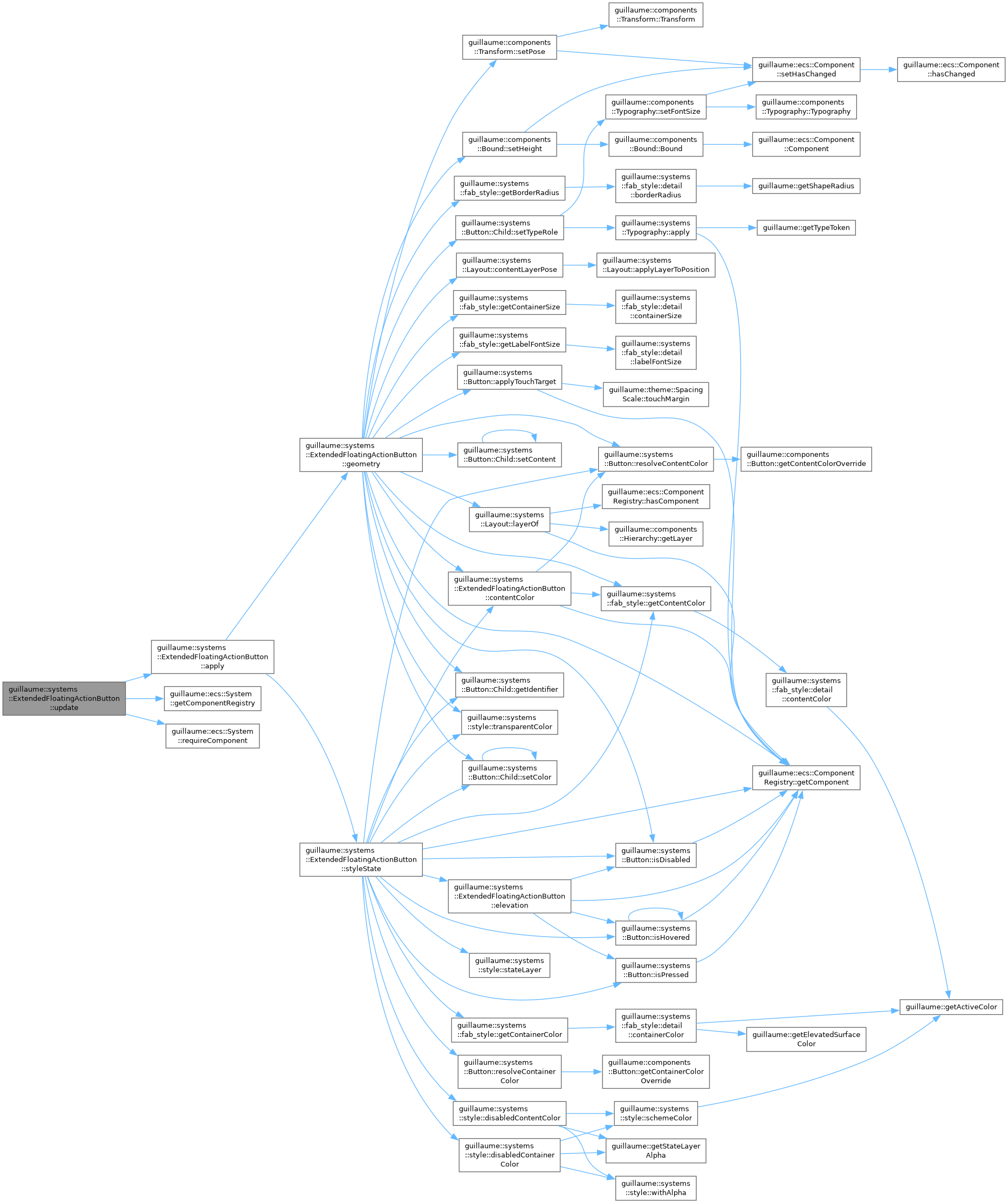
Frame entry point: call apply on one button.
- Parameters
-
entityIdentifier The button entity. An entity missing components::ExtendedFloatingActionButton or components::Button is logged and skipped.
Implements guillaume::ecs::System.
Definition at line 323 of file extended_floating_action_button.cpp.
The documentation for this class was generated from the following files:
- headers/guillaume/systems/extended_floating_action_button.hpp
- sources/systems/extended_floating_action_button.cpp
