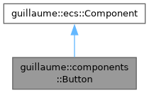
State shared by every pressable button, whatever its look. More...
#include <headers/guillaume/components/button.hpp>
Public Types | |
| using | Handler = std::function<void(void)> |
| Callback run when the button is clicked or long-pressed. | |
| using | TimePoint = std::chrono::steady_clock::time_point |
| Point in time on the clock used to measure how long a press lasts. | |
| using | OptionalColor = std::optional<utility::graphic::Color32Bit> |
| A color that replaces a themed one, or nothing to keep the theme. | |
| using | RestyleFunction |
Public Member Functions | |
| Button (void)=default | |
| Create the state of a plain button: no icon, no label, not a toggle, visible, no callback. | |
| ~Button (void)=default | |
| Default destructor. | |
| const std::string & | getIconGlyphName (void) const noexcept |
| Get the name of the icon glyph shown at rest. | |
| Button & | setIconGlyphName (const std::string &name) |
| Set the name of the icon glyph shown at rest. | |
| Glyph::Style | getIconStyle (void) const noexcept |
| Get the style the icon glyph is drawn in. | |
| Button & | setIconStyle (Glyph::Style style) |
| Set the style the icon glyph is drawn in. | |
| const std::string & | getSelectedIconGlyphName (void) const noexcept |
| Get the name of the icon glyph shown while selected. | |
| Button & | setSelectedIconGlyphName (const std::string &name) |
| Set the name of the icon glyph shown while selected. | |
| const std::string & | getLabelContent (void) const noexcept |
| Get the text of the label. | |
| Button & | setLabelContent (const std::string &content) |
| Set the text of the label. | |
| ecs::Entity::Identifier | getIcon (void) const noexcept |
| Get the child entity that draws the icon. | |
| Button & | setIcon (ecs::Entity::Identifier identifier) |
| Record which child entity draws the icon. | |
| ecs::Entity::Identifier | getLabel (void) const noexcept |
| Get the child entity that draws the label. | |
| Button & | setLabel (ecs::Entity::Identifier identifier) |
| Record which child entity draws the label. | |
| bool | isToggle (void) const noexcept |
| Check whether the button is a toggle. | |
| Button & | setToggle (bool toggle) |
| Make the button a toggle or a plain button. | |
| bool | isSelected (void) const noexcept |
| Check whether the button is selected. | |
| Button & | setSelected (bool selected) |
| Store the selection. | |
| bool | isMorph (void) const noexcept |
| Check whether the corner shape changes when selected. | |
| Button & | setMorph (bool morph) |
| Choose whether the corner shape changes when selected. | |
| bool | isTrailingIcon (void) const noexcept |
| Check on which side of the label the icon sits. | |
| Button & | setTrailingIcon (bool trailing) |
| Choose on which side of the label the icon sits. | |
| bool | isLoading (void) const noexcept |
| Check whether the button shows a progress glyph. | |
| Button & | setLoading (bool loading) |
| Show a progress glyph in place of the icon, or the icon again. | |
| bool | isVisible (void) const noexcept |
| Check whether the button is shown. | |
| Button & | setVisible (bool visible) |
| Show or hide the button. | |
| const Handler & | getOnClick (void) const noexcept |
| Get the click callback. | |
| Button & | setOnClick (Handler handler) |
| Set the callback run when the button is released. | |
| const Handler & | getOnLongPress (void) const noexcept |
| Get the long-press callback. | |
| Button & | setOnLongPress (Handler handler) |
| Set the callback run when the button is released after a long press. | |
| TimePoint | getPressStart (void) const noexcept |
| Get when the current press started. | |
| Button & | setPressStart (TimePoint time) |
| Record when the current press started. | |
| const OptionalColor & | getContainerColorOverride (void) const noexcept |
| Get the color that replaces the themed container color. | |
| Button & | setContainerColorOverride (const OptionalColor &color) |
| Replace the themed container (background) color. | |
| const OptionalColor & | getContentColorOverride (void) const noexcept |
| Get the color that replaces the themed content color. | |
| Button & | setContentColorOverride (const OptionalColor &color) |
| Replace the themed content (icon and label) color. | |
| RestyleFunction | getRestyle (void) const noexcept |
| Get the function that restyles this button at once. | |
| Button & | setRestyle (RestyleFunction function) |
| Register the function that restyles this button at once. | |
| Public Member Functions inherited from guillaume::ecs::Component | |
| bool | hasChanged (void) const |
| Tell whether a value of the component changed since the flags were last reset (the end of the previous frame). | |
| void | setHasChanged (bool hasChanged) |
| Raise or lower the changed flag. | |
| Component (void)=default | |
| Create a component that is not marked as changed. | |
| virtual | ~Component (void)=default |
| Virtual destructor, so components can be destroyed through the base class. | |
Detailed Description
State shared by every pressable button, whatever its look.
Holds what the button shows (icon glyph, label text, the identifiers of the icon and label child entities), how it reacts (toggle, click and long-press callbacks) and its transient state (selected, loading, visible, start of the current press).
Role in the frame:
- The widget classes (entities::Button, entities::IconButton, ...) write the content and the options.
- systems::Button (Event phase) turns hover, press and release into the selection, the press timing and the callbacks, and copies the active glyph to the icon child.
- One variant system (systems::CommonButton, systems::IconButton, systems::FloatingActionButton or systems::ExtendedFloatingActionButton, Layout phase) reads it together with its own configuration component to produce colors and geometry. That system registers its static apply here with setRestyle() so systems::Button can restyle the button the moment input changes it.
Every setter except setOnClick() and setOnLongPress() compares before writing and marks the component changed only when the value differs. A setter stores the value and nothing else: the screen follows on the next frame, or at once if the caller then runs systems::Button::restyle().
Definition at line 76 of file button.hpp.
Member Typedef Documentation
◆ Handler
| using guillaume::components::Button::Handler = std::function<void(void)> |
Callback run when the button is clicked or long-pressed.
Definition at line 80 of file button.hpp.
◆ OptionalColor
| using guillaume::components::Button::OptionalColor = std::optional<utility::graphic::Color32Bit> |
A color that replaces a themed one, or nothing to keep the theme.
Definition at line 86 of file button.hpp.
◆ RestyleFunction
Static function of a variant system that recomputes the colors and the geometry of one button at once, given the registry and the button's identifier.
Definition at line 91 of file button.hpp.
◆ TimePoint
| using guillaume::components::Button::TimePoint = std::chrono::steady_clock::time_point |
Point in time on the clock used to measure how long a press lasts.
Definition at line 83 of file button.hpp.
Member Function Documentation
◆ getContainerColorOverride()
|
noexcept |
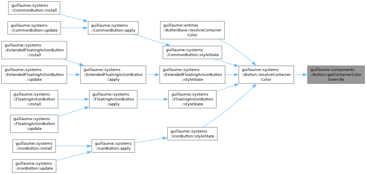
Get the color that replaces the themed container color.
- Returns
- The color, or std::nullopt when the theme decides.
Definition at line 234 of file button.cpp.
◆ getContentColorOverride()
|
noexcept |
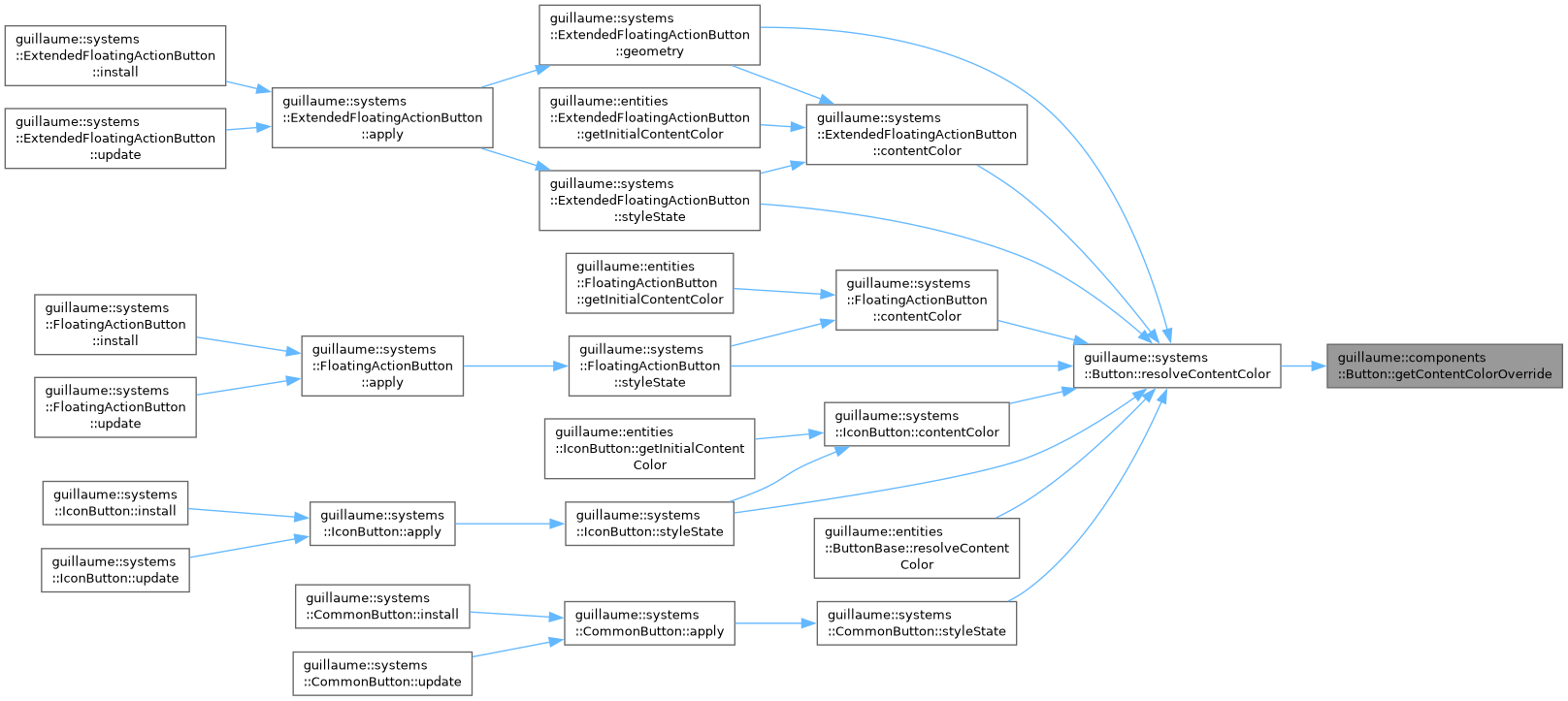
Get the color that replaces the themed content color.
- Returns
- The color, or std::nullopt when the theme decides.
Definition at line 249 of file button.cpp.
◆ getIcon()
|
noexcept |
Get the child entity that draws the icon.
- Returns
- Its identifier, or ecs::Entity::InvalidIdentifier when the button has no icon child.
Definition at line 85 of file button.cpp.

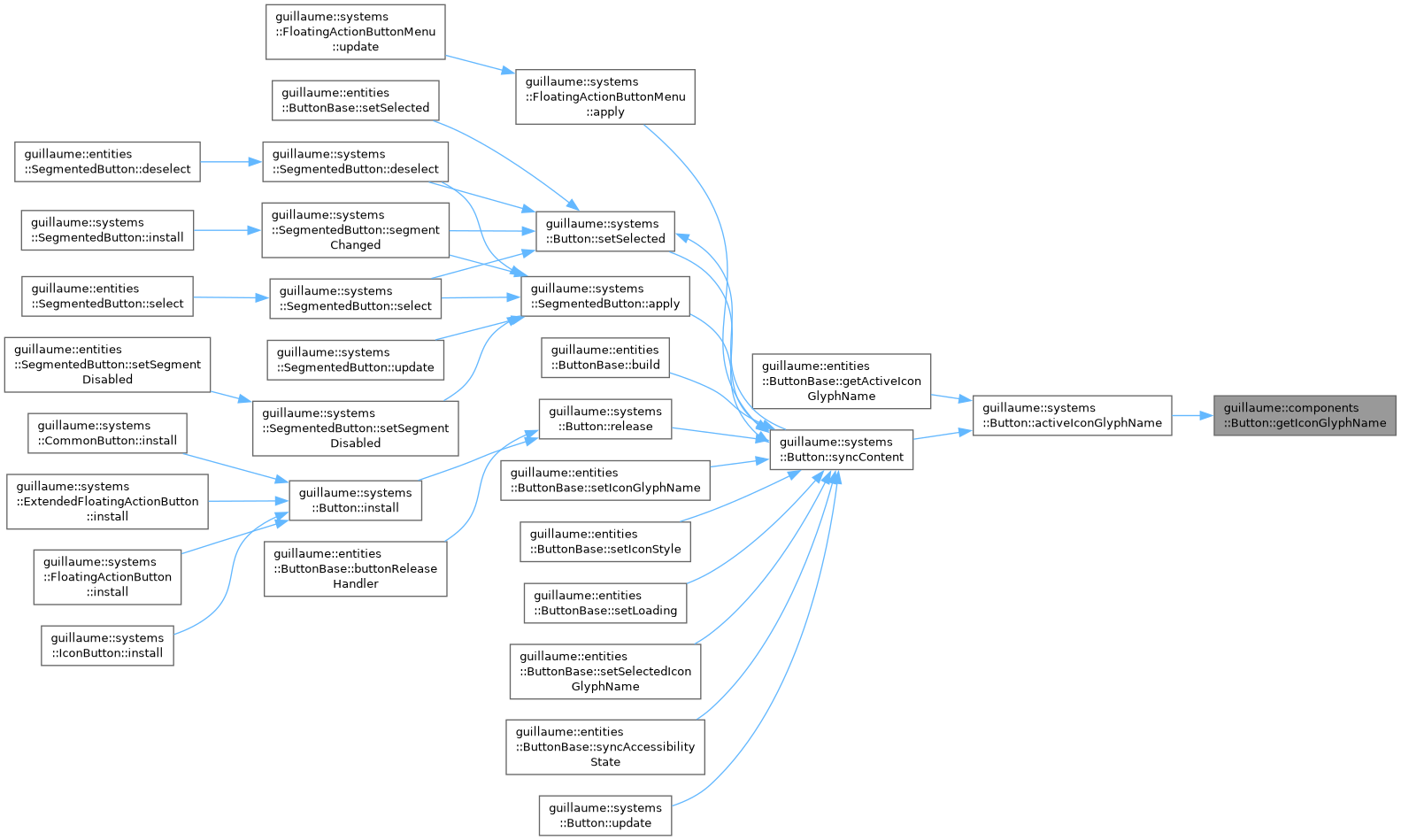
◆ getIconGlyphName()
|
noexcept |
Get the name of the icon glyph shown at rest.
- Returns
- The glyph name (for example "add"), empty when the button has no icon.
Definition at line 29 of file button.cpp.
◆ getIconStyle()
|
noexcept |
Get the style the icon glyph is drawn in.
- Returns
- The glyph style (outlined by default).
Definition at line 43 of file button.cpp.
◆ getLabel()
|
noexcept |
Get the child entity that draws the label.
- Returns
- Its identifier, or ecs::Entity::InvalidIdentifier when the button has no label child.
Definition at line 99 of file button.cpp.

◆ getLabelContent()
|
noexcept |
Get the text of the label.
- Returns
- The text as the caller gave it, before any upper-casing done by the variant system.
Definition at line 71 of file button.cpp.
◆ getOnClick()
|
noexcept |
Get the click callback.
- Returns
- The callback, empty when none is set.
Definition at line 197 of file button.cpp.
◆ getOnLongPress()
|
noexcept |
Get the long-press callback.
- Returns
- The callback, empty when none is set.
Definition at line 208 of file button.cpp.
◆ getPressStart()
|
noexcept |
Get when the current press started.
- Returns
- The time of the press, or a default-constructed TimePoint when the button is not being pressed.
Definition at line 219 of file button.cpp.
◆ getRestyle()
|
noexcept |
Get the function that restyles this button at once.
- Returns
- The static apply of the variant system, or nullptr when no variant system was installed on the entity.
Definition at line 263 of file button.cpp.
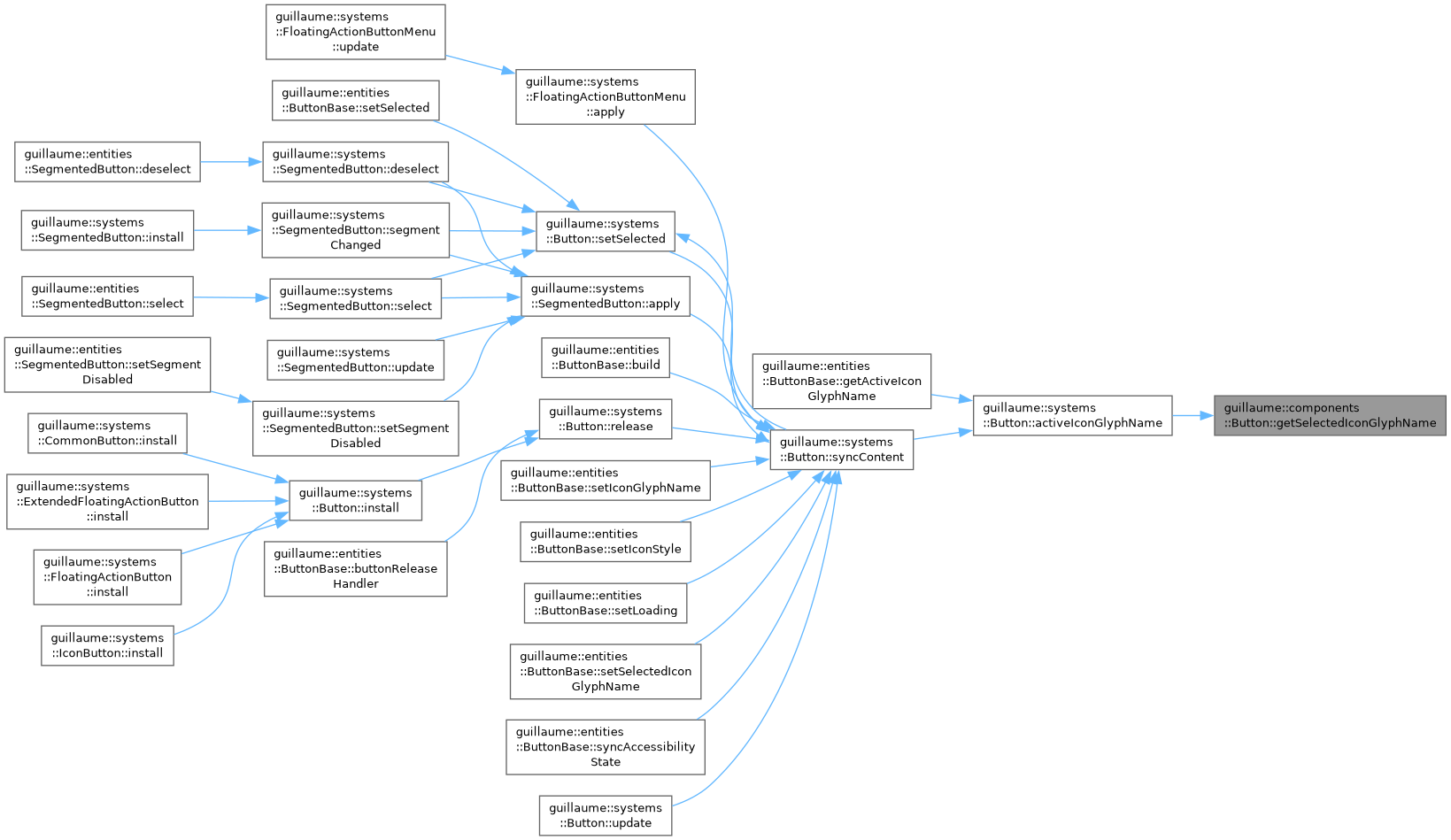
◆ getSelectedIconGlyphName()
|
noexcept |
Get the name of the icon glyph shown while selected.
- Returns
- The glyph name, empty when the selected button keeps its regular glyph.
Definition at line 57 of file button.cpp.
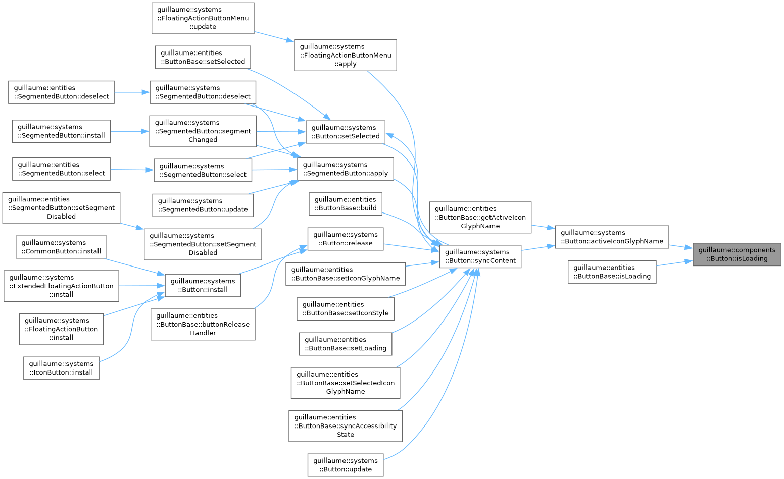
◆ isLoading()
|
noexcept |
Check whether the button shows a progress glyph.
- Returns
- True while loading.
Definition at line 169 of file button.cpp.
◆ isMorph()
|
noexcept |
Check whether the corner shape changes when selected.
- Returns
- True when a selected toggle swaps round and square corners.
Definition at line 141 of file button.cpp.
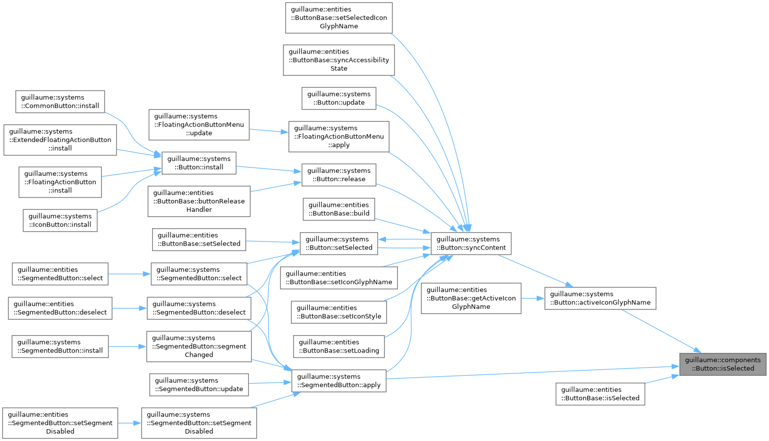
◆ isSelected()
|
noexcept |
Check whether the button is selected.
- Returns
- True when selected. Only meaningful for a toggle.
Definition at line 127 of file button.cpp.
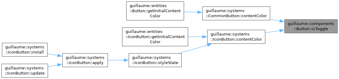
◆ isToggle()
|
noexcept |
Check whether the button is a toggle.
- Returns
- True when each release flips the selection.
Definition at line 113 of file button.cpp.
◆ isTrailingIcon()
|
noexcept |
Check on which side of the label the icon sits.
- Returns
- True when the icon comes after the label.
Definition at line 155 of file button.cpp.
◆ isVisible()
|
noexcept |
Check whether the button is shown.
- Returns
- True when shown (the default).
Definition at line 183 of file button.cpp.

◆ setContainerColorOverride()
| Button & guillaume::components::Button::setContainerColorOverride | ( | const OptionalColor & | color | ) |
Replace the themed container (background) color.
The variant system uses it as the resting color and still blends the hover and press layers over it. Disabled buttons keep the themed disabled color.
- Parameters
-
color The container color, or std::nullopt to follow the theme.
- Returns
- This component, for chaining.
Definition at line 239 of file button.cpp.


◆ setContentColorOverride()
| Button & guillaume::components::Button::setContentColorOverride | ( | const OptionalColor & | color | ) |
Replace the themed content (icon and label) color.
- Parameters
-
color The content color, or std::nullopt to follow the theme.
- Returns
- This component, for chaining.
Definition at line 254 of file button.cpp.


◆ setIcon()
| Button & guillaume::components::Button::setIcon | ( | ecs::Entity::Identifier | identifier | ) |
Record which child entity draws the icon.
The widget class calls it after creating the child; the component does not own the entity.
- Parameters
-
identifier The icon child, or ecs::Entity::InvalidIdentifier for none.
- Returns
- This component, for chaining.
Definition at line 90 of file button.cpp.


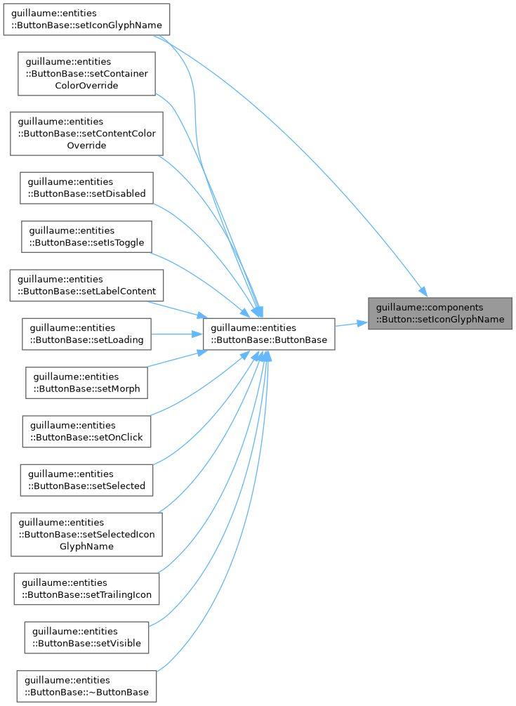
◆ setIconGlyphName()
| Button & guillaume::components::Button::setIconGlyphName | ( | const std::string & | name | ) |
Set the name of the icon glyph shown at rest.
systems::Button copies it to the icon child's Glyph, unless the button is loading or selected with a selected glyph.
- Parameters
-
name The glyph name in the icon font, for example "add".
- Returns
- This component, for chaining.
Definition at line 34 of file button.cpp.

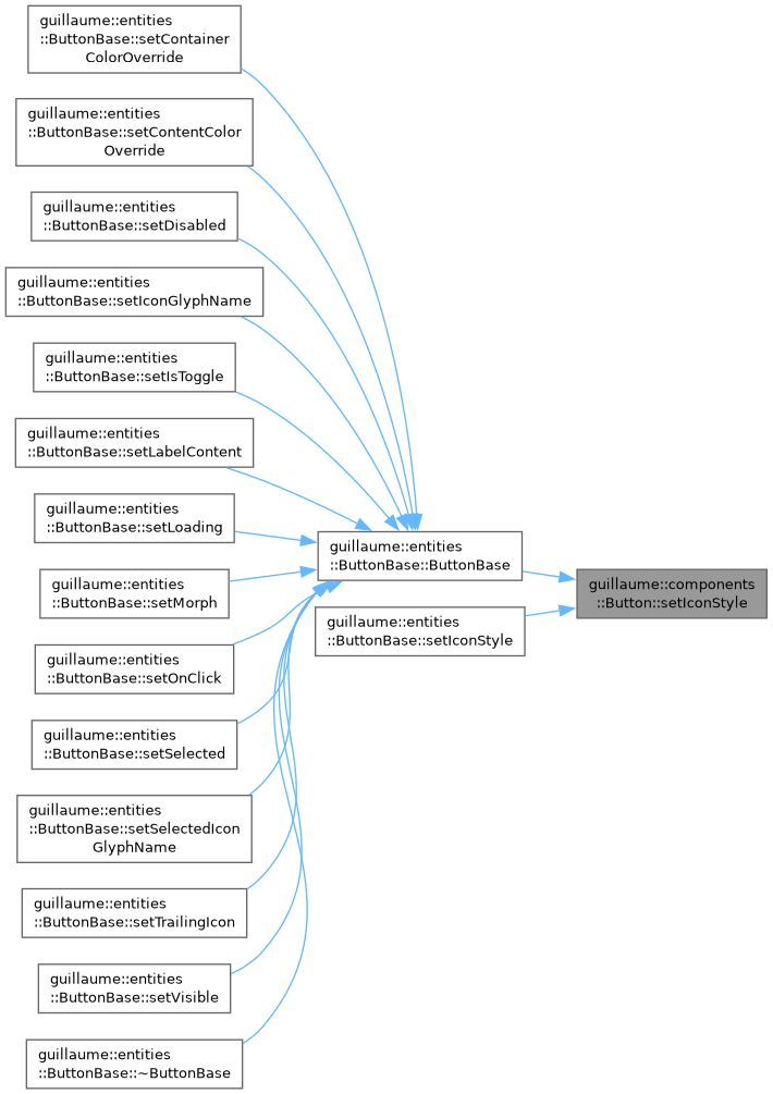
◆ setIconStyle()
| Button & guillaume::components::Button::setIconStyle | ( | Glyph::Style | style | ) |
Set the style the icon glyph is drawn in.
- Parameters
-
style The glyph style, copied to the icon child's Glyph by systems::Button.
- Returns
- This component, for chaining.
Definition at line 48 of file button.cpp.

◆ setLabel()
| Button & guillaume::components::Button::setLabel | ( | ecs::Entity::Identifier | identifier | ) |
Record which child entity draws the label.
- Parameters
-
identifier The label child, or ecs::Entity::InvalidIdentifier for none.
- Returns
- This component, for chaining.
Definition at line 104 of file button.cpp.


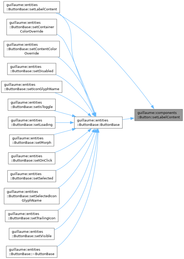
◆ setLabelContent()
| Button & guillaume::components::Button::setLabelContent | ( | const std::string & | content | ) |
Set the text of the label.
The variant system writes it to the label child's Text.
- Parameters
-
content The label text.
- Returns
- This component, for chaining.
Definition at line 76 of file button.cpp.

◆ setLoading()
| Button & guillaume::components::Button::setLoading | ( | bool | loading | ) |
Show a progress glyph in place of the icon, or the icon again.
While loading, systems::Button gives the icon child the glyph systems::Button::LoadingGlyph. The button still reacts to input.
- Parameters
-
loading True to show the progress glyph.
- Returns
- This component, for chaining.
Definition at line 174 of file button.cpp.


◆ setMorph()
| Button & guillaume::components::Button::setMorph | ( | bool | morph | ) |
Choose whether the corner shape changes when selected.
Read by systems::CommonButton only: a selected toggle with morph draws the opposite of its configured shape (round becomes square and the reverse).
- Parameters
-
morph True to swap the shape while selected.
- Returns
- This component, for chaining.
Definition at line 146 of file button.cpp.

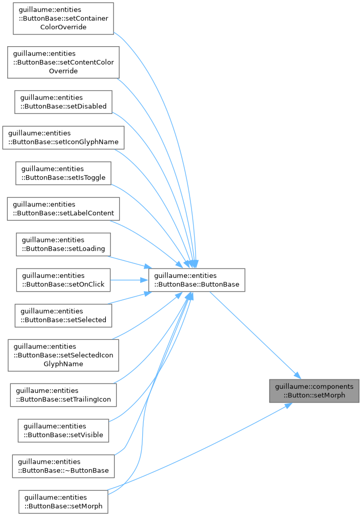
◆ setOnClick()
Set the callback run when the button is released.
It is not run when the release counts as a long press and a long-press callback is set. Does not mark the component changed.
- Parameters
-
handler The callback, or an empty one to remove it.
- Returns
- This component, for chaining.
Definition at line 202 of file button.cpp.

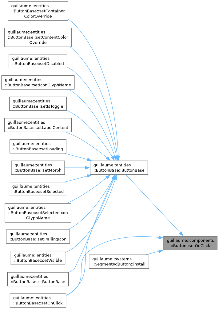
◆ setOnLongPress()
Set the callback run when the button is released after a long press.
A press held for at least systems::Button::LongPressDuration runs it instead of the click callback. Does not mark the component changed.
- Parameters
-
handler The callback, or an empty one so that every release is a click.
- Returns
- This component, for chaining.
Definition at line 213 of file button.cpp.


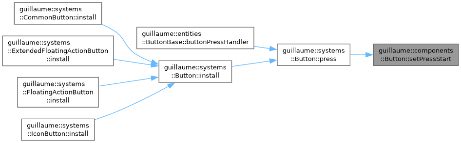
◆ setPressStart()
Record when the current press started.
Written by systems::Button: the time on press, a default-constructed TimePoint on release.
- Parameters
-
time The start of the press, or TimePoint {} for none.
- Returns
- This component, for chaining.
Definition at line 224 of file button.cpp.

◆ setRestyle()
| Button & guillaume::components::Button::setRestyle | ( | RestyleFunction | function | ) |
Register the function that restyles this button at once.
Each variant system's install() passes its static apply. systems::Button::restyle() calls it after every hover, press, release and selection change.
- Parameters
-
function The restyle function, or nullptr for none.
- Returns
- This component, for chaining.
Definition at line 268 of file button.cpp.

◆ setSelected()
| Button & guillaume::components::Button::setSelected | ( | bool | selected | ) |
Store the selection.
It only stores the flag, even when the button is not a toggle. Use systems::Button::setSelected() to also update the icon and restyle.
- Parameters
-
selected True to select the button.
- Returns
- This component, for chaining.
Definition at line 132 of file button.cpp.

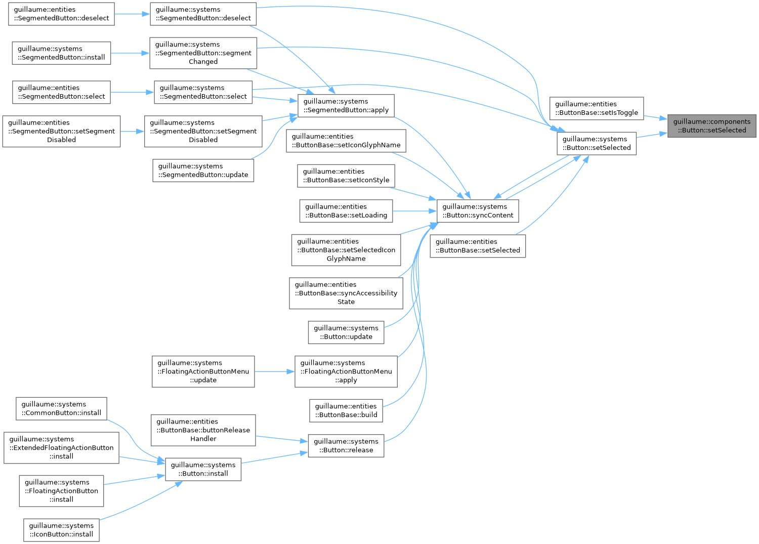
◆ setSelectedIconGlyphName()
| Button & guillaume::components::Button::setSelectedIconGlyphName | ( | const std::string & | name | ) |
Set the name of the icon glyph shown while selected.
- Parameters
-
name The glyph name, or an empty string to keep the regular glyph when selected.
- Returns
- This component, for chaining.
Definition at line 62 of file button.cpp.


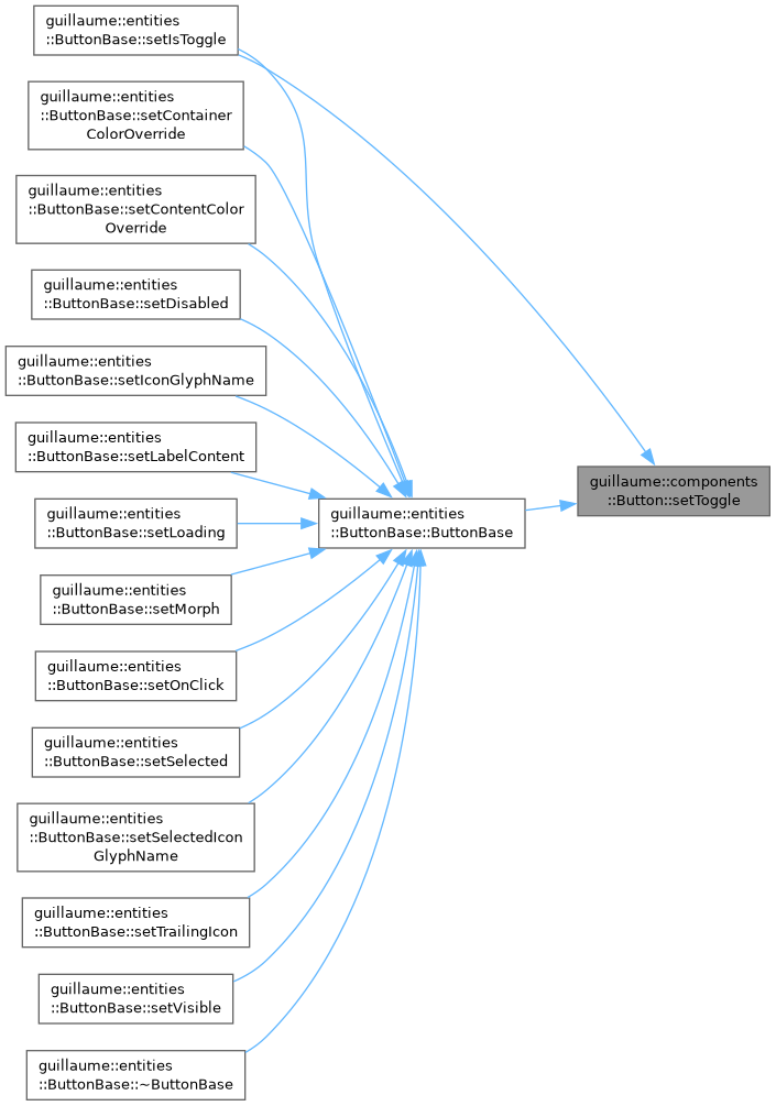
◆ setToggle()
| Button & guillaume::components::Button::setToggle | ( | bool | toggle | ) |
Make the button a toggle or a plain button.
- Parameters
-
toggle True so that each release flips the selection; false so that a release only runs the callback.
- Returns
- This component, for chaining.
Definition at line 118 of file button.cpp.

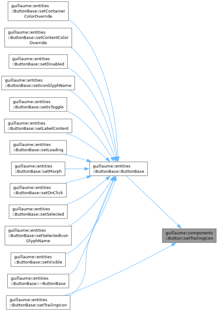
◆ setTrailingIcon()
| Button & guillaume::components::Button::setTrailingIcon | ( | bool | trailing | ) |
Choose on which side of the label the icon sits.
Read by systems::CommonButton only.
- Parameters
-
trailing True to place the icon after the label, false to place it before.
- Returns
- This component, for chaining.
Definition at line 160 of file button.cpp.

◆ setVisible()
| Button & guillaume::components::Button::setVisible | ( | bool | visible | ) |
Show or hide the button.
A hidden button ignores press and release. Only the floating action button systems also draw it transparent and without shadow; the other variants keep drawing it.
- Parameters
-
visible False to hide the button.
- Returns
- This component, for chaining.
Definition at line 188 of file button.cpp.


The documentation for this class was generated from the following files:
- headers/guillaume/components/button.hpp
- sources/components/button.cpp
