A Material 3 icon button: a small clickable container that shows a single icon and no label. More...
#include <headers/guillaume/entities/icon_button.hpp>


Classes | |
| class | Builder |
| Configures, creates and registers IconButton widgets. More... | |
Public Types | |
| using | Variant = components::IconButton::Variant |
| using | Size = components::IconButton::Size |
| Size: Small, Medium or Large (see components::IconButton::Size). | |
| Public Types inherited from guillaume::ecs::Entity | |
| using | Identifier = std::size_t |
| The key under which an entity's components are stored. Systems and components refer to entities by this value. | |
| using | Signature = std::bitset<128> |
| A set of component types, one bit per type (bit position given by ComponentTypeId, MaxComponentTypes bits). | |
Public Member Functions | |
| ~IconButton (void) override=default | |
| Default destructor. | |
| IconButton & | setVariant (const Variant &variant) |
| Set the color variant. Restyles at once. | |
| IconButton & | setSize (const Size &size) |
| Set the size, which decides the container and icon sizes. Restyles at once. | |
| Variant | getVariant (void) const |
| Get the color variant. | |
| Size | getSize (void) const |
| Get the size. | |
| Public Member Functions inherited from guillaume::entities::ButtonBase | |
| ~ButtonBase (void) override=default | |
| Default destructor. | |
| ButtonBase & | setIconGlyphName (const std::string &iconGlyphName) |
| Change the icon. | |
| ButtonBase & | setIconStyle (const components::Glyph::Style &iconStyle) |
| Change the style the icon glyph is drawn in. | |
| ButtonBase & | setLabelContent (const std::string &labelContent) |
| Change the text of the label. | |
| ButtonBase & | setIsToggle (const bool &isToggle) |
| Make the button a toggle, or a plain push button. | |
| bool | isSelected (void) const |
| Tell whether a toggle button is on. | |
| ButtonBase & | setSelected (const bool &selected) |
| Turn a toggle button on or off from code. | |
| ButtonBase & | setSelectedIconGlyphName (const std::string &selectedIconGlyphName) |
| Set the icon shown instead of the regular one while the button is selected. | |
| ButtonBase & | setMorph (const bool &isMorph) |
| Choose whether the button changes shape when selected, and restyle at once. | |
| ButtonBase & | setTrailingIcon (const bool &isTrailingIcon) |
| Put the icon before or after the label, and restyle at once. | |
| ButtonBase & | setDisabled (const bool &isDisabled) |
| Disable or enable the button, and restyle at once. | |
| bool | isDisabled (void) const |
| Tell whether the button is disabled. | |
| ButtonBase & | setAccessibilityLabel (const std::string &accessibilityLabel) |
| Set the name assistive tools announce for the button. | |
| const std::string & | getAccessibilityLabel (void) const |
| Get the name assistive tools announce for the button. | |
| ButtonBase & | setAccessibilityHint (const std::string &accessibilityHint) |
| Set the sentence that tells assistive tools what activating the button does. | |
| ButtonBase & | setAccessibilityRole (components::AccessibilityRole role) |
| Change the role announced by assistive tools. | |
| ButtonBase & | setOnLongPress (std::function< void(void)> onLongPress) |
| Set the function called when the user holds the button. | |
| ButtonBase & | setLoading (bool loading) |
| Show or hide the loading state. | |
| ButtonBase & | setVisible (bool visible) |
| Show or hide the button, and restyle at once. | |
| bool | isVisible (void) const |
| Tell whether the button is shown. | |
| bool | isLoading (void) const |
| Tell whether the button is in the loading state. | |
| ButtonBase & | setContainerColorOverride (std::optional< utility::graphic::Color32Bit > color) |
| Replace the theme's background color with a custom one, and restyle at once. | |
| ButtonBase & | setContentColorOverride (std::optional< utility::graphic::Color32Bit > color) |
| Replace the theme's icon and label color with a custom one, and restyle at once. | |
| const std::string & | getAccessibilityHint (void) const |
| Get the sentence that tells assistive tools what activating the button does. | |
| ButtonBase & | setOnClick (std::function< void(void)> onClick) |
| Set the function called when the user clicks the button. | |
| ecs::Entity::Identifier | getIconIdentifier (void) const |
| Get the icon child, to read or adjust its components. | |
| ecs::Entity::Identifier | getLabelIdentifier (void) const |
| Get the label child, to read or adjust its components. | |
| void | hoverHandler (void) |
| Tell the button a pointer started hovering it. | |
| void | unHoverHandler (void) |
| Tell the button a pointer stopped hovering it. | |
| void | buttonPressHandler (void) |
| Press the button from code, as the user would. | |
| void | buttonReleaseHandler (void) |
| Release the button from code, as the user would. | |
| Public Member Functions inherited from guillaume::ecs::ParentEntityFiller< components::Transform, components::Bound, components::Color, components::Borders, components::Focus, components::HandButtonInteraction, components::HandHoverInteraction, components::MouseHoverInteraction, components::MouseButtonInteraction, components::StyleState, components::Accessibility, components::Button > | |
| ParentEntityFiller (ComponentRegistry &componentRegistry) | |
| Create the entity, its listed components and its components::Hierarchy. It owns no child yet. | |
| virtual | ~ParentEntityFiller (void)=default |
| Destroy the entity object and release the children it owns; components stay in the registry (see EntityRegistry::removeEntity). | |
| Public Member Functions inherited from guillaume::ecs::Entity | |
| Entity (void) | |
| Create an entity with a fresh identifier, an empty signature, no parent and no component. | |
| virtual | ~Entity (void)=default |
| Destroy the entity object. | |
| Entity::Identifier | getIdentifier (void) const noexcept |
| Get the identifier of the entity. | |
| Entity::Signature | getSignature (void) const noexcept |
| Get the set of component types the entity declares. | |
| void | setSignature (const Signature &signature) |
| Replace the signature of the entity. | |
| std::int32_t | getLayer (void) const noexcept |
| Get the depth of the entity in the tree. | |
| Entity & | setParent (std::shared_ptr< Entity > parent) |
| Attach the entity under another one, or detach it. | |
| std::vector< Identifier > | releaseComponents (void) |
| Drop the entity's place in the tree and all its components. | |
| std::shared_ptr< Entity > | getParent (void) const noexcept |
| Get the parent entity. | |
| Public Member Functions inherited from guillaume::ecs::EntityRegistry | |
| EntityRegistry (void)=default | |
| Create a registry. | |
| virtual | ~EntityRegistry (void)=default |
| Virtual destructor. | |
| void | addEntity (std::shared_ptr< Entity > entity) |
| Make this registry own an entity, so that it stays alive and systems visit it. | |
| bool | removeEntity (Entity::Identifier identifier) |
| Remove an entity, with its children and all their components. | |
| void | clearEntities (void) |
| Remove every entity owned by this registry, with everything they own and all their components. | |
| const std::vector< std::shared_ptr< Entity > > & | getEntities (void) const |
| Get the entities this registry owns directly. | |
| std::vector< std::shared_ptr< Entity > > | getEntitiesBreadthFirst (void) |
| List every entity of this registry and of the registries nested in it, level by level. | |
| std::vector< std::shared_ptr< Entity > > | getEntitiesBreadthFirst (void) const |
| List every entity of this registry and of the registries nested in it, level by level (const overload). | |
| template<InheritFromEntity EntityType> | |
| std::shared_ptr< EntityType > | getEntity (Entity::Identifier identifier) |
| Find an entity owned directly by this registry, by identifier. | |
| template<InheritFromEntity EntityType> | |
| std::shared_ptr< const EntityType > | getEntity (Entity::Identifier identifier) const |
| Find an entity owned directly by this registry, by identifier (const overload). | |
| std::vector< Entity::Identifier > | getEntityWithSignature (Entity::Signature systemSignature) const |
| List the entities that have every component type of a signature, from the root down. | |
| std::vector< Entity::Identifier > | getEntityWithSignature (Entity::Signature systemSignature, const EntityTreeTraveler &traveler) const |
| List the entities that have every component type of a signature, in the order chosen by a traveler. | |
Static Public Member Functions | |
| template<typename... Arguments> | |
| static std::shared_ptr< IconButton > | create (Arguments &&...arguments) |
| Create an icon button and its icon child, without registering it in an entity registry. | |
| Static Public Member Functions inherited from guillaume::entities::ButtonBase | |
| static const utility::graphic::PoseF | applyLayerToPosition (const utility::graphic::PositionF &position, const utility::graphic::OrientationF &orientation, const std::uint32_t &layer) |
| Compute the pose of content drawn in front of a button. | |
| static utility::graphic::Color32Bit | applyStateAlpha (const utility::graphic::Color32Bit &color, std::uint8_t alpha) |
| Replace the alpha of a color and keep its red, green and blue. | |
| static utility::graphic::Color32Bit | applyStateLayer (const utility::graphic::Color32Bit &base, const utility::graphic::Color32Bit &overlay, std::uint8_t alpha) |
| Blend a translucent state layer (hover, press) over a container color. | |
| static utility::graphic::Color32Bit | getDisabledContainerColor (void) |
| Get the background color of a disabled button. | |
| static utility::graphic::Color32Bit | getDisabledContentColor (void) |
| Get the icon and label color of a disabled button. | |
| static utility::graphic::Color32Bit | getDisabledBorderColor (void) |
| Get the outline color of a disabled button. | |
| Static Public Member Functions inherited from guillaume::ecs::Entity | |
| template<InheritFromComponent... ComponentTypes> | |
| static Signature | getSignatureFromTypes (void) |
| Build the signature that has exactly the bits of the given component types. | |
Protected Member Functions | |
| float | getIconFontSize (void) const override |
| Get the font size of the icon child for the current size. | |
| bool | usesLabel (void) const override |
| Tell ButtonBase::build() that this variant has no label child. | |
| utility::graphic::Color32Bit | getInitialContentColor (void) const override |
| Get the color the icon child is created with. | |
| Protected Member Functions inherited from guillaume::entities::ButtonBase | |
| void | build (void) |
| Create the icon and label children, then style the button. | |
| ButtonBase (ecs::ComponentRegistry ®istry, const std::string &iconGlyphName, const components::Glyph::Style &iconStyle, const std::string &labelContent, bool isToggle, bool isMorph, bool isDisabled, bool isTrailingIcon, const std::string &accessibilityLabel, std::function< void(void)> onClick) | |
| Create the entity with its components and store the initial state. The children are created later, by build(). | |
| components::Button & | state (void) |
| Access the shared button state, for writing. | |
| const components::Button & | state (void) const |
| Access the shared button state, for reading. | |
| void | restyle (void) |
| Recompute colors and geometry now. | |
| virtual bool | usesIcon (void) const |
| Tell build() whether to create an icon child. | |
| bool | isHovered (void) |
| Tell whether a pointer is over the button. | |
| bool | isPressed (void) |
| Tell whether the button is held down. | |
| const std::string & | getActiveIconGlyphName (void) const |
| Get the glyph the icon child should show right now. | |
| void | applyTouchTarget (float width, float height) |
| Make a small button easier to hit. | |
| void | syncAccessibilityState (void) |
| Copy the current state to the icon child and to Accessibility. | |
| utility::graphic::Color32Bit | resolveContainerColor (const utility::graphic::Color32Bit &color) const |
| Pick the background color to paint. | |
| utility::graphic::Color32Bit | resolveContentColor (const utility::graphic::Color32Bit &color) const |
| Pick the icon and label color to paint. | |
| Protected Member Functions inherited from guillaume::ecs::ParentEntityFiller< components::Transform, components::Bound, components::Color, components::Borders, components::Focus, components::HandButtonInteraction, components::HandHoverInteraction, components::MouseHoverInteraction, components::MouseButtonInteraction, components::StyleState, components::Accessibility, components::Button > | |
| ComponentRegistry & | getComponentRegistry (void) |
| Get the registry that stores this entity's components. | |
| Protected Member Functions inherited from guillaume::ecs::ParentEntity | |
| std::vector< std::shared_ptr< Entity > > & | accessDirectEntities (void) override |
| Give access to the list of entities this entity owns directly. | |
| const std::vector< std::shared_ptr< Entity > > & | accessDirectEntities (void) const override |
| Give read access to the list of entities this entity owns directly. | |
| Protected Member Functions inherited from guillaume::ecs::Entity | |
| void | attachHierarchy (ComponentRegistry &componentRegistry) |
| Give the entity a components::Hierarchy in a registry and add that component to its signature. | |
| template<InheritFromComponent... ComponentTypes> | |
| void | setSignature (void) |
| Replace the signature by the one made of the given component types. | |
Additional Inherited Members | |
| Static Public Attributes inherited from guillaume::entities::ButtonBase | |
| static constexpr const char * | LoadingGlyph |
| Name of the glyph the icon child shows while loading. | |
| static constexpr std::chrono::milliseconds | LongPressDuration |
| How long a press must last to count as a long press (500 ms). | |
| Static Public Attributes inherited from guillaume::ecs::Entity | |
| static constexpr Identifier | InvalidIdentifier |
| "No entity": never the identifier of a real entity | |
| Static Protected Attributes inherited from guillaume::entities::ButtonBase | |
| static constexpr float | _layerDepthStep |
| Depth between two layers, toward the viewer. | |
Detailed Description
A Material 3 icon button: a small clickable container that shows a single icon and no label.
The state shared by every button (icon, toggle, callbacks) lives in components::Button, and systems::Button turns input into clicks in the Event phase. What is specific to this variant (color variant, size) lives in components::IconButton; systems::IconButton colors the container, sizes it and centers the icon each frame, in the Layout phase. The class itself holds no field: its setters write the component and restyle at once.
IconButton::create(registry, iconGlyphName, selectedIconGlyphName, iconStyle, isToggle, variant, size, isDisabled, accessibilityLabel, onClick) builds the same widget without registering it in an entity registry.
The button owns its icon child: it is the entity registry the icon is registered in. Its Bound is written each frame from its size, so a size set by hand on the Bound is overwritten. It has no text, so give it an accessibility label. setSelected() does not call the click handler; only a user click does.
Definition at line 76 of file icon_button.hpp.
Member Typedef Documentation
◆ Size
Size: Small, Medium or Large (see components::IconButton::Size).
Definition at line 84 of file icon_button.hpp.
◆ Variant
Color variant: Standard, Filled, Tonal or Outlined (see components::IconButton::Variant).
Definition at line 81 of file icon_button.hpp.
Member Function Documentation
◆ create()
|
inlinestatic |
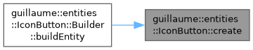
Create an icon button and its icon child, without registering it in an entity registry.
The constructor is private because the icon needs a button already held by a std::shared_ptr as parent: create() constructs the button then calls build(), which creates the icon.
- Template Parameters
-
Arguments The types of the constructor arguments.
- Parameters
-
arguments The arguments forwarded to the constructor: (registry, iconGlyphName, selectedIconGlyphName, iconStyle, isToggle, variant, size, isDisabled, accessibilityLabel, onClick).
- Returns
- The new icon button.
Definition at line 270 of file icon_button.hpp.
◆ getIconFontSize()
|
overrideprotectedvirtual |
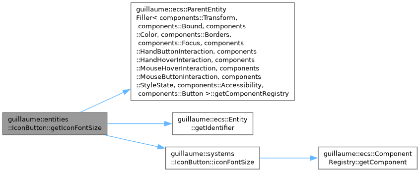
Get the font size of the icon child for the current size.
- Returns
- The icon font size, in dp.
Implements guillaume::entities::ButtonBase.
Definition at line 160 of file icon_button.cpp.
◆ getInitialContentColor()
|
overrideprotectedvirtual |
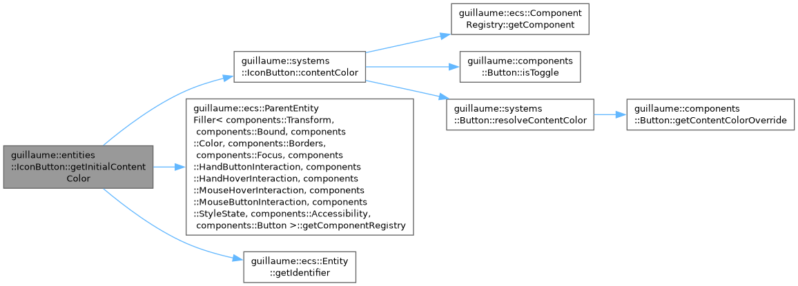
Get the color the icon child is created with.
- Returns
- The resting content color of the current variant.
Implements guillaume::entities::ButtonBase.
Definition at line 166 of file icon_button.cpp.
◆ getSize()
| IconButton::Size guillaume::entities::IconButton::getSize | ( | void | ) | const |
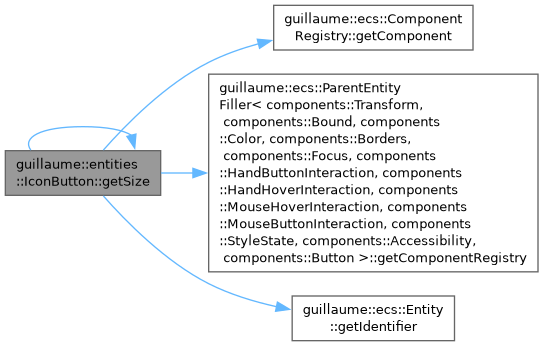
Get the size.
- Returns
- The size stored in components::IconButton.
Definition at line 197 of file icon_button.cpp.
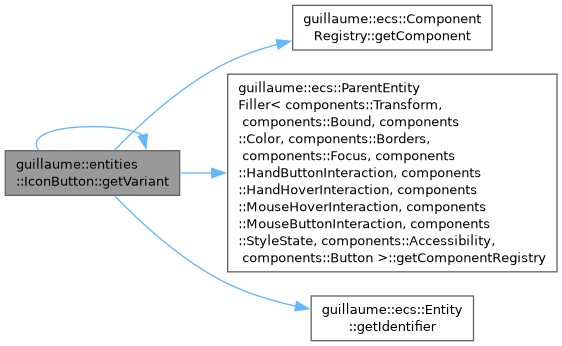
◆ getVariant()
| IconButton::Variant guillaume::entities::IconButton::getVariant | ( | void | ) | const |
Get the color variant.
- Returns
- The variant stored in components::IconButton.
Definition at line 190 of file icon_button.cpp.
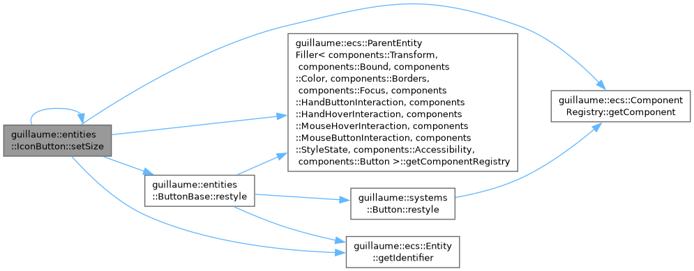
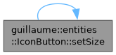
◆ setSize()
| IconButton & guillaume::entities::IconButton::setSize | ( | const Size & | size | ) |
Set the size, which decides the container and icon sizes. Restyles at once.
- Parameters
-
size The new size.
- Returns
- Reference to this icon button for chaining.
Definition at line 181 of file icon_button.cpp.
◆ setVariant()
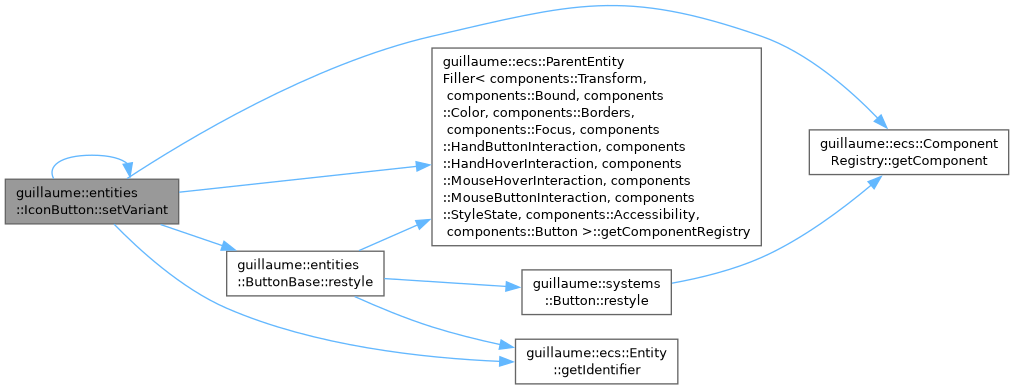
| IconButton & guillaume::entities::IconButton::setVariant | ( | const Variant & | variant | ) |
Set the color variant. Restyles at once.
- Parameters
-
variant The new color variant.
- Returns
- Reference to this icon button for chaining.
Definition at line 172 of file icon_button.cpp.
◆ usesLabel()
|
inlineoverrideprotectedvirtual |
Tell ButtonBase::build() that this variant has no label child.
- Returns
- Always false.
Reimplemented from guillaume::entities::ButtonBase.
Definition at line 243 of file icon_button.hpp.
The documentation for this class was generated from the following files:
- headers/guillaume/entities/icon_button.hpp
- sources/entities/icon_button.cpp
