State. Every class here is plain data attached to an entity. More...
Classes | |
| struct | AccessibilityValue |
| Position of a control within a range, such as a slider or a progress bar. Accessibility::setValue requires min <= now <= max. More... | |
| class | Accessibility |
| What an entity means to a user who does not see it: its name, its role, its state and its place in the keyboard traversal. More... | |
| class | Animation |
| A timer that runs from 0 to a duration and reports its eased progress, from 0 to 1, to a callback on every frame. More... | |
| class | AppBar |
| State of an app bar: the strip that carries a screen's title, its navigation icon and its action icons. More... | |
| class | Arc |
| A portion of a ring: the moving part of a circular progress or loading indicator. More... | |
| class | Backdrop |
| State of a modal backdrop, the dimming layer behind a dialog or a drawer: whether it is shown and how far its fade-in has progressed. More... | |
| class | Badge |
| State of a badge: a small dot or pill, usually holding a count, drawn over another widget. More... | |
| class | Borders |
| Corner radii and outline stroke of a rectangular entity. More... | |
| class | Bound |
| Size of an entity: the width and height, in dp, of the rectangle that starts at the position of its components::Transform. More... | |
| class | Button |
| State shared by every pressable button, whatever its look. More... | |
| class | ButtonInteraction |
| Which buttons of an input device are held on an entity, and what to call when one is pressed or released on it. More... | |
| class | Card |
| State of a card: a surface grouping an optional cover image, title, text and row of action buttons. More... | |
| class | Checkbox |
| State of a checkbox: checked state, variant, label, color overrides and the identifiers of its check glyph and label children. More... | |
| class | Chip |
| Configuration of a chip: a compact pill with a label and optional leading, check and close icons. More... | |
| class | Clip |
| Asks that drawing be cut to the entity's rectangle, and holds the rectangle that results. More... | |
| class | Color |
| Main color of an entity: the fill of a shape, or the ink of a text or an icon. More... | |
| class | CommonButton |
| Look of a Material 3 common button: color style, corner shape, size and padding options. More... | |
| class | Dialog |
| State of a dialog: a modal panel with an optional icon, a title, a message and a row of text buttons. More... | |
| class | Divider |
| State of a divider: a thin horizontal line separating content. More... | |
| class | DragInteraction |
| State of a drag gesture on an entity: whether it is in progress, how far the pointer moved since the previous motion event, and the callbacks for its start, its moves and its end. More... | |
| class | Elevation |
| Soft shadow drawn around an elevated surface. More... | |
| class | Ellipse |
| Marks an entity as a filled ellipse: a dot, a switch thumb, a disc. More... | |
| class | ExtendedFloatingActionButton |
| Look of a Material 3 extended floating action button: a FAB that shows a label next to its icon and can collapse to the icon alone. More... | |
| class | FloatingActionButton |
| Look of a Material 3 floating action button (FAB): color variant, size and shadow. More... | |
| class | FloatingActionButtonMenu |
| State of a floating action button menu (speed dial): a trigger button that expands into a column of action buttons above it. More... | |
| class | Focus |
| Makes an entity able to own the input focus, and holds whether it owns it and what to call when it gains or loses it. More... | |
| class | Glyph |
| An icon: one glyph of the Material Symbols font, chosen by name, at a given size. More... | |
| class | HandHoverInteraction |
| Whether an XR hand (controller) aims at an entity, what to call when the aim enters or leaves, and how far the hit area extends past the bound. More... | |
| class | HandPinchInteraction |
| Whether an XR hand pinches while pointing at an entity, and what to call when it does. More... | |
| class | HandPokeInteraction |
| Whether an XR hand pokes an entity (touches it with a finger), and what to call when it does. More... | |
| class | HandSqueezeInteraction |
| Marks an entity as a target of XR hand squeeze (grip) input and stores the callback for it. More... | |
| class | HandThumbRestInteraction |
| Marks an entity as a target of XR controller thumb rest input and stores the callback for it. More... | |
| class | HandThumbStickInteraction |
| Marks an entity as a target of XR controller thumb stick input and stores the callback for it. More... | |
| class | HandTriggerInteraction |
| Marks an entity as a target of XR controller trigger input and stores the callback for it. More... | |
| class | Hierarchy |
| Place of an entity in the entity tree: its parent, its direct children and its depth. More... | |
| class | IconButton |
| Look of a Material 3 icon button: color variant and size. More... | |
| class | Image |
| A picture drawn in the entity's rectangle: the texture to show, a fallback texture, and whether loading succeeded. More... | |
| class | InteractionBase |
| The part shared by every Interaction: one callback to run when the input the component stands for reaches the entity. More... | |
| class | Interaction |
| Component that makes an entity react to one kind of input event (a hand pinch, a hand poke, a trigger pull, ...). More... | |
| class | Interaction< EventType, false > |
| Interaction for an event type without nested Factory type. More... | |
| class | Interaction< EventType, true > |
| Interaction for an event type that declares a nested Factory type. More... | |
| class | Layout |
| How a container arranges its children: in a row or a column, with which alignment, spacing and padding, and at which size. More... | |
| class | LayoutExtent |
| Space a widget takes in its parent's layout beyond its Bound. More... | |
| class | Line |
| A straight stroke across the width of the entity: a divider, an indicator, the underline of a text field. More... | |
| class | List |
| State of a list: a column of rows, each with a headline and optional supporting text, icons or image, plus subheaders, dividers and accordions. More... | |
| class | LoadingIndicator |
| State of a loading indicator: an arc that turns, or a bar that slides, in a loop while something is in progress. More... | |
| class | Menu |
| State of a menu: a floating list of choices that opens next to an anchor. More... | |
| class | Mesh |
| A 3D model shown at the entity's pose: the model file and an optional texture. More... | |
| class | MouseHoverInteraction |
| Whether the mouse pointer is over an entity, what to call when it enters or leaves, and how far the hit area extends past the bound. More... | |
| class | NavigationBar |
| State of a navigation bar: the bottom strip of three to five destinations that switches between the top-level views of an app. More... | |
| class | NavigationBarDestination |
| State of one destination of a navigation bar: an icon in a pill, a label under it and an optional badge. More... | |
| class | NavigationDrawer |
| State of a navigation drawer: the side sheet that lists the destinations of an app, grouped by section headers and dividers. More... | |
| class | NavigationDrawerDestination |
| State of one destination of a navigation drawer: an icon, a label and an optional text at the trailing edge. More... | |
| class | Overlay |
| Marks an entity as something shown temporarily above the rest of the interface (a dialog, a menu, a drawer, a snackbar, a tooltip) and holds how it is dismissed. More... | |
| class | ProgressIndicator |
| State of a progress indicator: a bar or a ring that fills up with a value from 0 to 1, or loops when the value is unknown. More... | |
| class | RadioButton |
| Configuration of a radio button: its variant, its label and the identifiers of its dot and label children. More... | |
| class | RadioGroup |
| State of a radio group: a column of radio buttons of which at most one is selected. More... | |
| class | Range |
| An interval [low, high] kept inside a range, with a callback run when it changes. More... | |
| class | Ring |
| A full ring: the outline of a radio button, the track of a circular progress indicator. More... | |
| class | Scrim |
| A translucent veil drawn over the whole bound of its entity, to dim what is behind a modal surface. More... | |
| class | Scrollable |
| How far the content of an entity is scrolled, how large that content is, and how fast the mouse wheel scrolls it. More... | |
| class | Search |
| State of a search field: a leading icon, the query the user types (or a placeholder), then a clear button or a loading glyph and an optional trailing icon. More... | |
| class | SegmentedButton |
| State of a segmented button: a row of joined toggle buttons of which one (or several) can be selected. More... | |
| class | Selectable |
| Selected/unselected flag of an entity, with a callback run when it changes. More... | |
| class | SelectionGroup |
| Marks an entity whose Selectable children are mutually exclusive, and remembers which one is selected. More... | |
| class | Snackbar |
| State of a snackbar: a short message at the bottom of the screen, with an optional action, that goes away by itself. More... | |
| class | StyleState |
| The interaction state of an entity in one place: enabled or disabled, and whether it is hovered, pressed, focused or dragged. More... | |
| class | SurfaceTone |
| State of a tonal surface: how high it sits above the background, and whether it casts a shadow. More... | |
| class | Switch |
| Configuration of a switch: its variant, its thumb icon, its label and the identifiers of its thumb, icon and label children. More... | |
| class | Text |
| A run of text: its content, its font metrics and the position of the editing cursor. More... | |
| class | TextField |
| The texts around the input of a text field, and its error state: placeholder, label, supporting text, prefix, suffix and error text. More... | |
| class | TextFieldConfiguration |
| State of a text field widget that is not text around the input: its variant, icons, flags, width, callbacks and the identifiers of its children. More... | |
| class | Tooltip |
| State of a tooltip: a small label that appears under an entity (its anchor) after the pointer has rested on it. More... | |
| class | Transform |
| Where an entity is in space: its pose (position and orientation) and its scale. More... | |
| class | Typography |
| Which typescale role a text uses (BodyMedium, TitleLarge, ...) and an optional explicit size. More... | |
| class | Value |
| A number kept inside a range, with a callback run when it changes. More... | |
Concepts | |
| concept | IsEnum |
| True when a type is an enumeration. | |
| concept | HasFactoryType |
| True when an event type declares a nested Factory type. | |
Typedefs | |
| using | HandButtonInteraction |
| Which XR controller buttons are held on an entity, with a press and a release handler per button. | |
| using | MouseButtonInteraction |
| Which mouse buttons are held on an entity, with a press and a release handler per button. | |
Enumerations | |
| enum class | AccessibilityRole { None , Button , Checkbox , Radio , RadioGroup , Switch , Tab , TabList , Header , Alert , ProgressBar , Slider , TextField , Search , ListItem , Menu , MenuItem , Dialog , Image , Text } |
| What an entity is for a screen reader or another assistive technology. The values mirror react-native-paper's accessibilityRole. More... | |
| enum class | CheckedState { Unchecked , Checked , Mixed } |
| Checked state of a control that can be ticked (checkbox, radio button, switch). More... | |
| enum class | LiveRegion { None , Polite , Assertive } |
| How urgently a change of the entity is announced to the user. More... | |
Functions | |
| std::ostream & | operator<< (std::ostream &stream, const Borders &borders) |
| Print the four corner radii, for logs and test failures. | |
Variables | |
| constexpr std::array< utility::event::HandButtonEvent::Button, 6 > | HandButtons |
| The XR controller buttons a HandButtonInteraction tracks. | |
| constexpr std::array< utility::event::MouseButtonEvent::Button, 5 > | MouseButtons |
| The mouse buttons a MouseButtonInteraction tracks. | |
Detailed Description
State. Every class here is plain data attached to an entity.
Components hold no rule: their setters store a value and mark the component changed, nothing else. Three kinds live here:
- Geometry and appearance read by the render systems: Transform, Bound, Color, Borders, Elevation, Text, Glyph, ...
- Interaction state written by the input systems: Focus, StyleState, the hover and button interaction components, Selectable.
- Widget configuration, one per widget, named after it: Checkbox, Button, Menu, ... Each is read by the system of the same name.
components::Hierarchy mirrors the entity tree (parent, children, depth) so systems can walk it from identifiers.
Typedef Documentation
◆ HandButtonInteraction
Which XR controller buttons are held on an entity, with a press and a release handler per button.
systems::HandButton writes it in the Event phase: it tests the aim ray carried by each hand button event against the entity's Transform and Bound. Button A is the primary one: systems::StyleState and systems::Drag read its pressed state, and systems::interaction::makeInteractive wires the widget action to it. systems::Focus gives the focus on A, B, X or Y.
- See also
- ButtonInteraction for the members, systems::HandButton
Definition at line 64 of file hand_button_interaction.hpp.
◆ MouseButtonInteraction
Which mouse buttons are held on an entity, with a press and a release handler per button.
systems::MouseButton writes it in the Event phase: it casts a ray from the pointer position of each mouse button event and tests it against the entity's Transform and Bound. The left button is the primary one: systems::StyleState, systems::Focus and systems::Drag read its pressed state.
- See also
- ButtonInteraction for the members, systems::MouseButton
Definition at line 62 of file mouse_button_interaction.hpp.
Enumeration Type Documentation
◆ AccessibilityRole
|
strong |
What an entity is for a screen reader or another assistive technology. The values mirror react-native-paper's accessibilityRole.
| Enumerator | |
|---|---|
| None | No semantic role (decorative or container). |
| Button | Pressable button. |
| Checkbox | Two- or three-state checkbox. |
| Radio | Radio button. |
| RadioGroup | Group of radio buttons. |
| Switch | On/off switch. |
| Tab | Navigation destination. |
| TabList | Group of navigation destinations. |
| Header | Heading (app bar title, list subheader). |
| Alert | Live announcement (snackbar). |
| ProgressBar | Determinate or indeterminate progress. |
| Slider | Adjustable value. |
| TextField | Editable text. |
| Search | Search field. |
| ListItem | Row of a list. |
| Menu | Menu container. |
| MenuItem | Menu entry. |
| Dialog | Modal dialog. |
| Image | Image or icon with meaning. |
| Text | Static text. |
Definition at line 37 of file accessibility.hpp.
◆ CheckedState
|
strong |
Checked state of a control that can be ticked (checkbox, radio button, switch).
| Enumerator | |
|---|---|
| Unchecked | Not checked. |
| Checked | Checked. |
| Mixed | Indeterminate: neither checked nor unchecked. |
Definition at line 64 of file accessibility.hpp.
◆ LiveRegion
|
strong |
How urgently a change of the entity is announced to the user.
| Enumerator | |
|---|---|
| None | Changes are not announced. |
| Polite | Announced once the current speech is over. |
| Assertive | Announced at once, interrupting the current speech. |
Definition at line 73 of file accessibility.hpp.
Function Documentation
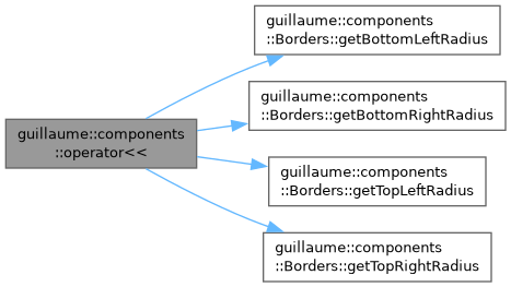
◆ operator<<()
| std::ostream & guillaume::components::operator<< | ( | std::ostream & | stream, |
| const Borders & | borders ) |
Print the four corner radii, for logs and test failures.
The output is Borders(topLeft, topRight, bottomRight, bottomLeft); the stroke color and width are not printed.
- Parameters
-
stream The stream to write to. borders The borders to print.
- Returns
stream, for chaining.
Definition at line 193 of file borders.cpp.
Variable Documentation
◆ HandButtons
|
inlineconstexpr |
The XR controller buttons a HandButtonInteraction tracks.
Definition at line 38 of file hand_button_interaction.hpp.
◆ MouseButtons
|
inlineconstexpr |
The mouse buttons a MouseButtonInteraction tracks.
Definition at line 38 of file mouse_button_interaction.hpp.
