Look of a Material 3 common button: color style, corner shape, size and padding options. More...
#include <headers/guillaume/components/common_button.hpp>
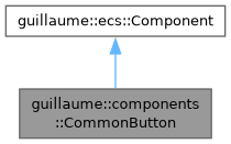
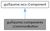
Classes | |
| struct | Corners |
| Radius of each corner, for a button joined to its neighbours (a segment of a segmented button). More... | |
Public Types | |
| enum class | Color { Elevated , Filled , Tonal , Outlined , Text , Segmented } |
| Which theme colors fill the container, the content and the outline. More... | |
| enum class | Shape { Round , Square } |
| Corner shape at rest: fully rounded (Round) or the rounded rectangle of the size (Square). More... | |
| enum class | Size { ExtraSmall , Small , Medium , Large , ExtraLarge } |
| Size step. It sets the padding, the icon size, the gap between icon and label and the corner radius; the label always uses the label-large type role. More... | |
Public Member Functions | |
| CommonButton (void)=default | |
| Create the configuration of a small, round text button. | |
| ~CommonButton (void)=default | |
| Default destructor. | |
| Color | getColorStyle (void) const noexcept |
| Get the color style. | |
| CommonButton & | setColorStyle (Color style) |
| Choose which theme colors the button uses. | |
| Shape | getShape (void) const noexcept |
| Get the corner shape at rest. | |
| CommonButton & | setShape (Shape shape) |
| Choose the corner shape at rest. | |
| Size | getSize (void) const noexcept |
| Get the size step. | |
| CommonButton & | setSize (Size size) |
| Choose the size step. | |
| bool | isCompact (void) const noexcept |
| Check whether the horizontal padding is halved. | |
| CommonButton & | setCompact (bool compact) |
| Halve the horizontal padding, or restore it. | |
| float | getMinWidth (void) const noexcept |
| Get the requested minimum width. | |
| CommonButton & | setMinWidth (float width) |
| Request a minimum container width. | |
| bool | isUppercase (void) const noexcept |
| Check whether the label is drawn in upper case. | |
| CommonButton & | setUppercase (bool uppercase) |
| Draw the label in upper case, or as written. | |
| const std::optional< Corners > & | getCorners (void) const noexcept |
| Get the per-corner radius override. | |
| CommonButton & | setCorners (const std::optional< Corners > &corners) |
| Override the radius of each corner. | |
| Public Member Functions inherited from guillaume::ecs::Component | |
| bool | hasChanged (void) const |
| Tell whether a value of the component changed since the flags were last reset (the end of the previous frame). | |
| void | setHasChanged (bool hasChanged) |
| Raise or lower the changed flag. | |
| Component (void)=default | |
| Create a component that is not marked as changed. | |
| virtual | ~Component (void)=default |
| Virtual destructor, so components can be destroyed through the base class. | |
Static Public Attributes | |
| static constexpr float | MinWidth = 64.0f |
| Minimum width of the container, in dp. | |
| static constexpr float | MinHeight = 40.0f |
Detailed Description
Look of a Material 3 common button: color style, corner shape, size and padding options.
It sits on the same entity as components::Button, which holds the content and the interaction state. entities::Button writes it; systems::CommonButton reads both, each frame in the Layout phase and at once after every input change, and writes the button's Color, Borders, Elevation and Bound and the pose of its icon and label.
Every setter compares before writing and marks the component changed only when the value differs.
Definition at line 55 of file common_button.hpp.
Member Enumeration Documentation
◆ Color
|
strong |
Which theme colors fill the container, the content and the outline.
Elevated, Filled and Tonal have a filled container; Outlined has a transparent container and an outline; Text has neither. Segmented is the style of one segment of a segmented button: outlined, and filled while selected without losing its outline.
Definition at line 67 of file common_button.hpp.
◆ Shape
|
strong |
Corner shape at rest: fully rounded (Round) or the rounded rectangle of the size (Square).
Definition at line 73 of file common_button.hpp.
◆ Size
|
strong |
Size step. It sets the padding, the icon size, the gap between icon and label and the corner radius; the label always uses the label-large type role.
Definition at line 80 of file common_button.hpp.
Member Function Documentation
◆ getColorStyle()
|
noexcept |
Get the color style.
- Returns
- The style (Text by default).
Definition at line 29 of file common_button.cpp.
◆ getCorners()
|
noexcept |
Get the per-corner radius override.
- Returns
- The corners, or std::nullopt when the shape decides the radius.
Definition at line 114 of file common_button.cpp.
◆ getMinWidth()
|
noexcept |
Get the requested minimum width.
- Returns
- The width, in dp; 0 when only MinWidth applies.
Definition at line 85 of file common_button.cpp.
◆ getShape()
|
noexcept |
Get the corner shape at rest.
- Returns
- The shape (Round by default).
Definition at line 43 of file common_button.cpp.
◆ getSize()
|
noexcept |
Get the size step.
- Returns
- The size (Small by default).
Definition at line 57 of file common_button.cpp.
◆ isCompact()
|
noexcept |
Check whether the horizontal padding is halved.
- Returns
- True when compact.
Definition at line 71 of file common_button.cpp.
◆ isUppercase()
|
noexcept |
Check whether the label is drawn in upper case.
- Returns
- True when the label is upper-cased.
Definition at line 99 of file common_button.cpp.
◆ setColorStyle()
| CommonButton & guillaume::components::CommonButton::setColorStyle | ( | Color | style | ) |
Choose which theme colors the button uses.
- Parameters
-
style The color style.
- Returns
- This component, for chaining.
Definition at line 34 of file common_button.cpp.

◆ setCompact()
| CommonButton & guillaume::components::CommonButton::setCompact | ( | bool | compact | ) |
Halve the horizontal padding, or restore it.
- Parameters
-
compact True for half the horizontal padding of the size.
- Returns
- This component, for chaining.
Definition at line 76 of file common_button.cpp.

◆ setCorners()
| CommonButton & guillaume::components::CommonButton::setCorners | ( | const std::optional< Corners > & | corners | ) |
Override the radius of each corner.
systems::SegmentedButton sets it on each segment so that only the outer corners of the group are rounded.
- Parameters
-
corners The corners, or std::nullopt to let the shape decide.
- Returns
- This component, for chaining.
Definition at line 120 of file common_button.cpp.

◆ setMinWidth()
| CommonButton & guillaume::components::CommonButton::setMinWidth | ( | float | width | ) |
Request a minimum container width.
The container is as wide as the largest of its padded content, MinWidth and this value.
- Parameters
-
width The minimum width, in dp.
- Returns
- This component, for chaining.
Definition at line 90 of file common_button.cpp.

◆ setShape()
| CommonButton & guillaume::components::CommonButton::setShape | ( | Shape | shape | ) |
Choose the corner shape at rest.
While pressed the button takes the pressed radius of its size whatever the shape, and a selected toggle with Button::setMorph(true) draws the opposite shape.
- Parameters
-
shape Round or Square.
- Returns
- This component, for chaining.
Definition at line 48 of file common_button.cpp.

◆ setSize()
| CommonButton & guillaume::components::CommonButton::setSize | ( | Size | size | ) |
Choose the size step.
- Parameters
-
size The size; it drives padding, icon size and radius.
- Returns
- This component, for chaining.
Definition at line 62 of file common_button.cpp.

◆ setUppercase()
| CommonButton & guillaume::components::CommonButton::setUppercase | ( | bool | uppercase | ) |
Draw the label in upper case, or as written.
The text stored in components::Button is left as written; only the label child receives the upper-cased copy.
- Parameters
-
uppercase True to upper-case the label.
- Returns
- This component, for chaining.
Definition at line 104 of file common_button.cpp.

Member Data Documentation
◆ MinHeight
|
staticconstexpr |
Minimum height of the container, in dp. ExtraSmall buttons are exempt.
Definition at line 87 of file common_button.hpp.
◆ MinWidth
|
staticconstexpr |
Minimum width of the container, in dp.
Definition at line 83 of file common_button.hpp.
The documentation for this class was generated from the following files:
- headers/guillaume/components/common_button.hpp
- sources/components/common_button.cpp
