Helpers of the namespace systems::interaction: what "pressable" means for a widget, and how its input state becomes a color. More...
#include <functional>#include <utility/graphic/color.hpp>#include "guillaume/components/accessibility.hpp"#include "guillaume/ecs/component_registry.hpp"#include "guillaume/ecs/entity.hpp"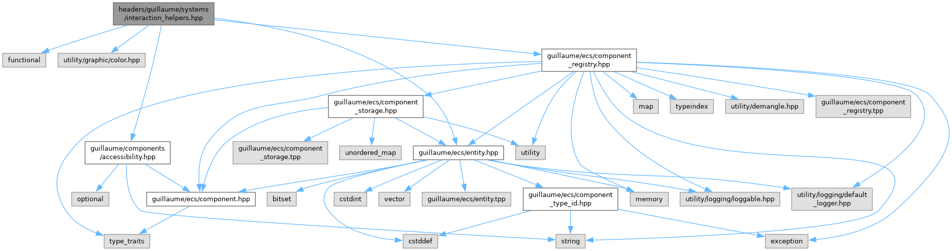

Go to the source code of this file.
Namespaces | |
| namespace | guillaume |
| A C++20 UI framework for desktop and XR, built as an entity-component-system. | |
| namespace | guillaume::systems |
| Rules. Every class here runs each frame on the entities that have the components it declares. | |
Functions | |
| void | guillaume::systems::interaction::makeInteractive (ecs::ComponentRegistry ®istry, const ecs::Entity::Identifier &entityIdentifier, components::AccessibilityRole role, std::function< void(void)> onPress, std::function< void(void)> onStateChange={}) |
| Make an entity hoverable, pressable and focusable. | |
| void | guillaume::systems::interaction::setEnabled (ecs::ComponentRegistry ®istry, const ecs::Entity::Identifier &entityIdentifier, bool enabled) |
| Enable or disable an entity. | |
| bool | guillaume::systems::interaction::isEnabled (const ecs::ComponentRegistry ®istry, const ecs::Entity::Identifier &entityIdentifier) |
| Whether an entity accepts input. | |
| bool | guillaume::systems::interaction::isHovered (const ecs::ComponentRegistry ®istry, const ecs::Entity::Identifier &entityIdentifier) |
| Whether the mouse pointer or a hand is over an entity. | |
| bool | guillaume::systems::interaction::isPressed (const ecs::ComponentRegistry ®istry, const ecs::Entity::Identifier &entityIdentifier) |
| Whether an entity is being pressed. | |
| utility::graphic::Color32Bit | guillaume::systems::interaction::stateLayerColor (const ecs::ComponentRegistry ®istry, const ecs::Entity::Identifier &entityIdentifier, const utility::graphic::Color32Bit &base, const utility::graphic::Color32Bit &content) |
| Container color of a widget in its current input state. | |
Detailed Description
Helpers of the namespace systems::interaction: what "pressable" means for a widget, and how its input state becomes a color.
Contents:
- makeInteractive(): gives an entity the components that make it hoverable, pressable and focusable, and wires its handlers.
- setEnabled(), isEnabled(), isHovered(), isPressed(): the input state of an entity, read from its components.
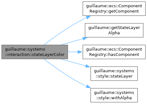
- stateLayerColor(): the container color of a widget with the tint of its current state (hovered, focused, pressed, dragged).
Used by widget systems such as systems::Checkbox, RadioButton, Switch, Chip, Card, List and Menu: typically their install calls makeInteractive() once, and their apply calls the others each time the widget is styled.
Definition in file interaction_helpers.hpp.
Function Documentation
◆ isEnabled()
| bool guillaume::systems::interaction::isEnabled | ( | const ecs::ComponentRegistry & | registry, |
| const ecs::Entity::Identifier & | entityIdentifier ) |
Whether an entity accepts input.
- Parameters
-
registry The registry holding the components. entityIdentifier The entity to test.
- Returns
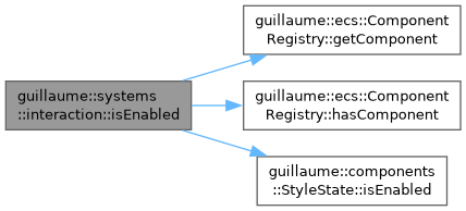
- True when the entity has no components::StyleState or an enabled one.
Definition at line 112 of file interaction_helpers.cpp.
◆ isHovered()
| bool guillaume::systems::interaction::isHovered | ( | const ecs::ComponentRegistry & | registry, |
| const ecs::Entity::Identifier & | entityIdentifier ) |
Whether the mouse pointer or a hand is over an entity.
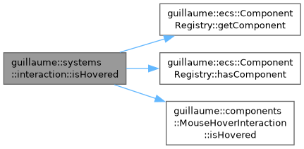
Reads components::MouseHoverInteraction and HandHoverInteraction directly, so the answer is that of the current frame.
- Parameters
-
registry The registry holding the components. entityIdentifier The entity to test.
- Returns
- True when the entity is enabled and one of its hover components is hovered. False when it has neither.
Definition at line 120 of file interaction_helpers.cpp.
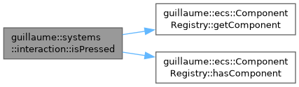
◆ isPressed()
| bool guillaume::systems::interaction::isPressed | ( | const ecs::ComponentRegistry & | registry, |
| const ecs::Entity::Identifier & | entityIdentifier ) |
Whether an entity is being pressed.
Reads components::MouseButtonInteraction (left button) and HandButtonInteraction (button A) directly. Pinch and poke are not taken into account here; components::StyleState covers them.
- Parameters
-
registry The registry holding the components. entityIdentifier The entity to test.
- Returns
- True when the entity is enabled and one of those buttons is held on it. False when it has neither component.
Definition at line 142 of file interaction_helpers.cpp.
◆ makeInteractive()
| void guillaume::systems::interaction::makeInteractive | ( | ecs::ComponentRegistry & | registry, |
| const ecs::Entity::Identifier & | entityIdentifier, | ||
| components::AccessibilityRole | role, | ||
| std::function< void(void)> | onPress, | ||
| std::function< void(void)> | onStateChange = {} ) |
Make an entity hoverable, pressable and focusable.
Adds, when missing, components::StyleState, Focus, Accessibility (its role is set to role), MouseHoverInteraction, HandHoverInteraction, MouseButtonInteraction and HandButtonInteraction, then sets these handlers, replacing any already set for the same event:
- hover and unhover (mouse and hand) call
onStateChange; - pressing the left mouse button or hand button A calls
onStateChange; - releasing either calls
onPressthenonStateChange, unless the entity is disabled, in which case neither is called.
The input systems then keep those components up to date each frame.
- Note
- The handlers are stored in the components and run in later frames: capture the registry and the identifier, not references to components or locals. The registry must outlive the entity.
- Parameters
-
registry The registry holding the components. entityIdentifier The entity to make interactive. role What the entity is for assistive technology (button, checkbox, ...). onPress Called when the entity is activated. May be empty. onStateChange Called when the hover or press state changes, so the widget can restyle at once. May be empty.
Definition at line 51 of file interaction_helpers.cpp.
◆ setEnabled()
| void guillaume::systems::interaction::setEnabled | ( | ecs::ComponentRegistry & | registry, |
| const ecs::Entity::Identifier & | entityIdentifier, | ||
| bool | enabled ) |
Enable or disable an entity.
Writes the enabled flag of its components::StyleState, adding the component when missing. Disabling also clears the hovered, pressed, focused and dragged flags, and the input systems skip the entity until it is enabled again. The component is marked changed only when a flag really changes.
- Parameters
-
registry The registry holding the components. entityIdentifier The entity to enable or disable. enabled True to accept input, false to ignore it.
Definition at line 104 of file interaction_helpers.cpp.
◆ stateLayerColor()
| utility::graphic::Color32Bit guillaume::systems::interaction::stateLayerColor | ( | const ecs::ComponentRegistry & | registry, |
| const ecs::Entity::Identifier & | entityIdentifier, | ||
| const utility::graphic::Color32Bit & | base, | ||
| const utility::graphic::Color32Bit & | content ) |
Container color of a widget in its current input state.
Material 3 shows hover, focus, press and drag by blending a translucent layer of the content color over the container (the "state layer"). This picks the layer of the entity and blends it at the opacity the active theme gives that state.
The state is chosen in this order: pressed (isPressed()), then the active layer of components::StyleState (dragged, pressed, focused, hovered), then hovered (isHovered()). The interaction components are consulted as well as StyleState because a handler can restyle a widget before systems::StyleState has run in the frame.
- Parameters
-
registry The registry holding the components. entityIdentifier The entity whose state is read. base The container color of the idle widget. content The color of what sits on the container (label, icon); it tints the layer.
- Returns
basewhen the entity is disabled or idle. Otherwisebasewith the layer blended over it, or, whenbaseis fully transparent,contentat the layer opacity.
Definition at line 166 of file interaction_helpers.cpp.