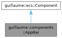
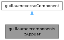
State of an app bar: the strip that carries a screen's title, its navigation icon and its action icons. More...
#include <headers/guillaume/components/app_bar.hpp>
Classes | |
| struct | Action |
| One pressable icon of the bar: the leading navigation icon or a trailing action. More... | |
Public Types | |
| enum class | Variant { Small , CenterAligned , Medium , Large , Bottom } |
| Shape of the bar. It sets the height and the title size. More... | |
| using | Identifiers = std::vector<ecs::Entity::Identifier> |
| Identifiers of child entities, in display order. | |
Public Member Functions | |
| AppBar (void)=default | |
| Create the configuration of a small, flat bar with no title and no icon. | |
| ~AppBar (void)=default | |
| Default destructor. | |
| Variant | getVariant (void) const noexcept |
| Get the shape of the bar. | |
| AppBar & | setVariant (Variant variant) |
| Set the shape of the bar, which decides its height and the size of its title. | |
| const std::string & | getTitle (void) const noexcept |
| Get the title shown in the bar. | |
| AppBar & | setTitle (const std::string &title) |
| Set the title shown in the bar. | |
| const Action & | getNavigation (void) const noexcept |
| Get the leading navigation action (back arrow, menu icon). | |
| AppBar & | setNavigation (Action navigation) |
| Set the leading navigation action. | |
| const std::vector< Action > & | getActions (void) const noexcept |
| Get the trailing actions. | |
| AppBar & | setActions (std::vector< Action > actions) |
| Replace the trailing actions. | |
| bool | isElevated (void) const noexcept |
| Tell whether the bar is elevated. | |
| AppBar & | setElevated (bool elevated) |
| Raise or flatten the bar. | |
| ecs::Entity::Identifier | getNavigationButton (void) const noexcept |
| Get the icon button child built for the navigation action. | |
| AppBar & | setNavigationButton (ecs::Entity::Identifier identifier) |
| Record the icon button child built for the navigation action. | |
| ecs::Entity::Identifier | getTitleEntity (void) const noexcept |
| Get the text child that displays the title. | |
| AppBar & | setTitleEntity (ecs::Entity::Identifier identifier) |
| Record the text child that displays the title. | |
| const Identifiers & | getActionButtons (void) const noexcept |
| Get the icon button children built for the trailing actions. | |
| AppBar & | setActionButtons (const Identifiers &identifiers) |
| Record the icon button children built for the trailing actions. | |
| Public Member Functions inherited from guillaume::ecs::Component | |
| bool | hasChanged (void) const |
| Tell whether a value of the component changed since the flags were last reset (the end of the previous frame). | |
| void | setHasChanged (bool hasChanged) |
| Raise or lower the changed flag. | |
| Component (void)=default | |
| Create a component that is not marked as changed. | |
| virtual | ~Component (void)=default |
| Virtual destructor, so components can be destroyed through the base class. | |
Static Public Attributes | |
| static constexpr float | HorizontalPadding = 4.0f |
| Padding on each side of the bar and gap between its children, in dp. | |
Detailed Description
State of an app bar: the strip that carries a screen's title, its navigation icon and its action icons.
The entities::AppBar widget writes it: its setters store the variant, title and actions here, and its build step records the identifiers of the children it creates (one icon button per action, one text for the title). systems::AppBar reads it every frame in the Layout phase and turns it into the bar's Layout, Color, Elevation and Bound, and into the text and typescale role of the title child.
The component only describes the bar. Changing the navigation action or the actions here does not create or remove icon buttons; the widget does that. Use the widget's setters unless you drive the system on a bare identifier.
- See also
- systems::AppBar, entities::AppBar
Definition at line 53 of file app_bar.hpp.
Member Typedef Documentation
◆ Identifiers
| using guillaume::components::AppBar::Identifiers = std::vector<ecs::Entity::Identifier> |
Identifiers of child entities, in display order.
Definition at line 79 of file app_bar.hpp.
Member Enumeration Documentation
◆ Variant
|
strong |
Shape of the bar. It sets the height and the title size.
Small and CenterAligned are 64 dp high, Medium 112 dp, Large 152 dp and Bottom 80 dp. CenterAligned also centers the title (or spreads the children when there are icons). Bottom is always drawn with the elevated surface color.
Definition at line 64 of file app_bar.hpp.
Member Function Documentation
◆ getActionButtons()
|
noexcept |
Get the icon button children built for the trailing actions.
- Returns
- One identifier per action, in the same order; an entry is ecs::Entity::InvalidIdentifier when its button could not be built.
Definition at line 125 of file app_bar.cpp.

◆ getActions()
|
noexcept |
Get the trailing actions.
- Returns
- The actions, in display order (leading edge first).
Definition at line 70 of file app_bar.cpp.
◆ getNavigation()
|
noexcept |
Get the leading navigation action (back arrow, menu icon).
- Returns
- The action; its icon is empty when the bar has none.
Definition at line 57 of file app_bar.cpp.
◆ getNavigationButton()
|
noexcept |
Get the icon button child built for the navigation action.
- Returns
- Its identifier, or ecs::Entity::InvalidIdentifier when it has not been built.
Definition at line 97 of file app_bar.cpp.

◆ getTitle()
|
noexcept |
Get the title shown in the bar.
- Returns
- The title text; empty when the bar has no title.
Definition at line 43 of file app_bar.cpp.
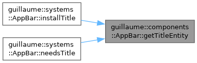
◆ getTitleEntity()
|
noexcept |
Get the text child that displays the title.
- Returns
- Its identifier, or ecs::Entity::InvalidIdentifier when it has not been built.
Definition at line 111 of file app_bar.cpp.
◆ getVariant()
|
noexcept |
Get the shape of the bar.
- Returns
- The variant, Variant::Small by default.
Definition at line 29 of file app_bar.cpp.
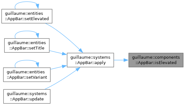
◆ isElevated()
|
noexcept |
Tell whether the bar is elevated.
- Returns
- True when the bar uses the level-2 surface color and elevation; false when it is flat.
Definition at line 83 of file app_bar.cpp.
◆ setActionButtons()
| AppBar & guillaume::components::AppBar::setActionButtons | ( | const Identifiers & | identifiers | ) |
Record the icon button children built for the trailing actions.
systems::AppBar considers the children missing when this list and the actions differ in size. Marks the component changed only when the list differs.
- Parameters
-
identifiers One identifier per action, in the same order.
- Returns
- This component, for chaining.
Definition at line 130 of file app_bar.cpp.

◆ setActions()
Replace the trailing actions.
Always marks the component changed, because the callback of an action cannot be compared.
- Parameters
-
actions The new actions, in display order.
- Returns
- This component, for chaining.
Definition at line 75 of file app_bar.cpp.

◆ setElevated()
| AppBar & guillaume::components::AppBar::setElevated | ( | bool | elevated | ) |
Raise or flatten the bar.
An elevated bar gets the level-2 tinted surface color and the level-2 elevation. Marks the component changed only when the flag differs.
- Parameters
-
elevated True to elevate the bar.
- Returns
- This component, for chaining.
Definition at line 88 of file app_bar.cpp.

◆ setNavigation()
Set the leading navigation action.
Always marks the component changed, because the callback of an action cannot be compared.
- Parameters
-
navigation The new action; an empty icon means no navigation icon.
- Returns
- This component, for chaining.
Definition at line 62 of file app_bar.cpp.

◆ setNavigationButton()
| AppBar & guillaume::components::AppBar::setNavigationButton | ( | ecs::Entity::Identifier | identifier | ) |
Record the icon button child built for the navigation action.
Called by the widget after it creates the child. Marks the component changed only when the identifier differs.
- Parameters
-
identifier The child's identifier.
- Returns
- This component, for chaining.
Definition at line 102 of file app_bar.cpp.

◆ setTitle()
| AppBar & guillaume::components::AppBar::setTitle | ( | const std::string & | title | ) |
Set the title shown in the bar.
systems::AppBar copies it to the title child, when that child exists. Marks the component changed only when the text differs.
- Parameters
-
title The new title text.
- Returns
- This component, for chaining.
Definition at line 48 of file app_bar.cpp.

◆ setTitleEntity()
| AppBar & guillaume::components::AppBar::setTitleEntity | ( | ecs::Entity::Identifier | identifier | ) |
Record the text child that displays the title.
Called by the widget after it creates the child. Marks the component changed only when the identifier differs.
- Parameters
-
identifier The child's identifier.
- Returns
- This component, for chaining.
Definition at line 116 of file app_bar.cpp.

◆ setVariant()
Set the shape of the bar, which decides its height and the size of its title.
Marks the component changed only when the variant differs.
- Parameters
-
variant The new variant.
- Returns
- This component, for chaining.
Definition at line 34 of file app_bar.cpp.

Member Data Documentation
◆ HorizontalPadding
|
staticconstexpr |
Padding on each side of the bar and gap between its children, in dp.
Definition at line 85 of file app_bar.hpp.
The documentation for this class was generated from the following files:
- headers/guillaume/components/app_bar.hpp
- sources/components/app_bar.cpp
