Look of a Material 3 icon button: color variant and size. More...
#include <headers/guillaume/components/icon_button.hpp>
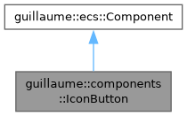
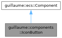
Public Types | |
| enum class | Variant { Standard , Filled , Tonal , Outlined } |
| Which theme colors fill the container and the icon. More... | |
| enum class | Size { Small , Medium , Large } |
| Size step: a 32, 40 or 48 dp container around an 18, 24 or 30 dp icon. More... | |
Public Member Functions | |
| IconButton (void)=default | |
| Create the configuration of a medium standard icon button. | |
| ~IconButton (void)=default | |
| Default destructor. | |
| Variant | getVariant (void) const noexcept |
| Get the color variant. | |
| IconButton & | setVariant (Variant variant) |
| Choose which theme colors the button uses. | |
| Size | getSize (void) const noexcept |
| Get the size step. | |
| IconButton & | setSize (Size size) |
| Choose the size step. | |
| Public Member Functions inherited from guillaume::ecs::Component | |
| bool | hasChanged (void) const |
| Tell whether a value of the component changed since the flags were last reset (the end of the previous frame). | |
| void | setHasChanged (bool hasChanged) |
| Raise or lower the changed flag. | |
| Component (void)=default | |
| Create a component that is not marked as changed. | |
| virtual | ~Component (void)=default |
| Virtual destructor, so components can be destroyed through the base class. | |
Detailed Description
Look of a Material 3 icon button: color variant and size.
It sits on the same entity as components::Button, which holds the glyph and the interaction state. entities::IconButton writes it; systems::IconButton reads both, each frame in the Layout phase and at once after every input change, and writes the button's Color, Borders and Bound and centers the icon child in the circular container.
Both setters compare before writing and mark the component changed only when the value differs.
- See also
- components::Button, systems::IconButton
Definition at line 45 of file icon_button.hpp.
Member Enumeration Documentation
◆ Size
|
strong |
Size step: a 32, 40 or 48 dp container around an 18, 24 or 30 dp icon.
Definition at line 61 of file icon_button.hpp.
◆ Variant
|
strong |
Which theme colors fill the container and the icon.
Standard has no container. Filled and Tonal have a filled container. Outlined has an outline and no container until it is selected, where it is filled and loses the outline.
Definition at line 55 of file icon_button.hpp.
Member Function Documentation
◆ getSize()
|
noexcept |
Get the size step.
- Returns
- The size (Medium by default).
Definition at line 43 of file icon_button.cpp.
◆ getVariant()
|
noexcept |
Get the color variant.
- Returns
- The variant (Standard by default).
Definition at line 29 of file icon_button.cpp.
◆ setSize()
| IconButton & guillaume::components::IconButton::setSize | ( | Size | size | ) |
Choose the size step.
- Parameters
-
size The size; it sets the container extent and the icon font size.
- Returns
- This component, for chaining.
Definition at line 48 of file icon_button.cpp.

◆ setVariant()
| IconButton & guillaume::components::IconButton::setVariant | ( | Variant | variant | ) |
Choose which theme colors the button uses.
- Parameters
-
variant The color variant.
- Returns
- This component, for chaining.
Definition at line 34 of file icon_button.cpp.

The documentation for this class was generated from the following files:
- headers/guillaume/components/icon_button.hpp
- sources/components/icon_button.cpp
