Colors, sizes and lays out an icon button: a round button that shows a single icon and no label. More...
#include <headers/guillaume/systems/icon_button.hpp>
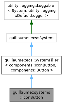
Public Member Functions | |
| IconButton (void) | |
| Create the system for the Layout phase, matching entities that have both a components::IconButton and a components::Button. | |
| ~IconButton (void) override=default | |
| Default destructor. | |
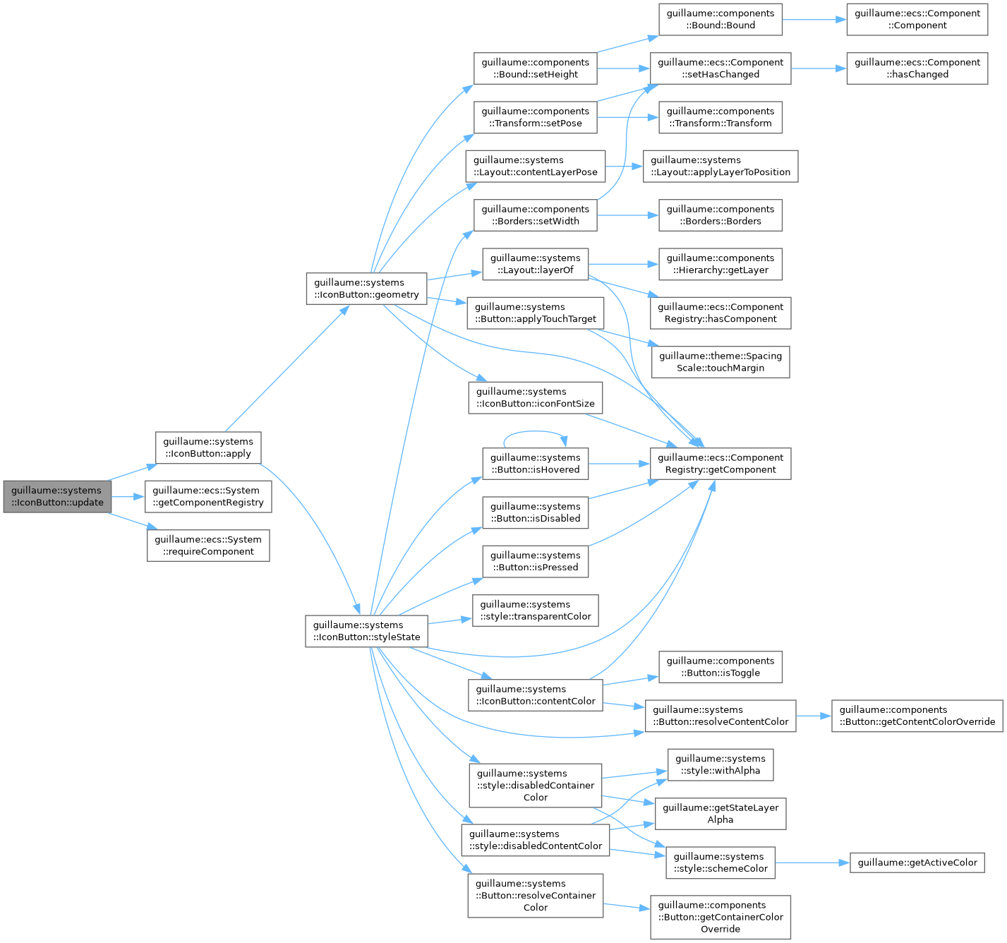
| void | update (const ecs::Entity::Identifier &entityIdentifier) override |
| Frame entry point: call apply on one button. | |
| Public Member Functions inherited from guillaume::ecs::SystemFiller< components::IconButton, components::Button > | |
| SystemFiller (Phase phase) | |
| Create the system and set its signature from ComponentTypes. | |
| virtual | ~SystemFiller (void)=default |
| Virtual destructor. | |
| Public Member Functions inherited from guillaume::ecs::System | |
| System (Phase phase) | |
| Create a system that runs in a given phase, with an empty signature. | |
| virtual | ~System (void)=default |
| Virtual destructor. | |
| Phase | getPhase (void) const noexcept |
| Get the phase of the frame in which the system runs. | |
| Entity::Signature | getSignature (void) const noexcept |
| Get the component types an entity must declare to be visited by this system. | |
| void | routine (ecs::ComponentRegistry &componentRegistry, ecs::EntityRegistry &entityRegistry, const ecs::EntityTreeTraveler &traveler) |
| Run the system once over a scene: prepare(), update() on each matching entity, cleanup(). | |
| void | bindComponentRegistry (ecs::ComponentRegistry &componentRegistry) |
| Bind a component registry so update() can be called directly, without routine(). | |
| void | unbindComponentRegistry (void) |
| Drop the binding made by bindComponentRegistry(). | |
| virtual void | prepare (void) |
| Called once per pass, before the first update(). | |
| virtual void | cleanup (void) |
| Called once per pass, after the last update(). | |
Static Public Member Functions | |
| static void | install (ecs::ComponentRegistry ®istry, const ecs::Entity::Identifier &identifier) |
| Make an entity behave as an icon button. | |
| static float | iconFontSize (const ecs::ComponentRegistry ®istry, const ecs::Entity::Identifier &identifier) |
| Get the font size of the icon for the configured size. | |
| static utility::graphic::Color32Bit | contentColor (const ecs::ComponentRegistry ®istry, const ecs::Entity::Identifier &identifier) |
| Get the color of the icon of the button when it is enabled. | |
| static void | styleState (ecs::ComponentRegistry ®istry, const ecs::Entity::Identifier &identifier) |
| First half of apply: write the colors. | |
| static void | geometry (ecs::ComponentRegistry ®istry, const ecs::Entity::Identifier &identifier) |
| Second half of apply: write the size and the corner radius of the button and center its icon. | |
| static void | apply (ecs::ComponentRegistry ®istry, const ecs::Entity::Identifier &identifier) |
| Style and lay out one button at once: styleState, then geometry. | |
Additional Inherited Members | |
| Protected Member Functions inherited from guillaume::ecs::System | |
| template<InheritFromComponent... ComponentTypes> | |
| void | setSignature (void) |
| Replace the signature by the one made of the given component types. | |
| ecs::EntityRegistry & | getEntityRegistry (void) |
| Get the entity registry of the scene being processed. | |
| const ecs::EntityRegistry & | getEntityRegistry (void) const |
| Get the entity registry of the scene being processed, read-only. | |
| ecs::ComponentRegistry & | getComponentRegistry (void) |
| Get the component registry of the scene being processed. | |
| const ecs::ComponentRegistry & | getComponentRegistry (void) const |
| Get the component registry of the scene being processed, read-only. | |
| template<InheritFromComponent ComponentType> | |
| bool | hasComponent (const ecs::Entity::Identifier &entityIdentifier) const |
| Tell whether an entity has a component, in the bound registry. | |
| template<InheritFromComponent ComponentType> | |
| ComponentType & | getComponent (const ecs::Entity::Identifier &entityIdentifier) |
| Get a component of an entity from the bound registry, to read or modify it. | |
| template<InheritFromComponent ComponentType> | |
| const ComponentType & | getComponent (const ecs::Entity::Identifier &entityIdentifier) const |
| Get a component of an entity from the bound registry, read-only. | |
| template<InheritFromComponent ComponentType> | |
| bool | requireComponent (const ecs::Entity::Identifier &entityIdentifier) |
| Tell whether an entity has a component, and log a warning naming the entity and the component when it does not. | |
Detailed Description
Colors, sizes and lays out an icon button: a round button that shows a single icon and no label.
This is the variant half of a button; systems::Button owns the input half (press, toggle, callbacks) and calls back into apply through the restyle function of components::Button.
- Reads: components::IconButton (variant and size), components::Button (toggle, selection, color overrides, icon child), the hover, press and enabled state, the components::Bound of the measured icon, the active theme.
- Writes: the button's components::Color, components::Borders and components::Bound (a square of 32, 40 or 48 dp for Small, Medium and Large), the hover margin that makes up the touch target, and the color, font size and components::Transform of the icon child.
- Phase: Layout, registered after systems::Layout. The icon was measured in the Measure phase of the same frame.
The size of the button is fixed by its size setting: any width or height written to its components::Bound elsewhere is overwritten each frame.
- See also
- guillaume::components::IconButton, guillaume::systems::Button, guillaume::entities::IconButton
Definition at line 60 of file icon_button.hpp.
Constructor & Destructor Documentation
◆ IconButton()
| guillaume::systems::IconButton::IconButton | ( | void | ) |
Create the system for the Layout phase, matching entities that have both a components::IconButton and a components::Button.
Definition at line 191 of file icon_button.cpp.

Member Function Documentation
◆ apply()
|
static |
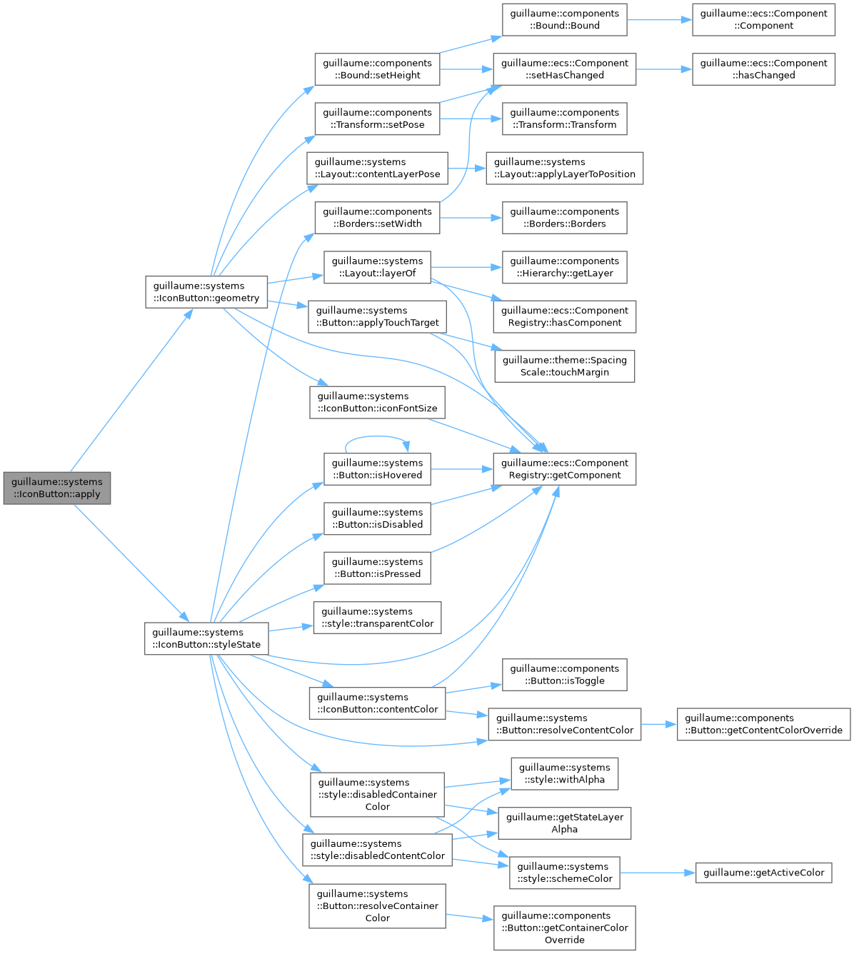
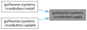
Style and lay out one button at once: styleState, then geometry.
The frame calls it through update. Call it yourself after changing components::IconButton or components::Button when the result must be visible before the next Layout phase; systems::Button does on every hover, press and release.
- Parameters
-
registry The registry holding the components. identifier The button entity. It must have the components listed in the class description.
- Exceptions
-
std::runtime_error If the configured size or variant is not a valid enumerator.
Definition at line 338 of file icon_button.cpp.
◆ contentColor()
|
static |
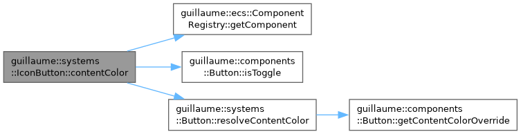
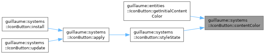
Get the color of the icon of the button when it is enabled.
It depends on the variant and on whether the button counts as active: a selected button always does, and a Filled or Tonal button that is not a toggle does too.
- Parameters
-
registry The registry holding the components. identifier The button entity.
- Returns
- The content color override of components::Button when one is set, the themed color otherwise. The disabled color is not taken into account.
- Exceptions
-
std::runtime_error If the configured variant is not a valid enumerator.
Definition at line 218 of file icon_button.cpp.
◆ geometry()
|
static |
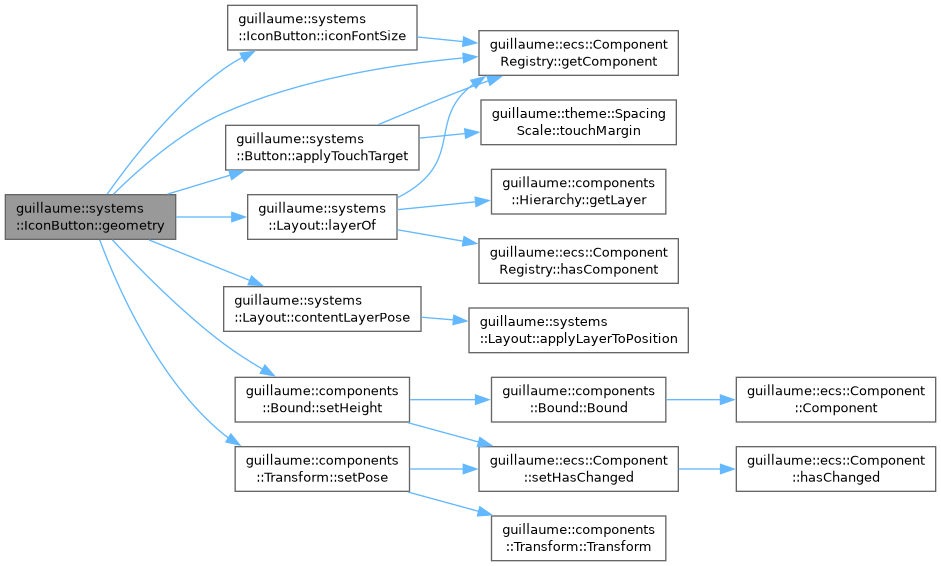
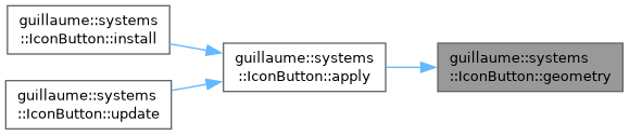
Second half of apply: write the size and the corner radius of the button and center its icon.
The button becomes a square of the container size of its size setting with fully rounded corners, and its touch target is grown through systems::Button::applyTouchTarget. The icon, when there is one, gets its font size and is centered from its measured components::Bound, in front of the container.
- Parameters
-
registry The registry holding the components. identifier The button entity.
Definition at line 292 of file icon_button.cpp.
◆ iconFontSize()
|
static |
Get the font size of the icon for the configured size.
The widget class uses it to create the icon child at the right size.
- Parameters
-
registry The registry holding the components. identifier The button entity.
- Returns
- The font size, in dp: 18 for Small, 24 for Medium, 30 for Large.
- Exceptions
-
std::runtime_error If the configured size is not a valid enumerator.
Definition at line 209 of file icon_button.cpp.


◆ install()
|
static |
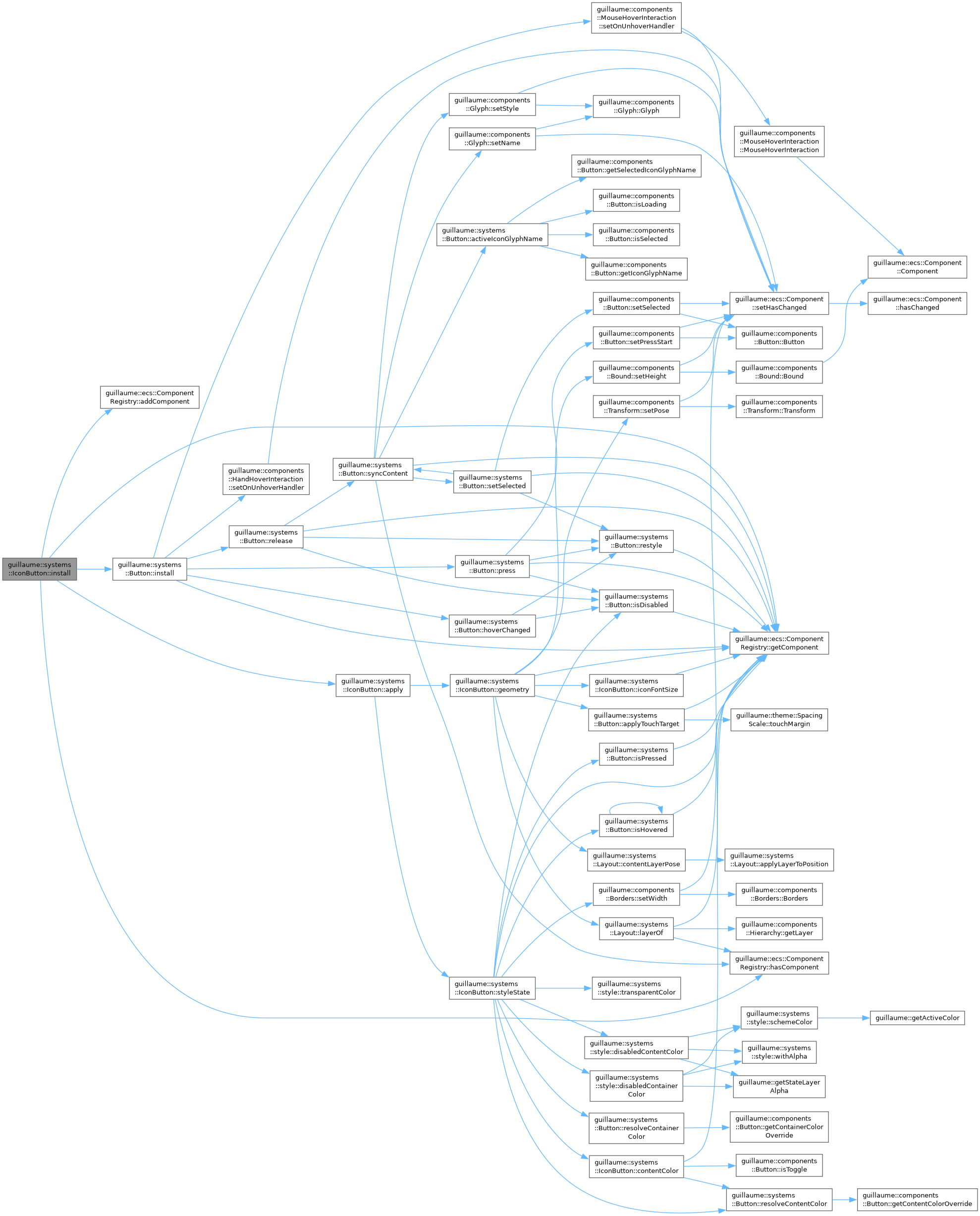
Make an entity behave as an icon button.
Adds a components::Elevation at level 0 when the entity has none, wires input through systems::Button::install, and stores apply in components::Button as the restyle function, so a hover, a press or a toggle redraws the button without waiting for the Layout phase. Call it once when the entity is built; entities::IconButton does it for you.
- Parameters
-
registry The registry holding the components. It must outlive the entity. identifier The button entity. It must already have its components::Button and the hand and mouse hover and button interaction components.
Definition at line 197 of file icon_button.cpp.
◆ styleState()
|
static |
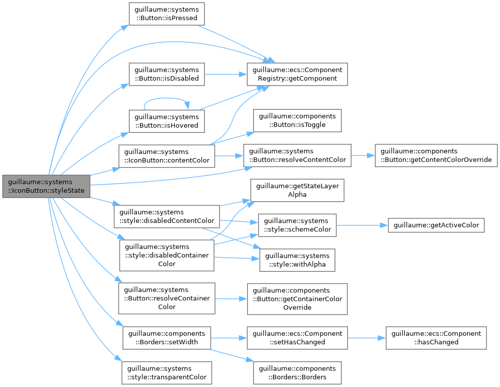
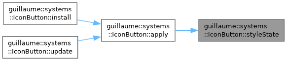
First half of apply: write the colors.
- Disabled: the container takes the disabled container color for the Filled and Tonal variants and is transparent for the others; only the Outlined variant keeps a (disabled) outline; the icon takes the disabled content color.
- Enabled: container and icon colors come from the variant and the selection, replaced by the color overrides of components::Button when set. While pressed, or else hovered, the content color is blended over the container at the theme opacity of that state; over a transparent container the tint is the content color at that opacity. Only an unselected Outlined button has a visible outline.
The outline width is always written as 1 dp; a button without an outline gets a transparent outline color.
- Parameters
-
registry The registry holding the components. identifier The button entity.
Definition at line 231 of file icon_button.cpp.
◆ update()
|
overridevirtual |
Frame entry point: call apply on one button.
- Parameters
-
entityIdentifier The button entity. An entity missing components::IconButton or components::Button is logged and skipped.
Implements guillaume::ecs::System.
Definition at line 345 of file icon_button.cpp.
The documentation for this class was generated from the following files:
- headers/guillaume/systems/icon_button.hpp
- sources/systems/icon_button.cpp
