Input and content rules shared by every button variant: press, release, toggle, click and long press. More...
#include <headers/guillaume/systems/button.hpp>
Classes | |
| class | Child |
| Short-lived handle on the icon or label child of a button, used by the variant systems to style it. More... | |
Public Member Functions | |
| Button (void) | |
| Create the system for the Event phase, matching entities that have a components::Button. | |
| ~Button (void) override=default | |
| Default destructor. | |
| void | update (const ecs::Entity::Identifier &entityIdentifier) override |
| Frame entry point: call syncContent on one button. | |
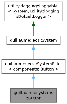
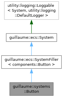
| Public Member Functions inherited from guillaume::ecs::SystemFiller< components::Button > | |
| SystemFiller (Phase phase) | |
| Create the system and set its signature from ComponentTypes. | |
| virtual | ~SystemFiller (void)=default |
| Virtual destructor. | |
| Public Member Functions inherited from guillaume::ecs::System | |
| System (Phase phase) | |
| Create a system that runs in a given phase, with an empty signature. | |
| virtual | ~System (void)=default |
| Virtual destructor. | |
| Phase | getPhase (void) const noexcept |
| Get the phase of the frame in which the system runs. | |
| Entity::Signature | getSignature (void) const noexcept |
| Get the component types an entity must declare to be visited by this system. | |
| void | routine (ecs::ComponentRegistry &componentRegistry, ecs::EntityRegistry &entityRegistry, const ecs::EntityTreeTraveler &traveler) |
| Run the system once over a scene: prepare(), update() on each matching entity, cleanup(). | |
| void | bindComponentRegistry (ecs::ComponentRegistry &componentRegistry) |
| Bind a component registry so update() can be called directly, without routine(). | |
| void | unbindComponentRegistry (void) |
| Drop the binding made by bindComponentRegistry(). | |
| virtual void | prepare (void) |
| Called once per pass, before the first update(). | |
| virtual void | cleanup (void) |
| Called once per pass, after the last update(). | |
Static Public Member Functions | |
| static void | install (ecs::ComponentRegistry ®istry, const ecs::Entity::Identifier &identifier) |
| Make an entity react to input as a button. | |
| static void | hoverChanged (ecs::ComponentRegistry ®istry, const ecs::Entity::Identifier &identifier) |
| React to a pointer or a hand entering or leaving the button: restyle it so the hover tint appears or disappears. | |
| static void | press (ecs::ComponentRegistry ®istry, const ecs::Entity::Identifier &identifier) |
| React to the button being pressed: record when the press started and restyle. | |
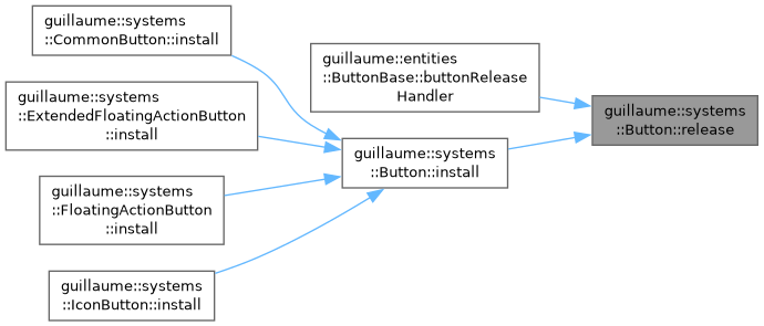
| static void | release (ecs::ComponentRegistry ®istry, const ecs::Entity::Identifier &identifier) |
| React to the button being released: this is the click. | |
| static void | setSelected (ecs::ComponentRegistry ®istry, const ecs::Entity::Identifier &identifier, bool selected) |
| Select or unselect a toggle button from code and show it at once. | |
| static void | syncContent (ecs::ComponentRegistry ®istry, const ecs::Entity::Identifier &identifier) |
| Copy what components::Button says onto the icon child and the accessibility state. | |
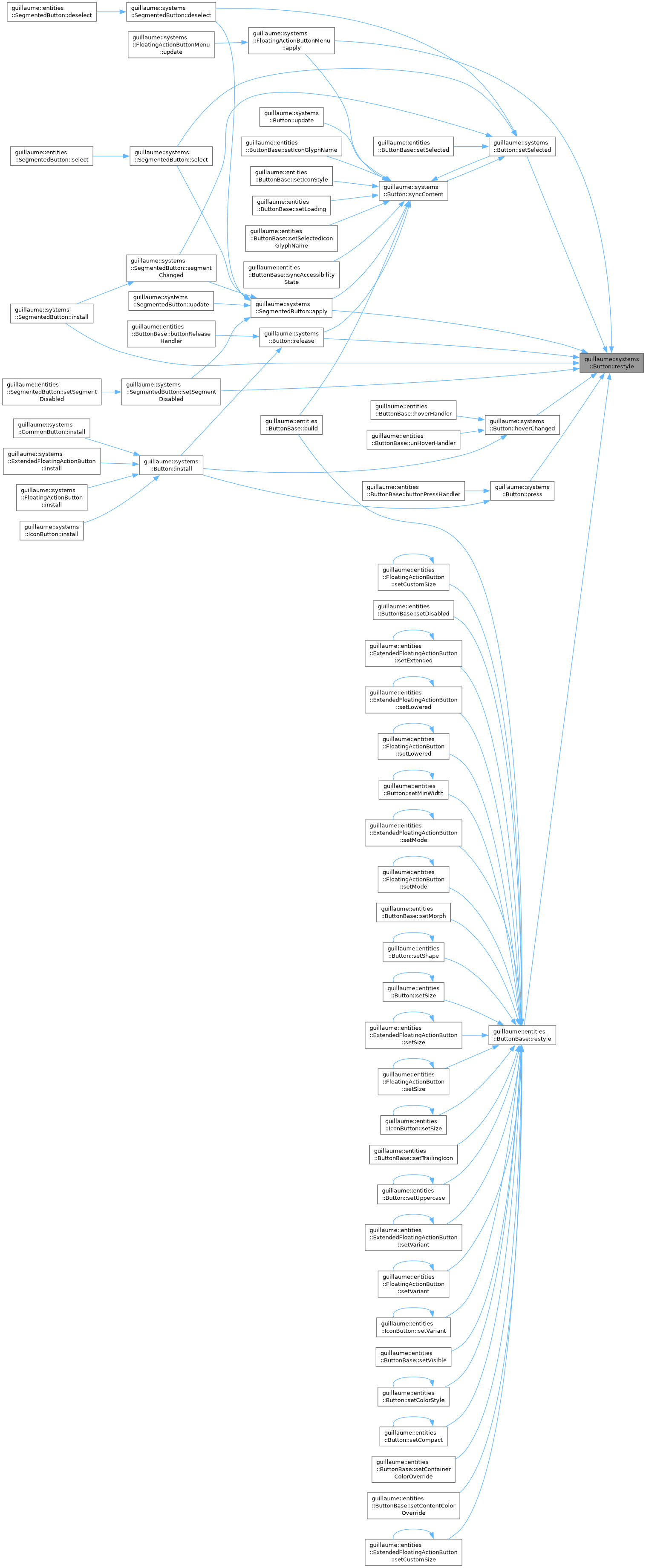
| static void | restyle (ecs::ComponentRegistry ®istry, const ecs::Entity::Identifier &identifier) |
| Recompute the colors and geometry of the button at once. | |
| static const std::string & | activeIconGlyphName (const components::Button &button) |
| Choose the icon glyph a button shows in its current state. | |
| static bool | isDisabled (const ecs::ComponentRegistry ®istry, const ecs::Entity::Identifier &identifier) |
| Whether the button ignores input and is drawn disabled. | |
| static bool | isHovered (const ecs::ComponentRegistry ®istry, const ecs::Entity::Identifier &identifier) |
| Whether a pointer is over the button. | |
| static bool | isPressed (const ecs::ComponentRegistry ®istry, const ecs::Entity::Identifier &identifier) |
| Whether the button is being held down. | |
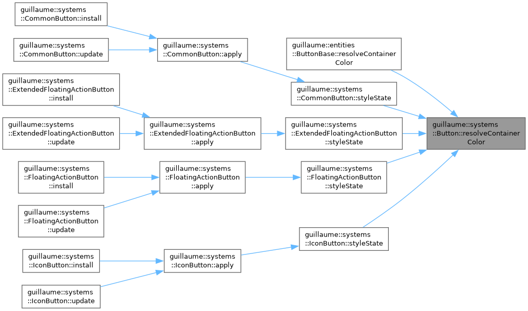
| static utility::graphic::Color32Bit | resolveContainerColor (const components::Button &button, const utility::graphic::Color32Bit &color) |
| Let a custom container color replace the themed one. | |
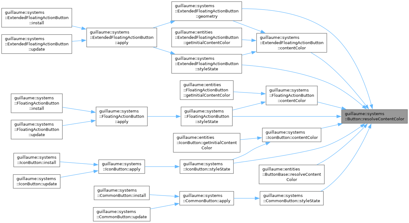
| static utility::graphic::Color32Bit | resolveContentColor (const components::Button &button, const utility::graphic::Color32Bit &color) |
| Let a custom content color replace the themed one. | |
| static void | applyTouchTarget (ecs::ComponentRegistry ®istry, const ecs::Entity::Identifier &identifier, float width, float height) |
| Make a small button as easy to hit as a large one, without drawing it larger. | |
Static Public Attributes | |
| static constexpr const char * | LoadingGlyph = "progress_activity" |
| static constexpr std::chrono::milliseconds | LongPressDuration { 500 } |
Additional Inherited Members | |
| Protected Member Functions inherited from guillaume::ecs::System | |
| template<InheritFromComponent... ComponentTypes> | |
| void | setSignature (void) |
| Replace the signature by the one made of the given component types. | |
| ecs::EntityRegistry & | getEntityRegistry (void) |
| Get the entity registry of the scene being processed. | |
| const ecs::EntityRegistry & | getEntityRegistry (void) const |
| Get the entity registry of the scene being processed, read-only. | |
| ecs::ComponentRegistry & | getComponentRegistry (void) |
| Get the component registry of the scene being processed. | |
| const ecs::ComponentRegistry & | getComponentRegistry (void) const |
| Get the component registry of the scene being processed, read-only. | |
| template<InheritFromComponent ComponentType> | |
| bool | hasComponent (const ecs::Entity::Identifier &entityIdentifier) const |
| Tell whether an entity has a component, in the bound registry. | |
| template<InheritFromComponent ComponentType> | |
| ComponentType & | getComponent (const ecs::Entity::Identifier &entityIdentifier) |
| Get a component of an entity from the bound registry, to read or modify it. | |
| template<InheritFromComponent ComponentType> | |
| const ComponentType & | getComponent (const ecs::Entity::Identifier &entityIdentifier) const |
| Get a component of an entity from the bound registry, read-only. | |
| template<InheritFromComponent ComponentType> | |
| bool | requireComponent (const ecs::Entity::Identifier &entityIdentifier) |
| Tell whether an entity has a component, and log a warning naming the entity and the component when it does not. | |
Detailed Description
Input and content rules shared by every button variant: press, release, toggle, click and long press.
A button is described by two components: components::Button (what every button has: icon, label, toggle, callbacks) and one variant component (components::CommonButton, components::IconButton, components::FloatingActionButton or components::ExtendedFloatingActionButton). This system owns the first half; the variant system of the same name owns colors and geometry.
- Reads: components::Button, the hand and mouse hover and button interaction components, components::StyleState (enabled or not).
- Writes: the press start and selection of components::Button, the name and style of the icon child's components::Glyph, the selected flag of components::Accessibility. It then calls the restyle function stored in components::Button, which is the apply of the variant system, so the new state is drawn at once.
- Phase: Event. update only calls syncContent.
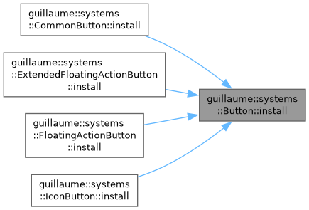
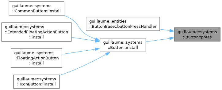
Most of the work does not wait for the frame: install wires the interaction components of the entity to the static functions press, release and hoverChanged, which run when the input systems deliver the event. The variant systems call install from their own install.
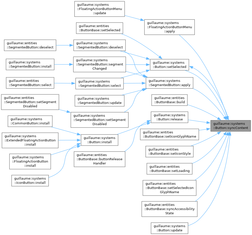
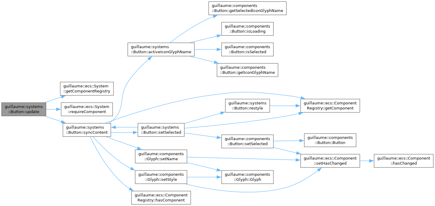
Each frame, in the Event phase, update calls syncContent, so a glyph or selection written straight to components::Button reaches the icon child and Accessibility without going through an action.
- See also
- guillaume::components::Button, guillaume::systems::CommonButton, guillaume::systems::IconButton, guillaume::entities::ButtonBase
Definition at line 74 of file button.hpp.
Constructor & Destructor Documentation
◆ Button()
| guillaume::systems::Button::Button | ( | void | ) |
Create the system for the Event phase, matching entities that have a components::Button.
Definition at line 101 of file button.cpp.

Member Function Documentation
◆ activeIconGlyphName()
|
static |
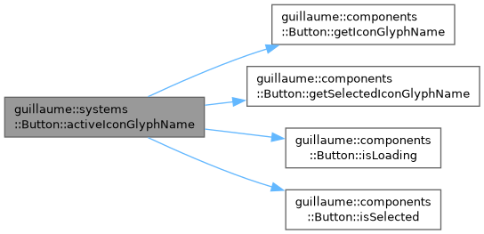
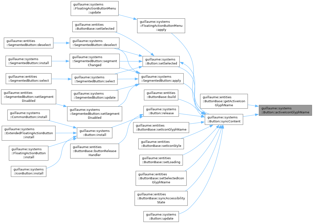
Choose the icon glyph a button shows in its current state.
- Parameters
-
button The button state.
- Returns
- LoadingGlyph while the button is loading; else the selected glyph name when the button is selected and has one; else its regular glyph name, which is empty for a button without an icon. The reference points into button or to a static string.
Definition at line 170 of file button.cpp.
◆ applyTouchTarget()
|
static |
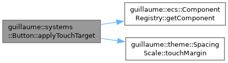
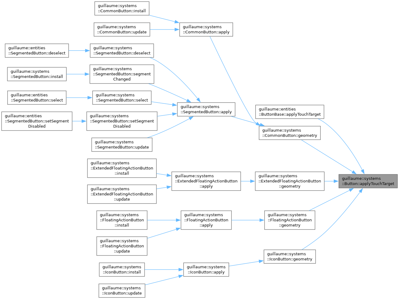
Make a small button as easy to hit as a large one, without drawing it larger.
Sets the accessibility margin of the hand and mouse hover components to what each axis lacks to reach the minimum touch target of the theme (theme::SpacingScale::touchMargin, rounded up), and to 0 on an axis that is already large enough. Variant systems call it each time they resize the button.
- Parameters
-
registry The registry holding the components. identifier The button entity. width The drawn width of the button, in dp. height The drawn height of the button, in dp.
Definition at line 197 of file button.cpp.
◆ hoverChanged()
|
static |
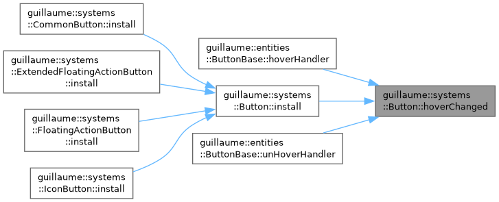
React to a pointer or a hand entering or leaving the button: restyle it so the hover tint appears or disappears.
A disabled button is left as it is. Called by the handlers install sets; the hover flag itself is written by the input systems.
- Parameters
-
registry The registry holding the components. identifier The button entity.
Definition at line 253 of file button.cpp.

◆ install()
|
static |
Make an entity react to input as a button.
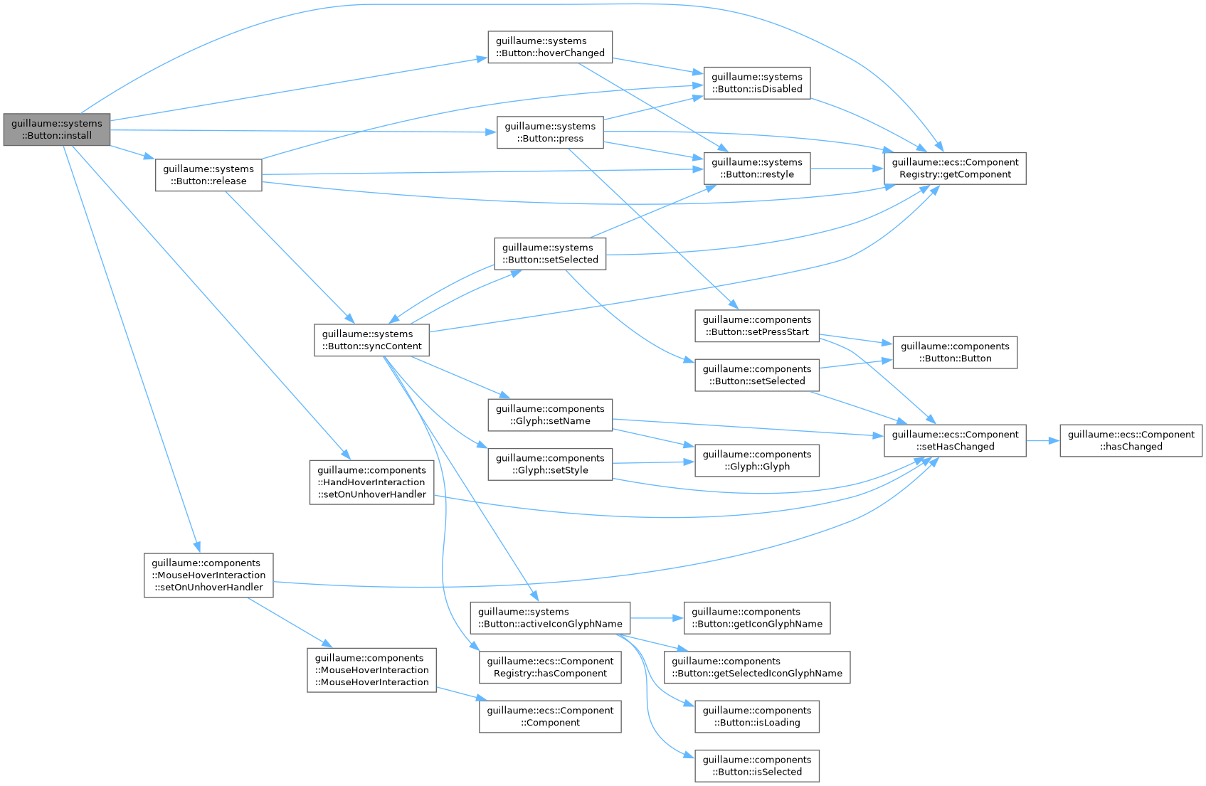
Sets the handlers of its four interaction components: the A button of a hand and the left mouse button call press and release, and a hover or unhover of a hand or of the mouse calls hoverChanged. Call it once when the entity is built; the variant systems do it from their own install.
The handlers capture the address of the registry, which must outlive the entity. They replace any handler already set for these buttons and for hover.
- Parameters
-
registry The registry holding the components. identifier The button entity. It must already have components::HandButtonInteraction, components::MouseButtonInteraction, components::HandHoverInteraction and components::MouseHoverInteraction.
Definition at line 106 of file button.cpp.
◆ isDisabled()
|
static |
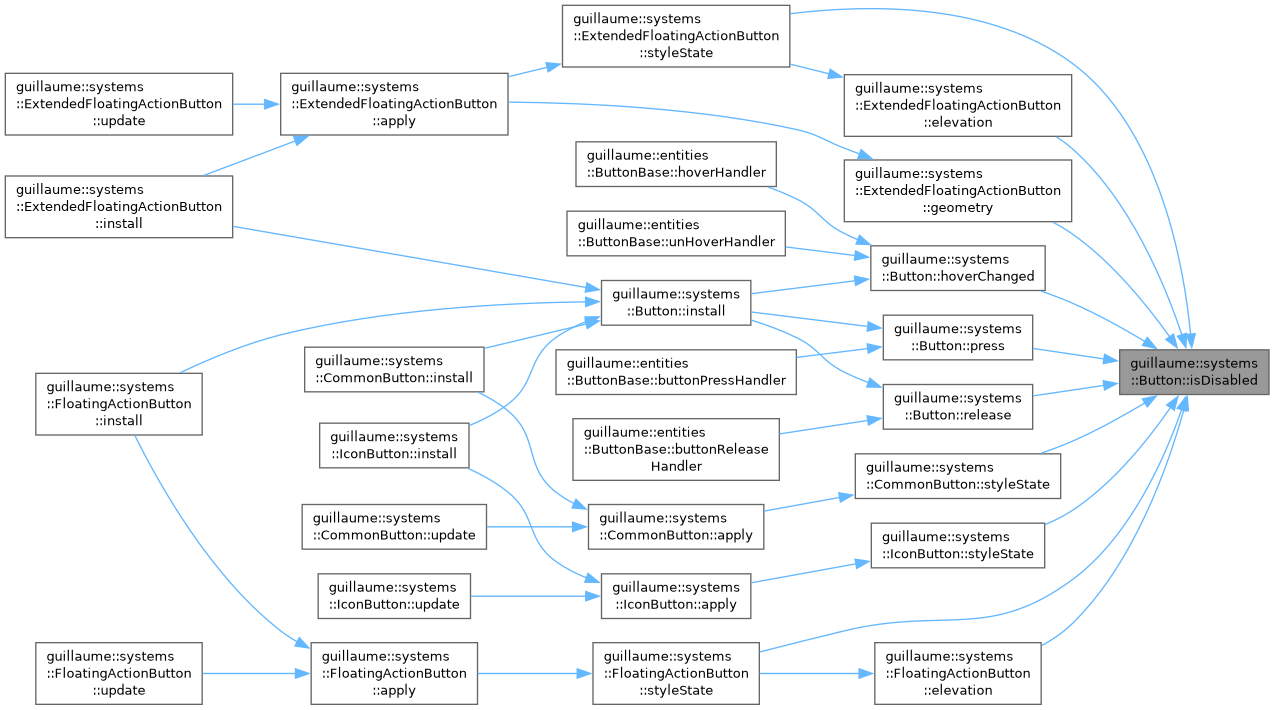
Whether the button ignores input and is drawn disabled.
- Parameters
-
registry The registry holding the components. identifier The button entity. It must have a components::StyleState.
- Returns
- True when its components::StyleState is not enabled.
Definition at line 139 of file button.cpp.

◆ isHovered()
|
static |
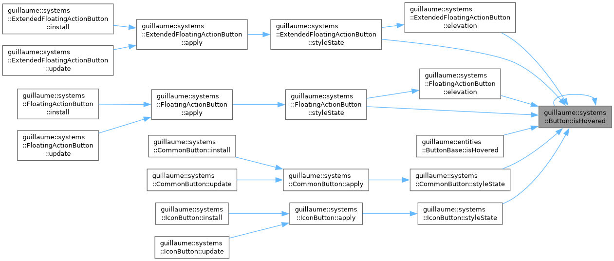
Whether a pointer is over the button.
- Parameters
-
registry The registry holding the components. identifier The button entity. It must have components::HandHoverInteraction and components::MouseHoverInteraction.
- Returns
- True when a hand or the mouse hovers it.
Definition at line 146 of file button.cpp.

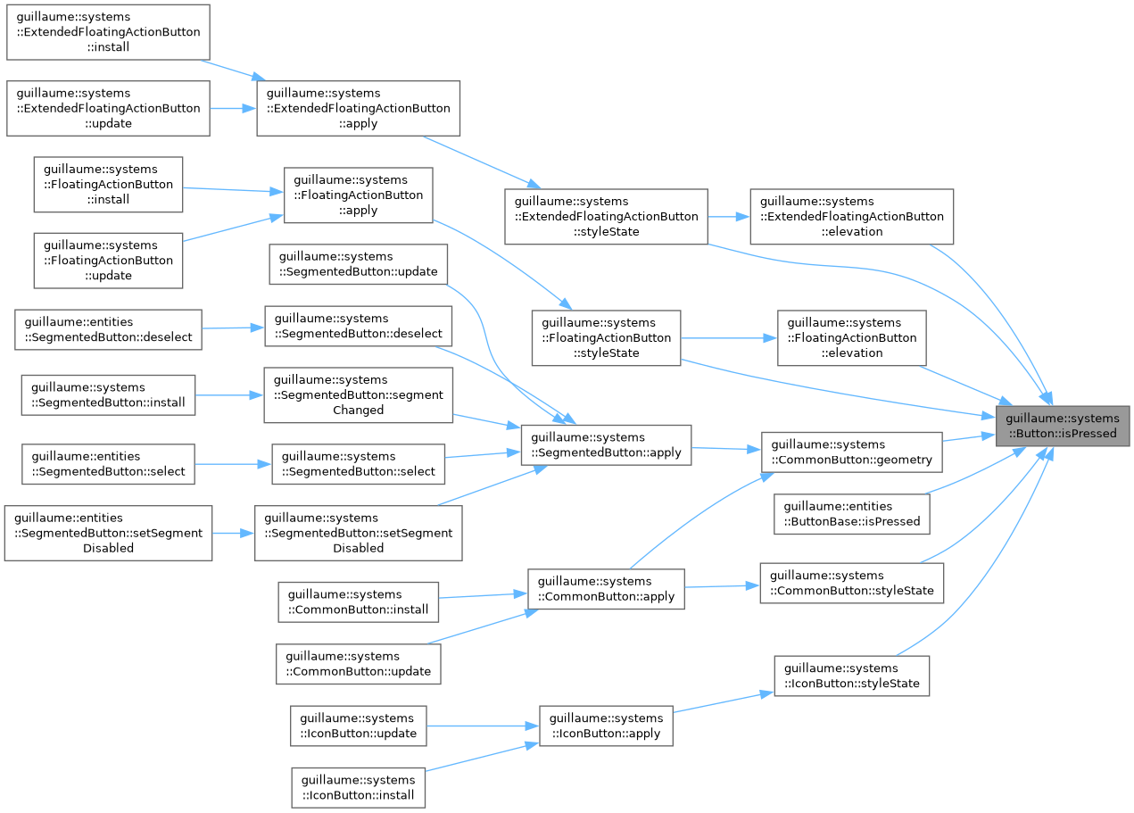
◆ isPressed()
|
static |
Whether the button is being held down.
- Parameters
-
registry The registry holding the components. identifier The button entity. It must have components::HandButtonInteraction and components::MouseButtonInteraction.
- Returns
- True while the A button of a hand or the left mouse button is pressed on it.
Definition at line 157 of file button.cpp.

◆ press()
|
static |
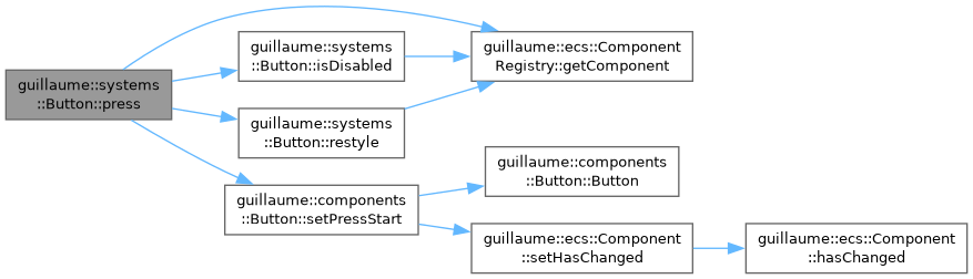
React to the button being pressed: record when the press started and restyle.
The start time is what release compares against LongPressDuration. Ignored when the button is disabled or not visible. No callback is called here: a click is reported on release.
- Parameters
-
registry The registry holding the components. identifier The button entity.
Definition at line 262 of file button.cpp.
◆ release()
|
static |
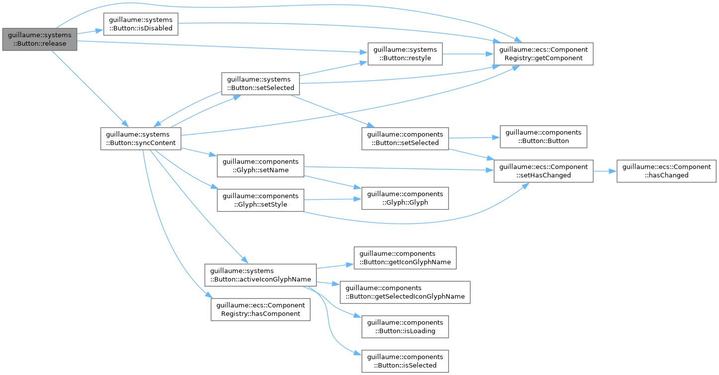
React to the button being released: this is the click.
In order: a toggle button flips its selection; the icon and the accessibility state are synced; the button is restyled; then one callback is called. It is the long-press callback when one is set and the press lasted at least LongPressDuration, and the click callback otherwise. Ignored when the button is disabled or not visible.
Calling it directly simulates a click, which is how a test drives a button on a bare identifier. Without a preceding press it is always a click, never a long press.
- Parameters
-
registry The registry holding the components. identifier The button entity.
Definition at line 274 of file button.cpp.
◆ resolveContainerColor()
|
static |
Let a custom container color replace the themed one.
Variant systems pass every container color through it before writing components::Color.
- Parameters
-
button The button state. color The color the theme gives for the current state.
- Returns
- The container color override of the button when one is set, color otherwise.
Definition at line 184 of file button.cpp.

◆ resolveContentColor()
|
static |
Let a custom content color replace the themed one.
Variant systems pass the icon and label color through it before writing the children.
- Parameters
-
button The button state. color The color the theme gives for the current state.
- Returns
- The content color override of the button when one is set, color otherwise.
Definition at line 191 of file button.cpp.

◆ restyle()
|
static |
Recompute the colors and geometry of the button at once.
Calls the function stored in components::Button by setRestyle, which is the apply of the variant system (for example systems::CommonButton::apply). Does nothing when no function is set. This is how this system redraws a button without knowing its variant.
- Parameters
-
registry The registry holding the components. identifier The button entity.
Definition at line 228 of file button.cpp.

◆ setSelected()
|
static |
Select or unselect a toggle button from code and show it at once.
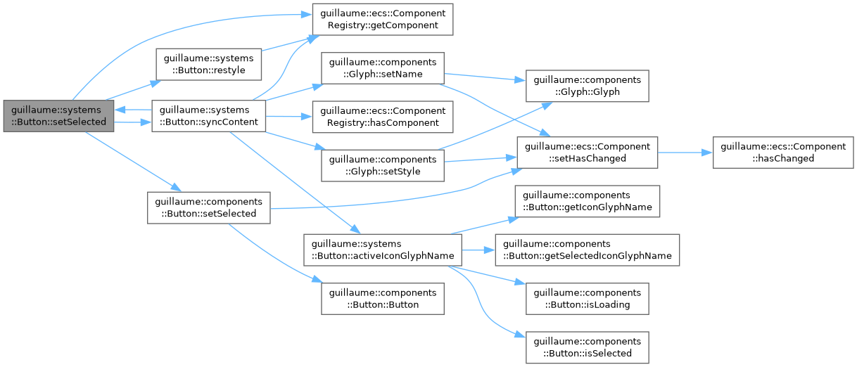
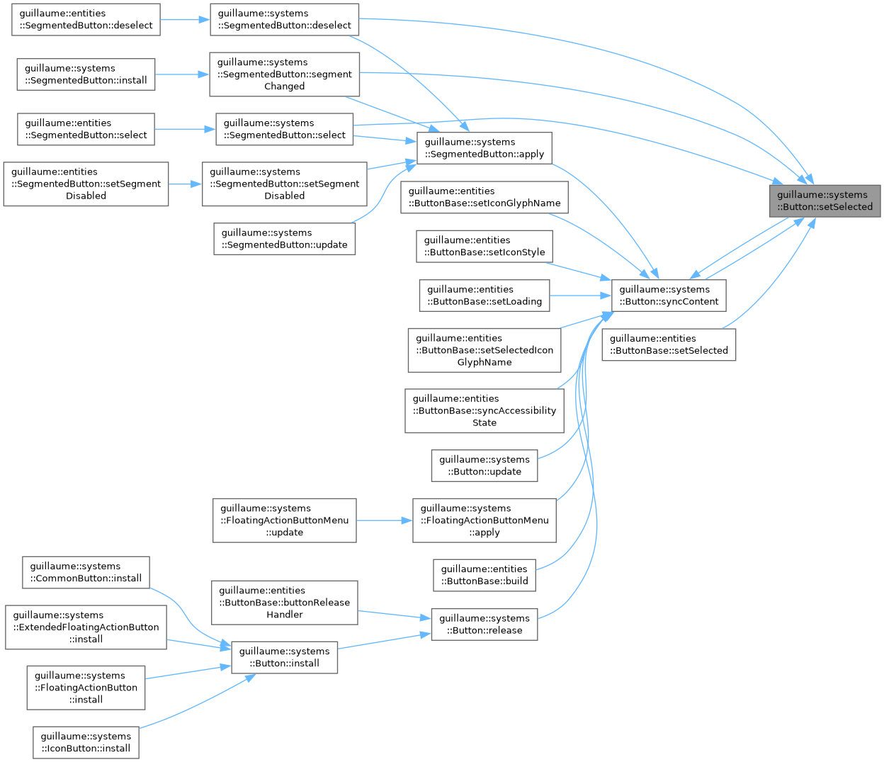
Writes the selection, syncs the icon and the accessibility state, and restyles. Unlike release, it calls no callback and works on a disabled button. systems::SegmentedButton uses it to keep its segments consistent.
- Parameters
-
registry The registry holding the components. identifier The button entity. selected True to select the button. The call does nothing when the button is not a toggle.
Definition at line 239 of file button.cpp.
◆ syncContent()
|
static |
Copy what components::Button says onto the icon child and the accessibility state.
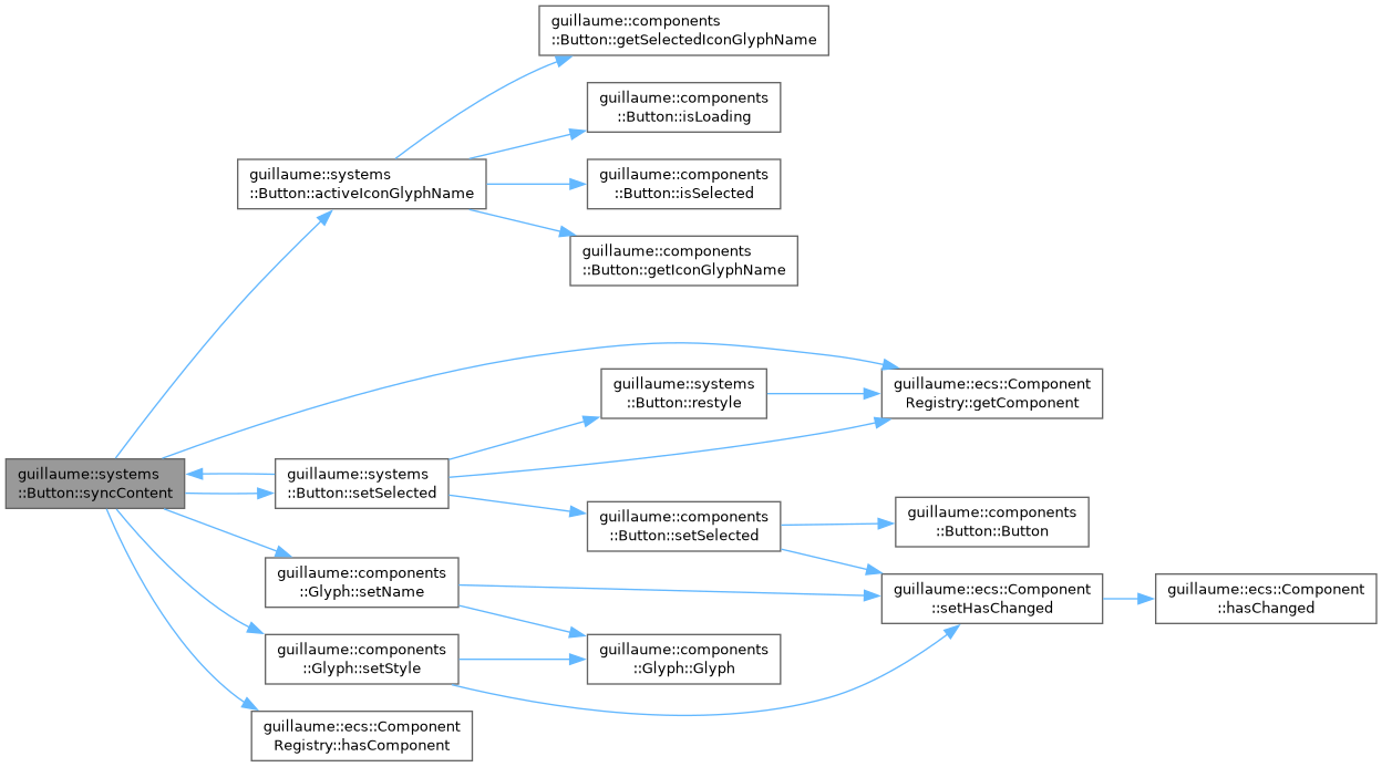
Writes the glyph name returned by activeIconGlyphName and the icon style into the icon child's components::Glyph (skipped when the button has no icon), and sets the selected flag of components::Accessibility, true only for a selected toggle. Call it after changing the icon, the loading flag or the selection of a components::Button directly.
- Parameters
-
registry The registry holding the components. identifier The button entity. It must have a components::Accessibility.
Definition at line 213 of file button.cpp.
◆ update()
|
overridevirtual |
Frame entry point: call syncContent on one button.
- Parameters
-
entityIdentifier The button entity. An entity without a components::Button is logged and skipped.
Implements guillaume::ecs::System.
Definition at line 303 of file button.cpp.
Member Data Documentation
◆ LoadingGlyph
|
staticconstexpr |
Name of the glyph shown in place of the icon while the button is loading.
Definition at line 172 of file button.hpp.
◆ LongPressDuration
|
staticconstexpr |
How long a press must last for its release to count as a long press instead of a click.
Definition at line 176 of file button.hpp.
The documentation for this class was generated from the following files:
- headers/guillaume/systems/button.hpp
- sources/systems/button.cpp
