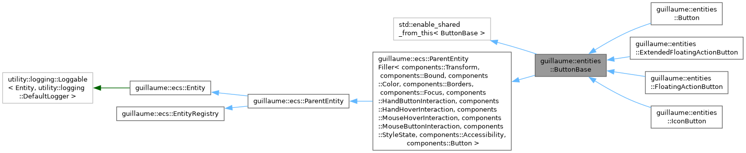
What Button, IconButton, FloatingActionButton and ExtendedFloatingActionButton have in common: an icon, a label, a click, a toggle state. More...
#include <headers/guillaume/entities/button_base.hpp>
Public Member Functions | |
| ~ButtonBase (void) override=default | |
| Default destructor. | |
| ButtonBase & | setIconGlyphName (const std::string &iconGlyphName) |
| Change the icon. | |
| ButtonBase & | setIconStyle (const components::Glyph::Style &iconStyle) |
| Change the style the icon glyph is drawn in. | |
| ButtonBase & | setLabelContent (const std::string &labelContent) |
| Change the text of the label. | |
| ButtonBase & | setIsToggle (const bool &isToggle) |
| Make the button a toggle, or a plain push button. | |
| bool | isSelected (void) const |
| Tell whether a toggle button is on. | |
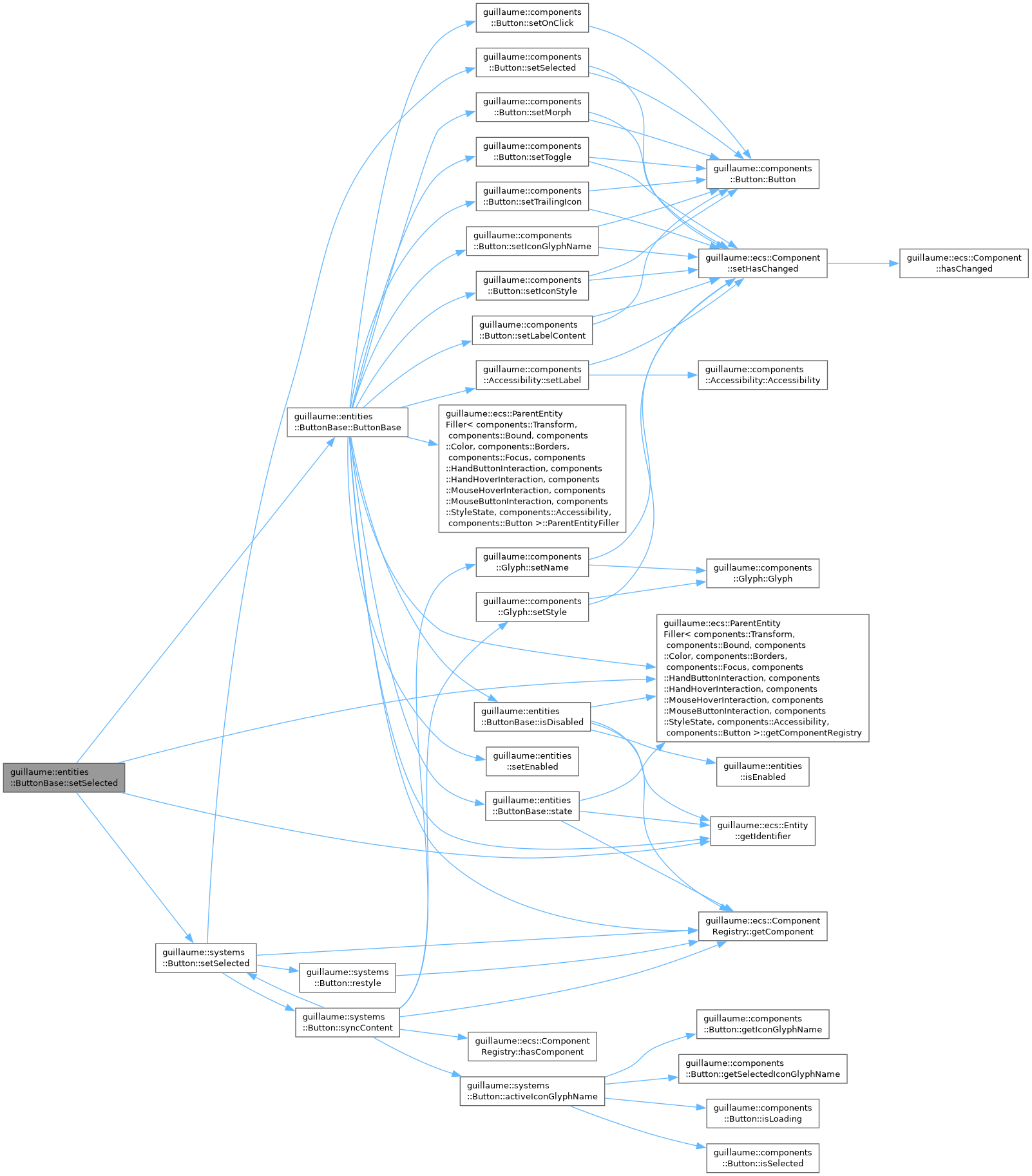
| ButtonBase & | setSelected (const bool &selected) |
| Turn a toggle button on or off from code. | |
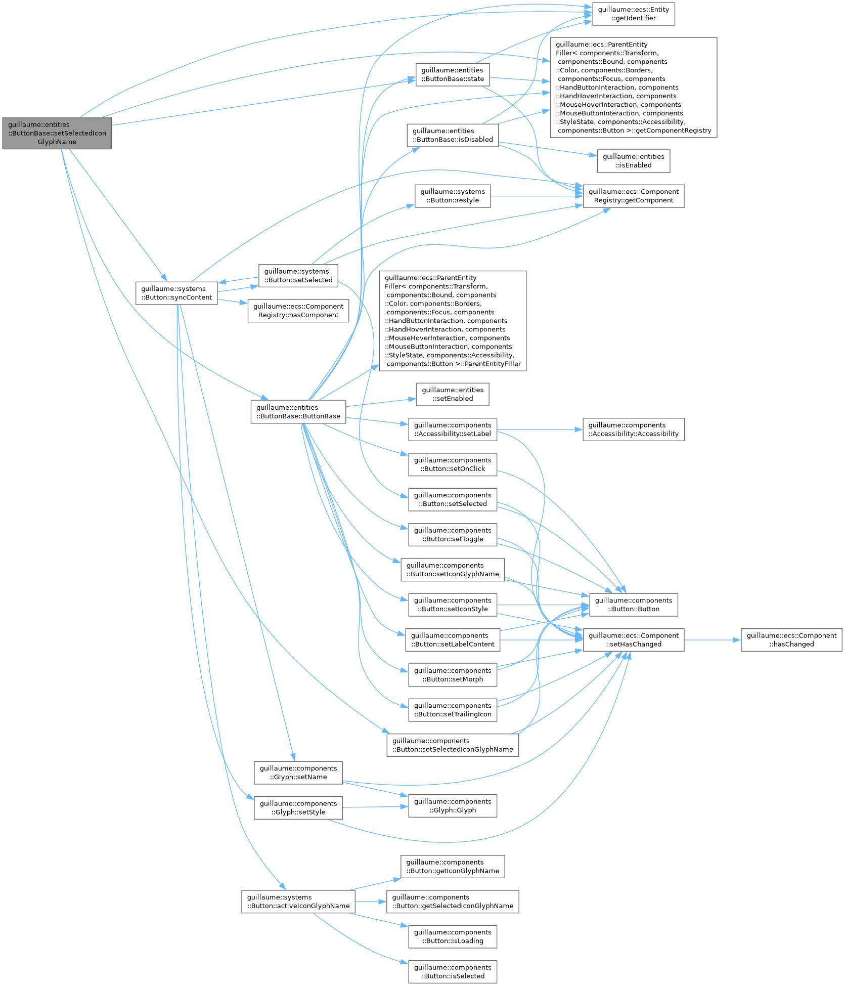
| ButtonBase & | setSelectedIconGlyphName (const std::string &selectedIconGlyphName) |
| Set the icon shown instead of the regular one while the button is selected. | |
| ButtonBase & | setMorph (const bool &isMorph) |
| Choose whether the button changes shape when selected, and restyle at once. | |
| ButtonBase & | setTrailingIcon (const bool &isTrailingIcon) |
| Put the icon before or after the label, and restyle at once. | |
| ButtonBase & | setDisabled (const bool &isDisabled) |
| Disable or enable the button, and restyle at once. | |
| bool | isDisabled (void) const |
| Tell whether the button is disabled. | |
| ButtonBase & | setAccessibilityLabel (const std::string &accessibilityLabel) |
| Set the name assistive tools announce for the button. | |
| const std::string & | getAccessibilityLabel (void) const |
| Get the name assistive tools announce for the button. | |
| ButtonBase & | setAccessibilityHint (const std::string &accessibilityHint) |
| Set the sentence that tells assistive tools what activating the button does. | |
| ButtonBase & | setAccessibilityRole (components::AccessibilityRole role) |
| Change the role announced by assistive tools. | |
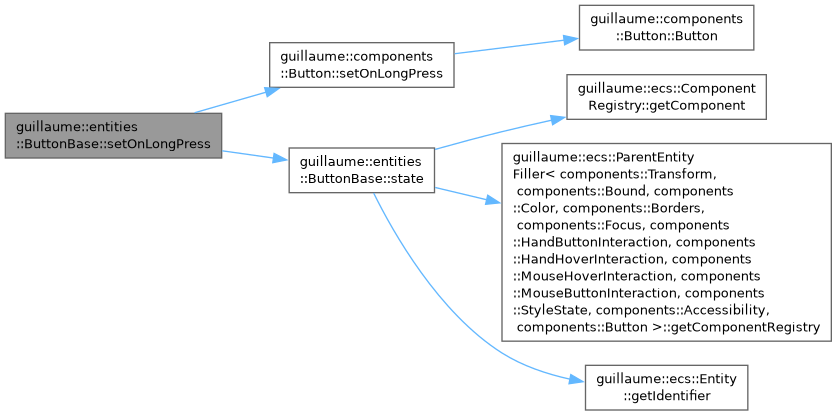
| ButtonBase & | setOnLongPress (std::function< void(void)> onLongPress) |
| Set the function called when the user holds the button. | |
| ButtonBase & | setLoading (bool loading) |
| Show or hide the loading state. | |
| ButtonBase & | setVisible (bool visible) |
| Show or hide the button, and restyle at once. | |
| bool | isVisible (void) const |
| Tell whether the button is shown. | |
| bool | isLoading (void) const |
| Tell whether the button is in the loading state. | |
| ButtonBase & | setContainerColorOverride (std::optional< utility::graphic::Color32Bit > color) |
| Replace the theme's background color with a custom one, and restyle at once. | |
| ButtonBase & | setContentColorOverride (std::optional< utility::graphic::Color32Bit > color) |
| Replace the theme's icon and label color with a custom one, and restyle at once. | |
| const std::string & | getAccessibilityHint (void) const |
| Get the sentence that tells assistive tools what activating the button does. | |
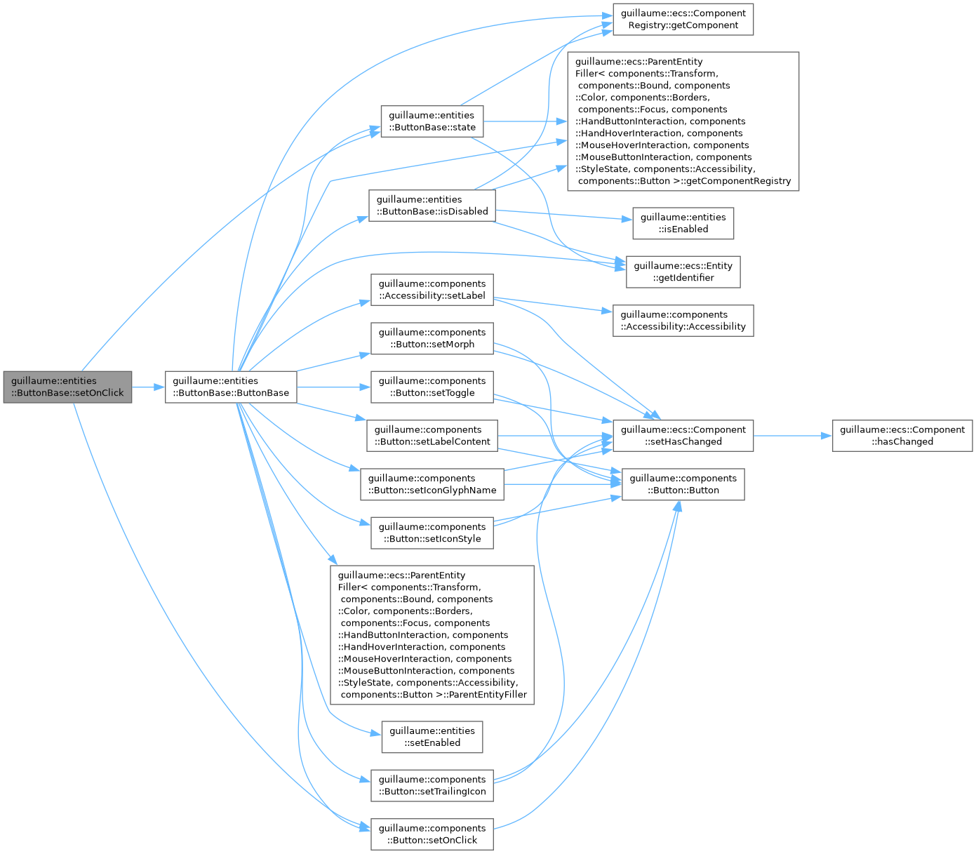
| ButtonBase & | setOnClick (std::function< void(void)> onClick) |
| Set the function called when the user clicks the button. | |
| ecs::Entity::Identifier | getIconIdentifier (void) const |
| Get the icon child, to read or adjust its components. | |
| ecs::Entity::Identifier | getLabelIdentifier (void) const |
| Get the label child, to read or adjust its components. | |
| void | hoverHandler (void) |
| Tell the button a pointer started hovering it. | |
| void | unHoverHandler (void) |
| Tell the button a pointer stopped hovering it. | |
| void | buttonPressHandler (void) |
| Press the button from code, as the user would. | |
| void | buttonReleaseHandler (void) |
| Release the button from code, as the user would. | |
| Public Member Functions inherited from guillaume::ecs::ParentEntityFiller< components::Transform, components::Bound, components::Color, components::Borders, components::Focus, components::HandButtonInteraction, components::HandHoverInteraction, components::MouseHoverInteraction, components::MouseButtonInteraction, components::StyleState, components::Accessibility, components::Button > | |
| ParentEntityFiller (ComponentRegistry &componentRegistry) | |
| Create the entity, its listed components and its components::Hierarchy. It owns no child yet. | |
| virtual | ~ParentEntityFiller (void)=default |
| Destroy the entity object and release the children it owns; components stay in the registry (see EntityRegistry::removeEntity). | |
| Public Member Functions inherited from guillaume::ecs::Entity | |
| Entity (void) | |
| Create an entity with a fresh identifier, an empty signature, no parent and no component. | |
| virtual | ~Entity (void)=default |
| Destroy the entity object. | |
| Entity::Identifier | getIdentifier (void) const noexcept |
| Get the identifier of the entity. | |
| Entity::Signature | getSignature (void) const noexcept |
| Get the set of component types the entity declares. | |
| void | setSignature (const Signature &signature) |
| Replace the signature of the entity. | |
| std::int32_t | getLayer (void) const noexcept |
| Get the depth of the entity in the tree. | |
| Entity & | setParent (std::shared_ptr< Entity > parent) |
| Attach the entity under another one, or detach it. | |
| std::vector< Identifier > | releaseComponents (void) |
| Drop the entity's place in the tree and all its components. | |
| std::shared_ptr< Entity > | getParent (void) const noexcept |
| Get the parent entity. | |
| Public Member Functions inherited from guillaume::ecs::EntityRegistry | |
| EntityRegistry (void)=default | |
| Create a registry. | |
| virtual | ~EntityRegistry (void)=default |
| Virtual destructor. | |
| void | addEntity (std::shared_ptr< Entity > entity) |
| Make this registry own an entity, so that it stays alive and systems visit it. | |
| bool | removeEntity (Entity::Identifier identifier) |
| Remove an entity, with its children and all their components. | |
| void | clearEntities (void) |
| Remove every entity owned by this registry, with everything they own and all their components. | |
| const std::vector< std::shared_ptr< Entity > > & | getEntities (void) const |
| Get the entities this registry owns directly. | |
| std::vector< std::shared_ptr< Entity > > | getEntitiesBreadthFirst (void) |
| List every entity of this registry and of the registries nested in it, level by level. | |
| std::vector< std::shared_ptr< Entity > > | getEntitiesBreadthFirst (void) const |
| List every entity of this registry and of the registries nested in it, level by level (const overload). | |
| template<InheritFromEntity EntityType> | |
| std::shared_ptr< EntityType > | getEntity (Entity::Identifier identifier) |
| Find an entity owned directly by this registry, by identifier. | |
| template<InheritFromEntity EntityType> | |
| std::shared_ptr< const EntityType > | getEntity (Entity::Identifier identifier) const |
| Find an entity owned directly by this registry, by identifier (const overload). | |
| std::vector< Entity::Identifier > | getEntityWithSignature (Entity::Signature systemSignature) const |
| List the entities that have every component type of a signature, from the root down. | |
| std::vector< Entity::Identifier > | getEntityWithSignature (Entity::Signature systemSignature, const EntityTreeTraveler &traveler) const |
| List the entities that have every component type of a signature, in the order chosen by a traveler. | |
Static Public Member Functions | |
| static const utility::graphic::PoseF | applyLayerToPosition (const utility::graphic::PositionF &position, const utility::graphic::OrientationF &orientation, const std::uint32_t &layer) |
| Compute the pose of content drawn in front of a button. | |
| static utility::graphic::Color32Bit | applyStateAlpha (const utility::graphic::Color32Bit &color, std::uint8_t alpha) |
| Replace the alpha of a color and keep its red, green and blue. | |
| static utility::graphic::Color32Bit | applyStateLayer (const utility::graphic::Color32Bit &base, const utility::graphic::Color32Bit &overlay, std::uint8_t alpha) |
| Blend a translucent state layer (hover, press) over a container color. | |
| static utility::graphic::Color32Bit | getDisabledContainerColor (void) |
| Get the background color of a disabled button. | |
| static utility::graphic::Color32Bit | getDisabledContentColor (void) |
| Get the icon and label color of a disabled button. | |
| static utility::graphic::Color32Bit | getDisabledBorderColor (void) |
| Get the outline color of a disabled button. | |
| Static Public Member Functions inherited from guillaume::ecs::Entity | |
| template<InheritFromComponent... ComponentTypes> | |
| static Signature | getSignatureFromTypes (void) |
| Build the signature that has exactly the bits of the given component types. | |
Static Public Attributes | |
| static constexpr const char * | LoadingGlyph |
| Name of the glyph the icon child shows while loading. | |
| static constexpr std::chrono::milliseconds | LongPressDuration |
| How long a press must last to count as a long press (500 ms). | |
| Static Public Attributes inherited from guillaume::ecs::Entity | |
| static constexpr Identifier | InvalidIdentifier |
| "No entity": never the identifier of a real entity | |
Protected Member Functions | |
| void | build (void) |
| Create the icon and label children, then style the button. | |
| ButtonBase (ecs::ComponentRegistry ®istry, const std::string &iconGlyphName, const components::Glyph::Style &iconStyle, const std::string &labelContent, bool isToggle, bool isMorph, bool isDisabled, bool isTrailingIcon, const std::string &accessibilityLabel, std::function< void(void)> onClick) | |
| Create the entity with its components and store the initial state. The children are created later, by build(). | |
| components::Button & | state (void) |
| Access the shared button state, for writing. | |
| const components::Button & | state (void) const |
| Access the shared button state, for reading. | |
| void | restyle (void) |
| Recompute colors and geometry now. | |
| virtual float | getIconFontSize (void) const =0 |
| Size the icon child is created with. | |
| virtual bool | usesLabel (void) const |
| Tell build() whether to create a label child. | |
| virtual bool | usesIcon (void) const |
| Tell build() whether to create an icon child. | |
| virtual utility::graphic::Color32Bit | getInitialContentColor (void) const =0 |
| Color the icon and label children are created with. | |
| bool | isHovered (void) |
| Tell whether a pointer is over the button. | |
| bool | isPressed (void) |
| Tell whether the button is held down. | |
| const std::string & | getActiveIconGlyphName (void) const |
| Get the glyph the icon child should show right now. | |
| void | applyTouchTarget (float width, float height) |
| Make a small button easier to hit. | |
| void | syncAccessibilityState (void) |
| Copy the current state to the icon child and to Accessibility. | |
| utility::graphic::Color32Bit | resolveContainerColor (const utility::graphic::Color32Bit &color) const |
| Pick the background color to paint. | |
| utility::graphic::Color32Bit | resolveContentColor (const utility::graphic::Color32Bit &color) const |
| Pick the icon and label color to paint. | |
| Protected Member Functions inherited from guillaume::ecs::ParentEntityFiller< components::Transform, components::Bound, components::Color, components::Borders, components::Focus, components::HandButtonInteraction, components::HandHoverInteraction, components::MouseHoverInteraction, components::MouseButtonInteraction, components::StyleState, components::Accessibility, components::Button > | |
| ComponentRegistry & | getComponentRegistry (void) |
| Get the registry that stores this entity's components. | |
| Protected Member Functions inherited from guillaume::ecs::ParentEntity | |
| std::vector< std::shared_ptr< Entity > > & | accessDirectEntities (void) override |
| Give access to the list of entities this entity owns directly. | |
| const std::vector< std::shared_ptr< Entity > > & | accessDirectEntities (void) const override |
| Give read access to the list of entities this entity owns directly. | |
| Protected Member Functions inherited from guillaume::ecs::Entity | |
| void | attachHierarchy (ComponentRegistry &componentRegistry) |
| Give the entity a components::Hierarchy in a registry and add that component to its signature. | |
| template<InheritFromComponent... ComponentTypes> | |
| void | setSignature (void) |
| Replace the signature by the one made of the given component types. | |
Static Protected Attributes | |
| static constexpr float | _layerDepthStep |
| Depth between two layers, toward the viewer. | |
Additional Inherited Members | |
| Public Types inherited from guillaume::ecs::Entity | |
| using | Identifier = std::size_t |
| The key under which an entity's components are stored. Systems and components refer to entities by this value. | |
| using | Signature = std::bitset<128> |
| A set of component types, one bit per type (bit position given by ComponentTypeId, MaxComponentTypes bits). | |
Detailed Description
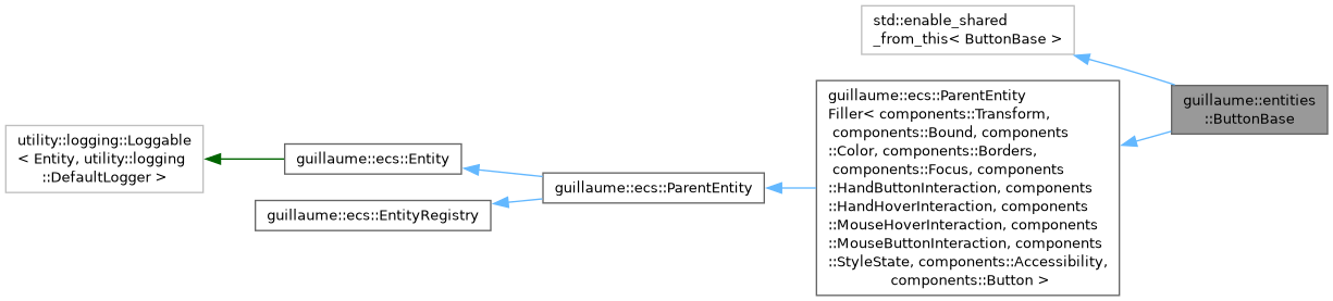
What Button, IconButton, FloatingActionButton and ExtendedFloatingActionButton have in common: an icon, a label, a click, a toggle state.
This class is not created directly; use one of the four widgets above. It holds no field. The shared state lives in components::Button (glyph names, label, toggle, selected, loading, visible, callbacks, color overrides), the enabled flag in components::StyleState and the label read by assistive tools in components::Accessibility. The rules are in two systems:
- systems::Button (Event phase) turns hover, press and release into state, calls the click or long-press handler and keeps the icon child's glyph up to date.
- The system of the concrete widget (systems::CommonButton, systems::IconButton, ...) computes colors, size and the position of the icon and label. It is reached through the restyle function stored in components::Button.
The setters below write the components and, when the look depends on the value, restyle at once.
Watch out for:
- The icon and the label are child entities (Icon and Text) owned by the button and created once, when the widget is built. Their colors, sizes and positions are overwritten by the concrete widget's system.
- The handlers are called on release, not on press. A hidden or disabled button calls none.
- See also
- components::Button, systems::Button, Button, IconButton
Definition at line 97 of file button_base.hpp.
Constructor & Destructor Documentation
◆ ButtonBase()
|
protected |
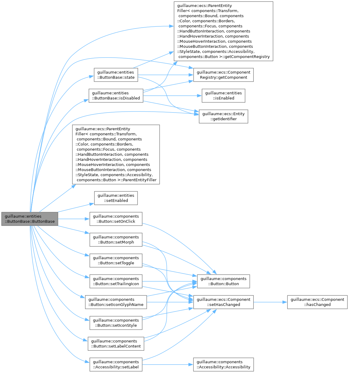
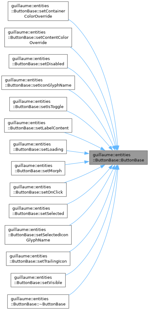
Create the entity with its components and store the initial state. The children are created later, by build().
- Parameters
-
registry The registry that stores the components. iconGlyphName The name of the icon glyph, empty for none. iconStyle The style the glyph is drawn in. labelContent The text of the label, empty for none. isToggle True when a release flips the selected state. isMorph True when the shape changes while selected. isDisabled True to start disabled. isTrailingIcon True to place the icon after the label. accessibilityLabel The name announced by assistive tools. When empty, labelContentis used.onClick The function called on click (may be empty).
Definition at line 33 of file button_base.cpp.
Member Function Documentation
◆ applyLayerToPosition()
|
static |
Compute the pose of content drawn in front of a button.
Forwards to systems::Layout::contentLayerPose: the position is moved toward the viewer, along the forward axis of the orientation, by one depth step per layer plus one, so the icon and the label do not overlap the container surface in depth.
- Parameters
-
position The position of the content on the button plane. orientation The orientation of the button. layer The layer of the button in the entity tree.
- Returns
- The pose to give to the content.
Definition at line 212 of file button_base.cpp.

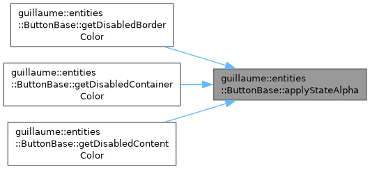
◆ applyStateAlpha()
|
static |
Replace the alpha of a color and keep its red, green and blue.
- Parameters
-
color The base color. alpha The new alpha, from 0 (transparent) to 255 (opaque).
- Returns
- The color with the new alpha.
Definition at line 221 of file button_base.cpp.

◆ applyStateLayer()
|
static |
Blend a translucent state layer (hover, press) over a container color.
- Parameters
-
base The container color. overlay The color of the state layer, usually the content color. alpha The opacity of the layer, from 0 to 255.
- Returns
- The container color with the layer blended on top.
Definition at line 228 of file button_base.cpp.

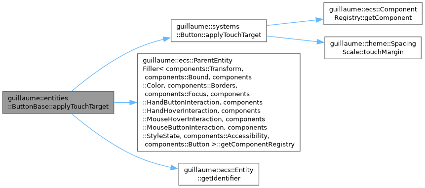
◆ applyTouchTarget()
|
protected |
Make a small button easier to hit.
Sets the accessibility margin of the mouse and hand hover components so the area that reacts to pointers is at least theme::SpacingScale::MinTouchTarget (48 dp) on both axes. The drawn size does not change.
- Parameters
-
width The drawn width of the button, in dp. height The drawn height of the button, in dp.
Definition at line 357 of file button_base.cpp.
◆ build()
|
protected |
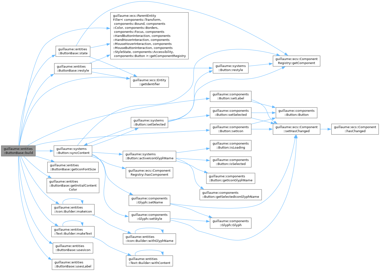
Create the icon and label children, then style the button.
Called once by the create() of the concrete widget, after construction: a child needs its parent to be owned by a std::shared_ptr. usesIcon() and usesLabel() decide which children exist; their identifiers are stored in components::Button. The button itself is the entity registry that owns them.
Definition at line 383 of file button_base.cpp.
◆ buttonPressHandler()
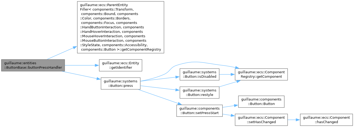
| void guillaume::entities::ButtonBase::buttonPressHandler | ( | void | ) |
Press the button from code, as the user would.
Starts timing the press and restyles. Ignored when the button is disabled or hidden.
Definition at line 373 of file button_base.cpp.
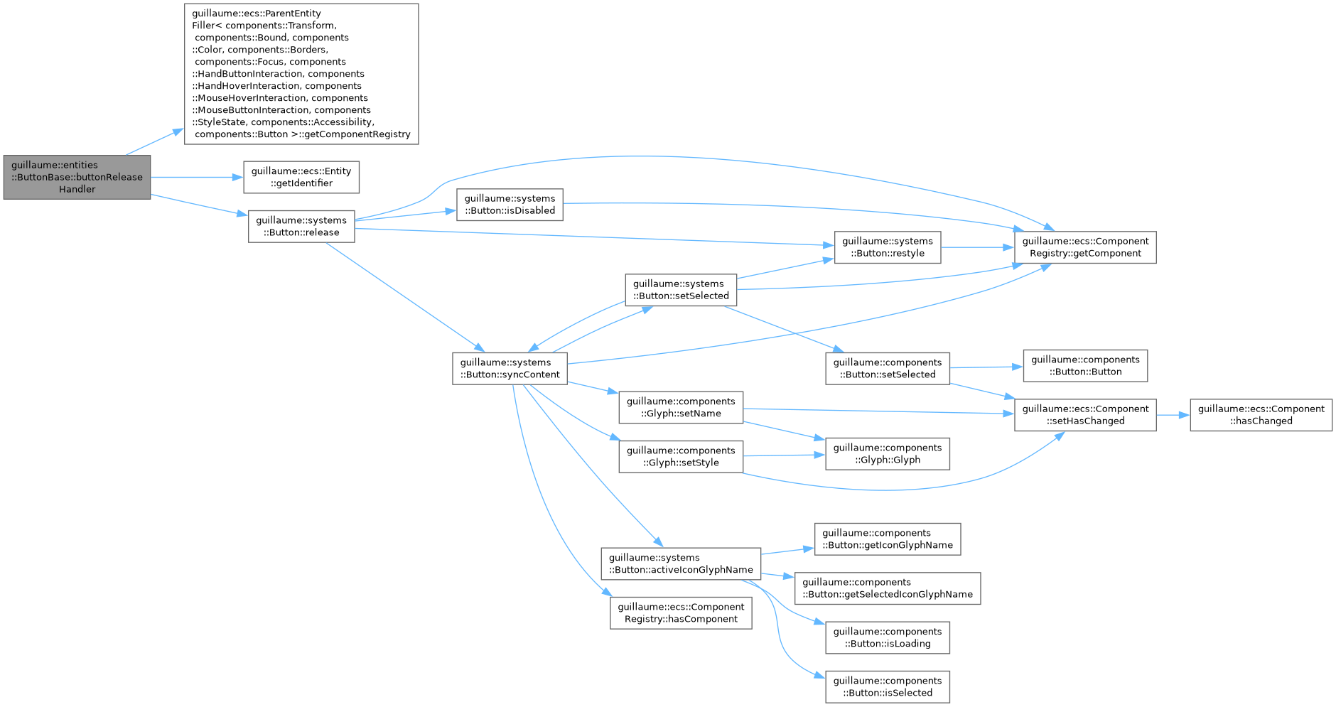
◆ buttonReleaseHandler()
| void guillaume::entities::ButtonBase::buttonReleaseHandler | ( | void | ) |
Release the button from code, as the user would.
Flips the selected state of a toggle, restyles, then calls the long-press or the click handler. Ignored when the button is disabled or hidden.
Definition at line 378 of file button_base.cpp.
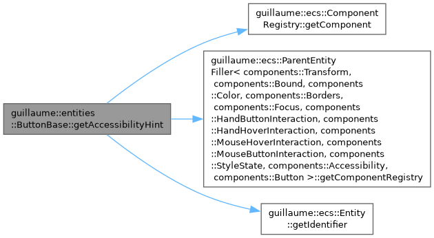
◆ getAccessibilityHint()
| const std::string & guillaume::entities::ButtonBase::getAccessibilityHint | ( | void | ) | const |
Get the sentence that tells assistive tools what activating the button does.
- Returns
- The hint stored in components::Accessibility, empty when none was set.
Definition at line 196 of file button_base.cpp.
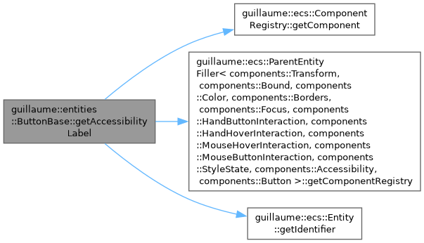
◆ getAccessibilityLabel()
| const std::string & guillaume::entities::ButtonBase::getAccessibilityLabel | ( | void | ) | const |
Get the name assistive tools announce for the button.
- Returns
- The label stored in components::Accessibility.
Definition at line 180 of file button_base.cpp.
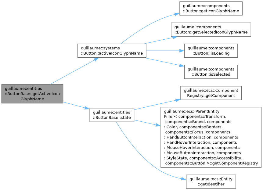
◆ getActiveIconGlyphName()
|
protected |
Get the glyph the icon child should show right now.
- Returns
- LoadingGlyph while loading; otherwise the selected glyph when the button is selected and one is set; otherwise the regular glyph.
Definition at line 352 of file button_base.cpp.
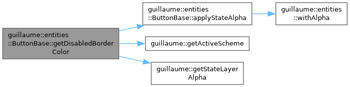
◆ getDisabledBorderColor()
|
static |
Get the outline color of a disabled button.
- Returns
- The OnSurface color of the active scheme at the disabled-container opacity of the theme (the same value as getDisabledContainerColor()).
Definition at line 253 of file button_base.cpp.
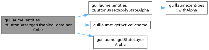
◆ getDisabledContainerColor()
|
static |
Get the background color of a disabled button.
- Returns
- The OnSurface color of the active scheme at the disabled-container opacity of the theme.
Definition at line 235 of file button_base.cpp.
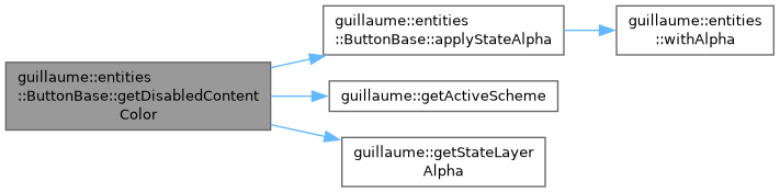
◆ getDisabledContentColor()
|
static |
Get the icon and label color of a disabled button.
- Returns
- The OnSurface color of the active scheme at the disabled-content opacity of the theme.
Definition at line 244 of file button_base.cpp.
◆ getIconFontSize()
|
protectedpure virtual |
Size the icon child is created with.
- Returns
- The glyph size, in dp.
Implemented in guillaume::entities::Button, guillaume::entities::ExtendedFloatingActionButton, guillaume::entities::FloatingActionButton, and guillaume::entities::IconButton.

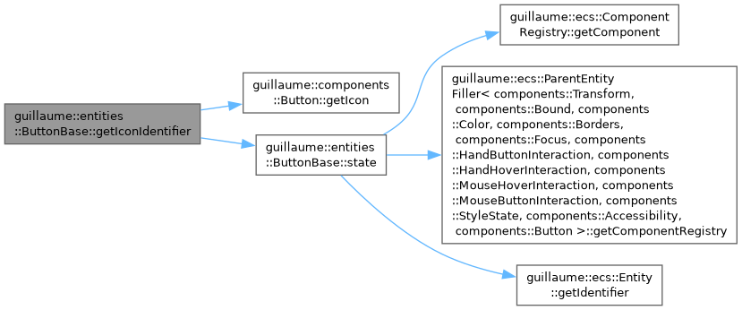
◆ getIconIdentifier()
| ecs::Entity::Identifier guillaume::entities::ButtonBase::getIconIdentifier | ( | void | ) | const |
Get the icon child, to read or adjust its components.
- Returns
- The identifier of the Icon child, or ecs::Entity::InvalidIdentifier when the widget has none.
Definition at line 330 of file button_base.cpp.
◆ getInitialContentColor()
|
protectedpure virtual |
Color the icon and label children are created with.
- Returns
- The content color for the initial state of the widget. The first restyle replaces it.
Implemented in guillaume::entities::Button, guillaume::entities::ExtendedFloatingActionButton, guillaume::entities::FloatingActionButton, and guillaume::entities::IconButton.

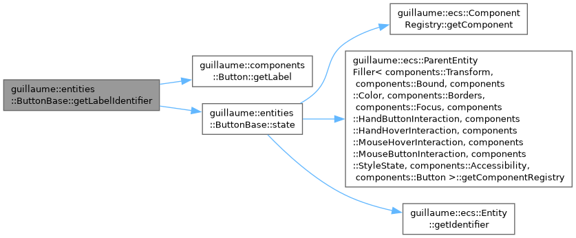
◆ getLabelIdentifier()
| ecs::Entity::Identifier guillaume::entities::ButtonBase::getLabelIdentifier | ( | void | ) | const |
Get the label child, to read or adjust its components.
- Returns
- The identifier of the Text child, or ecs::Entity::InvalidIdentifier when the widget has none.
Definition at line 335 of file button_base.cpp.
◆ hoverHandler()
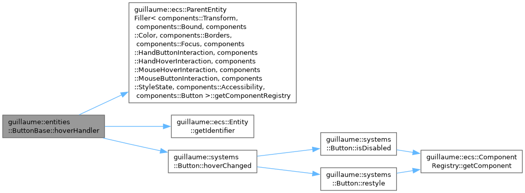
| void guillaume::entities::ButtonBase::hoverHandler | ( | void | ) |
Tell the button a pointer started hovering it.
Restyles unless the button is disabled. The framework does not call this: systems::Button wires the hover components itself. Useful to drive a button from code or from a test.
Definition at line 363 of file button_base.cpp.
◆ isDisabled()
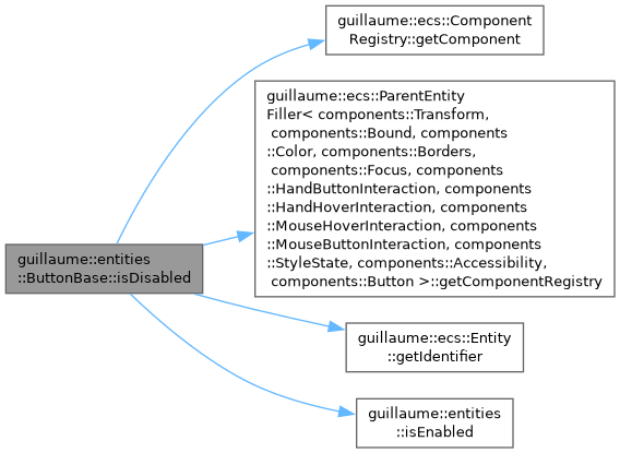
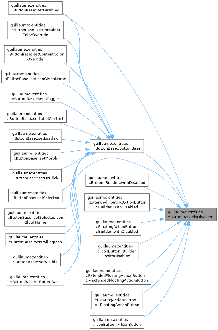
| bool guillaume::entities::ButtonBase::isDisabled | ( | void | ) | const |
Tell whether the button is disabled.
- Returns
- True when its components::StyleState is not enabled.
Definition at line 164 of file button_base.cpp.
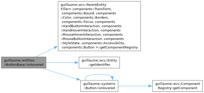
◆ isHovered()
|
protected |
Tell whether a pointer is over the button.
- Returns
- True when the mouse or a hand hovers it.
Definition at line 340 of file button_base.cpp.
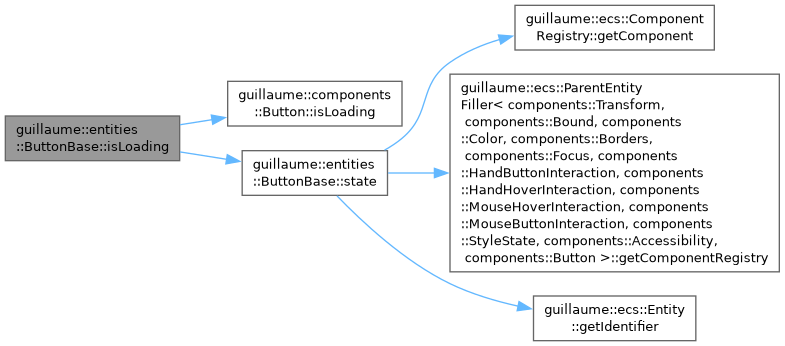
◆ isLoading()
| bool guillaume::entities::ButtonBase::isLoading | ( | void | ) | const |
Tell whether the button is in the loading state.
- Returns
- True between setLoading(true) and setLoading(false).
Definition at line 282 of file button_base.cpp.
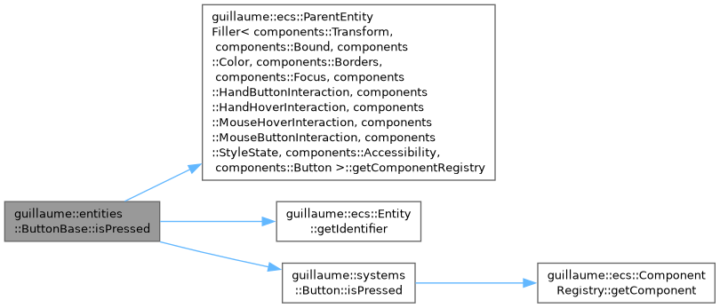
◆ isPressed()
|
protected |
Tell whether the button is held down.
- Returns
- True while the left mouse button or the hand button A is pressed on it.
Definition at line 346 of file button_base.cpp.
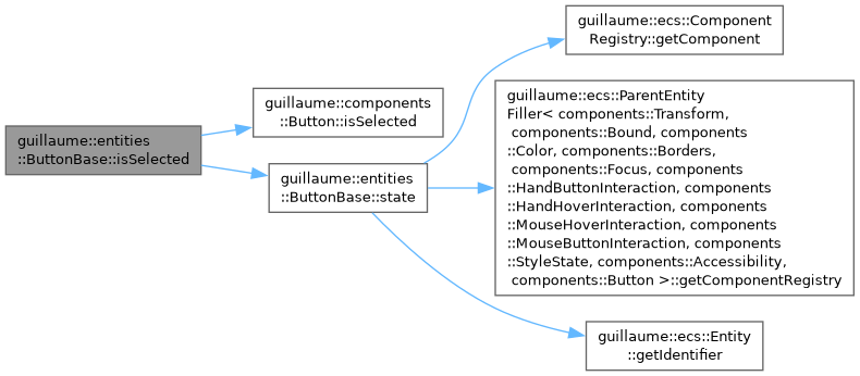
◆ isSelected()
| bool guillaume::entities::ButtonBase::isSelected | ( | void | ) | const |
Tell whether a toggle button is on.
- Returns
- True when the button is a toggle and is selected. Always false for a push button.
Definition at line 121 of file button_base.cpp.
◆ isVisible()
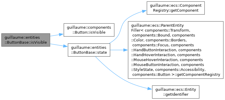
| bool guillaume::entities::ButtonBase::isVisible | ( | void | ) | const |
Tell whether the button is shown.
- Returns
- False after setVisible(false). True by default.
Definition at line 297 of file button_base.cpp.
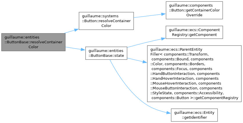
◆ resolveContainerColor()
|
protected |
Pick the background color to paint.
- Parameters
-
color The color computed from the theme.
- Returns
- The color given to setContainerColorOverride() when one is set, otherwise
color.
Definition at line 318 of file button_base.cpp.
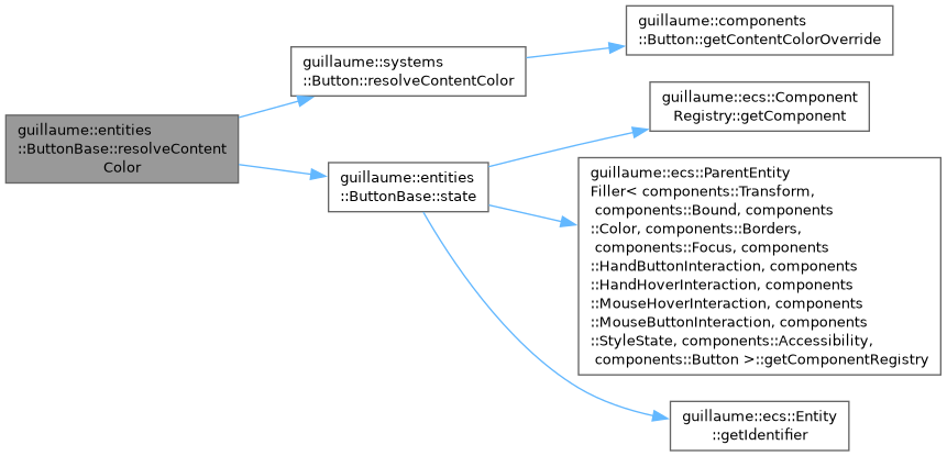
◆ resolveContentColor()
|
protected |
Pick the icon and label color to paint.
- Parameters
-
color The color computed from the theme.
- Returns
- The color given to setContentColorOverride() when one is set, otherwise
color.
Definition at line 324 of file button_base.cpp.
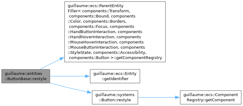
◆ restyle()
|
protected |
Recompute colors and geometry now.
Runs the restyle function the concrete widget's system stored in components::Button, if any. That system does the same every frame; calling it from a setter makes the change visible immediately.
Definition at line 79 of file button_base.cpp.

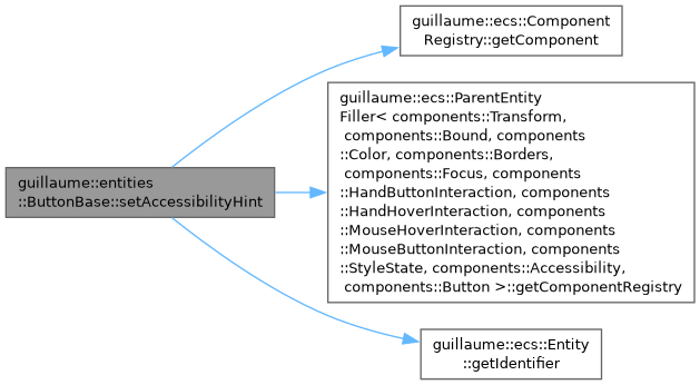
◆ setAccessibilityHint()
| ButtonBase & guillaume::entities::ButtonBase::setAccessibilityHint | ( | const std::string & | accessibilityHint | ) |
Set the sentence that tells assistive tools what activating the button does.
- Parameters
-
accessibilityHint The hint, such as "Opens the settings".
- Returns
- This button, for chaining.
Definition at line 188 of file button_base.cpp.
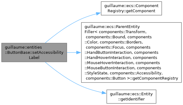
◆ setAccessibilityLabel()
| ButtonBase & guillaume::entities::ButtonBase::setAccessibilityLabel | ( | const std::string & | accessibilityLabel | ) |
Set the name assistive tools announce for the button.
- Parameters
-
accessibilityLabel The name. At construction it defaults to the label text.
- Returns
- This button, for chaining.
Definition at line 172 of file button_base.cpp.
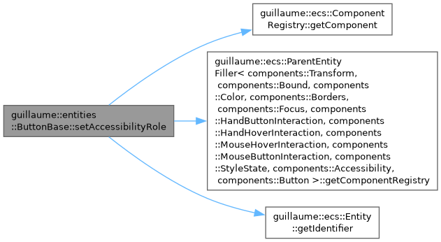
◆ setAccessibilityRole()
| ButtonBase & guillaume::entities::ButtonBase::setAccessibilityRole | ( | components::AccessibilityRole | role | ) |
Change the role announced by assistive tools.
- Parameters
-
role The role. It is components::AccessibilityRole::Button until this is called.
- Returns
- This button, for chaining.
Definition at line 204 of file button_base.cpp.
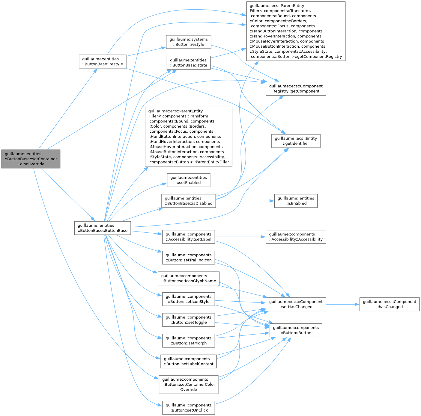
◆ setContainerColorOverride()
| ButtonBase & guillaume::entities::ButtonBase::setContainerColorOverride | ( | std::optional< utility::graphic::Color32Bit > | color | ) |
Replace the theme's background color with a custom one, and restyle at once.
- Parameters
-
color The custom color, or std::nullopt to go back to the color of the theme.
- Returns
- This button, for chaining.
Definition at line 302 of file button_base.cpp.
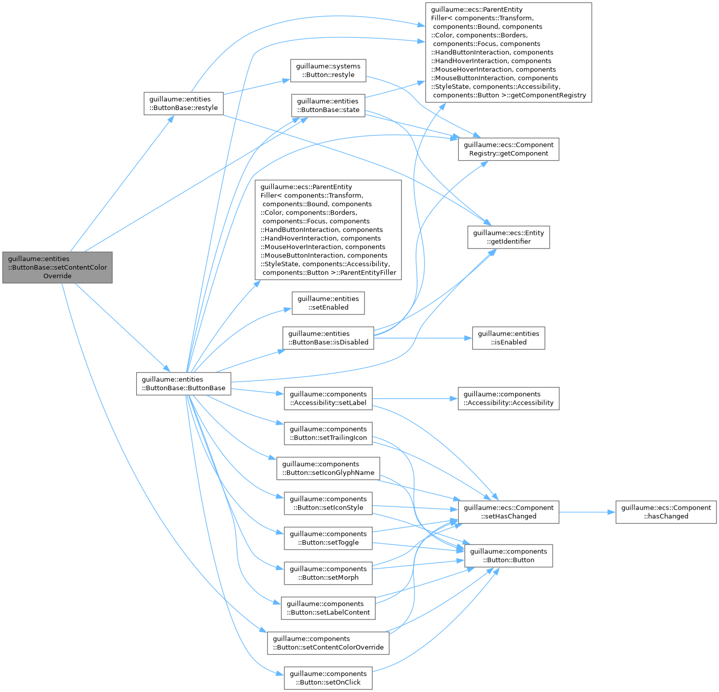
◆ setContentColorOverride()
| ButtonBase & guillaume::entities::ButtonBase::setContentColorOverride | ( | std::optional< utility::graphic::Color32Bit > | color | ) |
Replace the theme's icon and label color with a custom one, and restyle at once.
- Parameters
-
color The custom color, or std::nullopt to go back to the color of the theme.
- Returns
- This button, for chaining.
Definition at line 310 of file button_base.cpp.
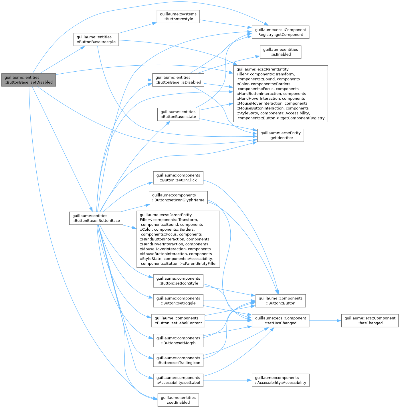
◆ setDisabled()
| ButtonBase & guillaume::entities::ButtonBase::setDisabled | ( | const bool & | isDisabled | ) |
Disable or enable the button, and restyle at once.
A disabled button ignores hover, press and release and calls no handler. The flag is stored in components::StyleState.
- Parameters
-
isDisabled True to disable the button.
- Returns
- This button, for chaining.
Definition at line 155 of file button_base.cpp.
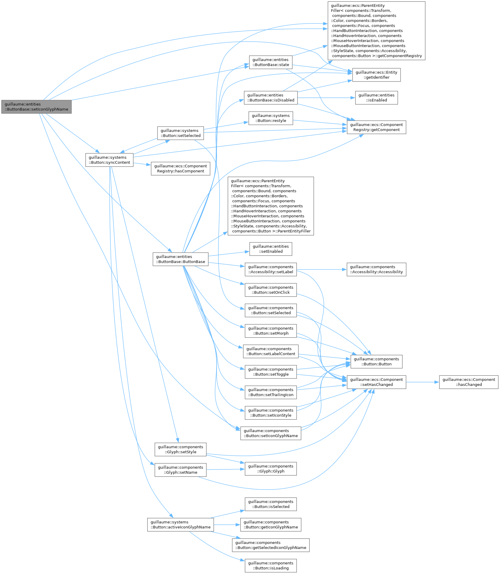
◆ setIconGlyphName()
| ButtonBase & guillaume::entities::ButtonBase::setIconGlyphName | ( | const std::string & | iconGlyphName | ) |
Change the icon.
The icon child shows it at once, unless the button is loading or is selected with a selected glyph set.
- Parameters
-
iconGlyphName The name of the glyph, such as "add".
- Returns
- This button, for chaining.
Definition at line 84 of file button_base.cpp.
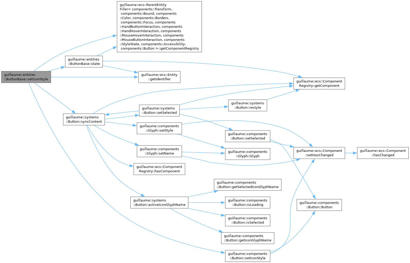
◆ setIconStyle()
| ButtonBase & guillaume::entities::ButtonBase::setIconStyle | ( | const components::Glyph::Style & | iconStyle | ) |
Change the style the icon glyph is drawn in.
- Parameters
-
iconStyle The glyph style (outlined, filled, ...), applied to the icon child at once.
- Returns
- This button, for chaining.
Definition at line 92 of file button_base.cpp.
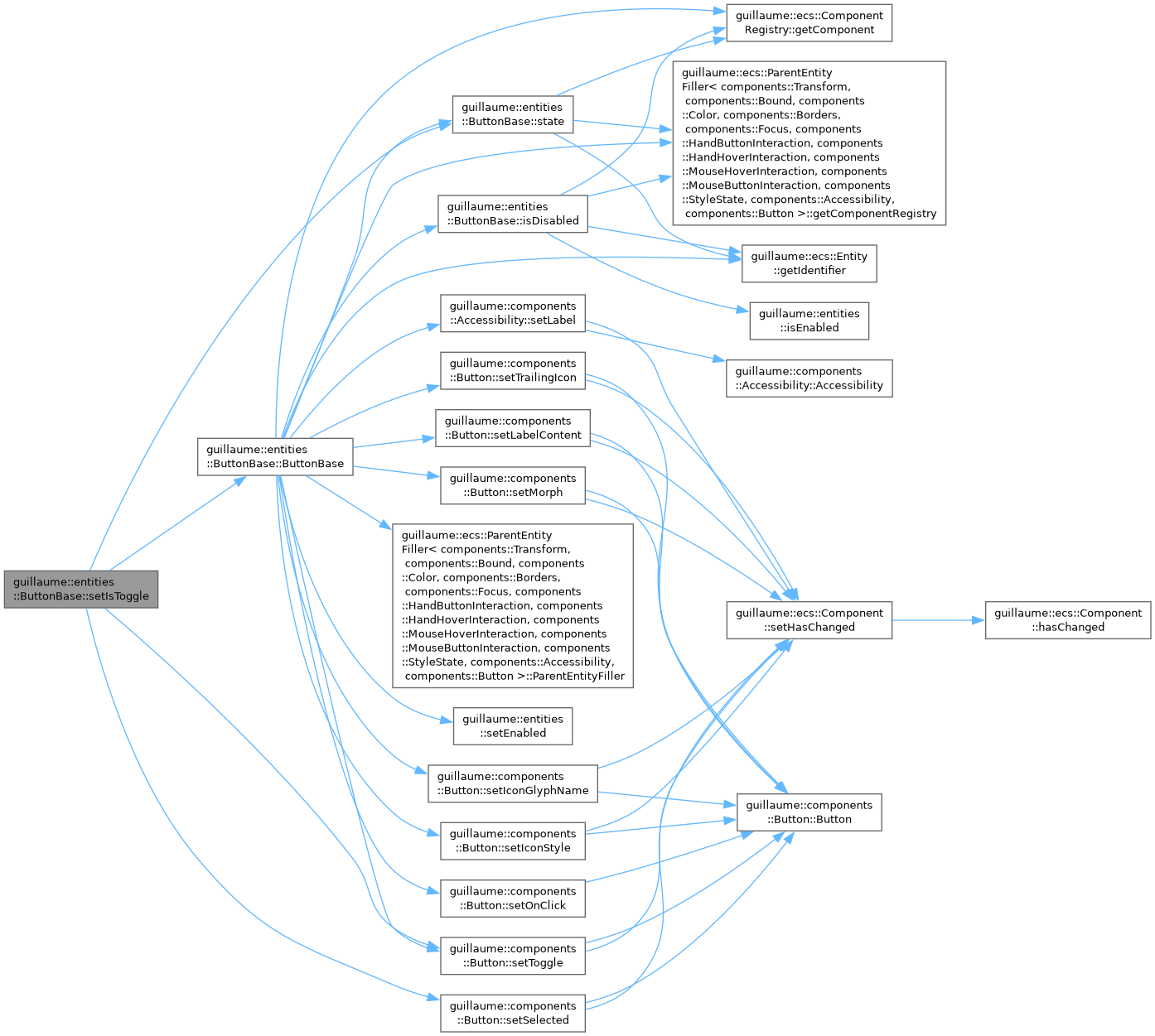
◆ setIsToggle()
| ButtonBase & guillaume::entities::ButtonBase::setIsToggle | ( | const bool & | isToggle | ) |
Make the button a toggle, or a plain push button.
A toggle flips its selected state each time the user releases it.
- Parameters
-
isToggle True for a toggle. False also clears the selected state.
- Returns
- This button, for chaining.
Definition at line 112 of file button_base.cpp.
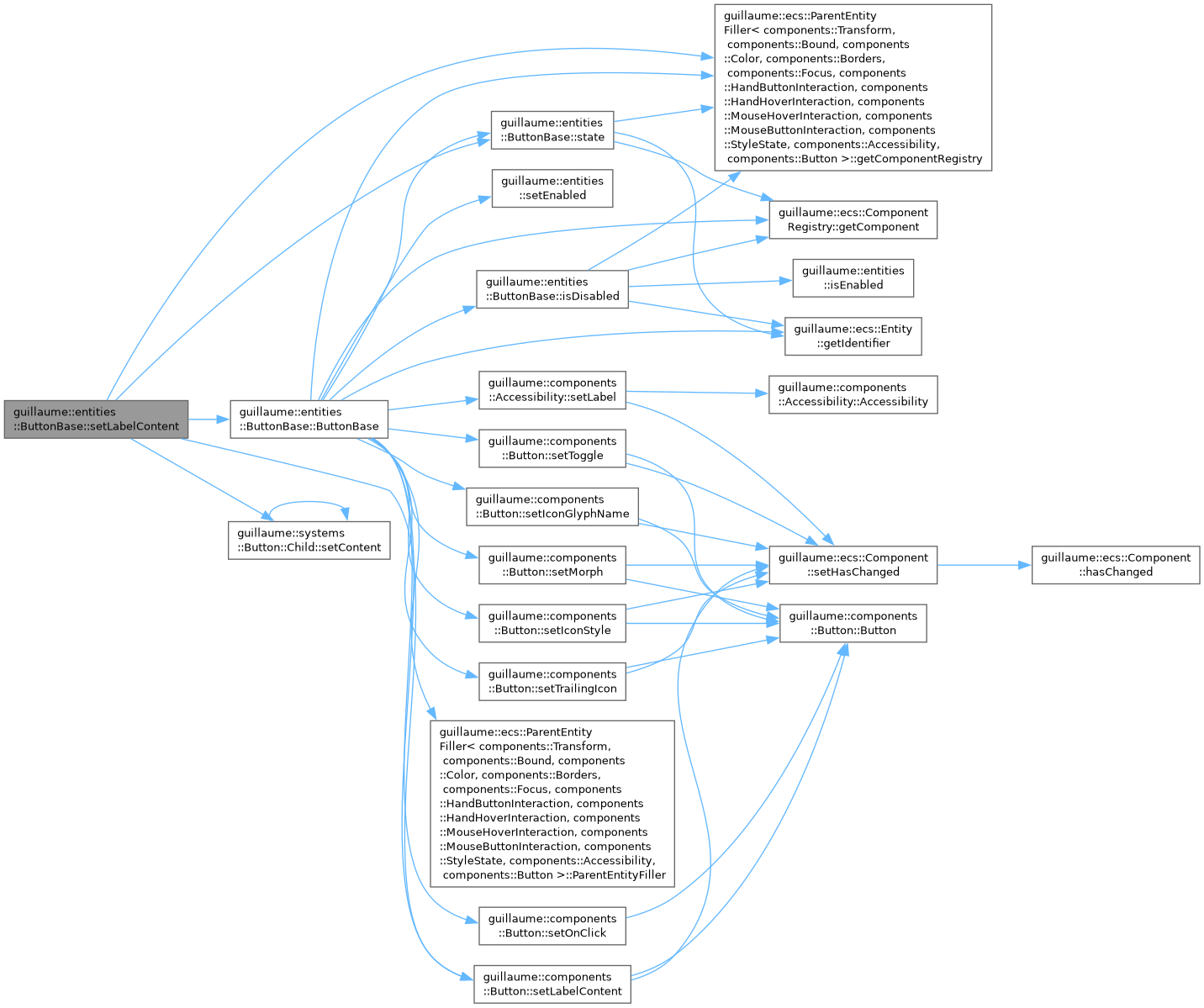
◆ setLabelContent()
| ButtonBase & guillaume::entities::ButtonBase::setLabelContent | ( | const std::string & | labelContent | ) |
Change the text of the label.
Writes the content of the label child. It has no visible effect on a widget without label child (see usesLabel()).
- Parameters
-
labelContent The new text.
- Returns
- This button, for chaining.
Definition at line 99 of file button_base.cpp.
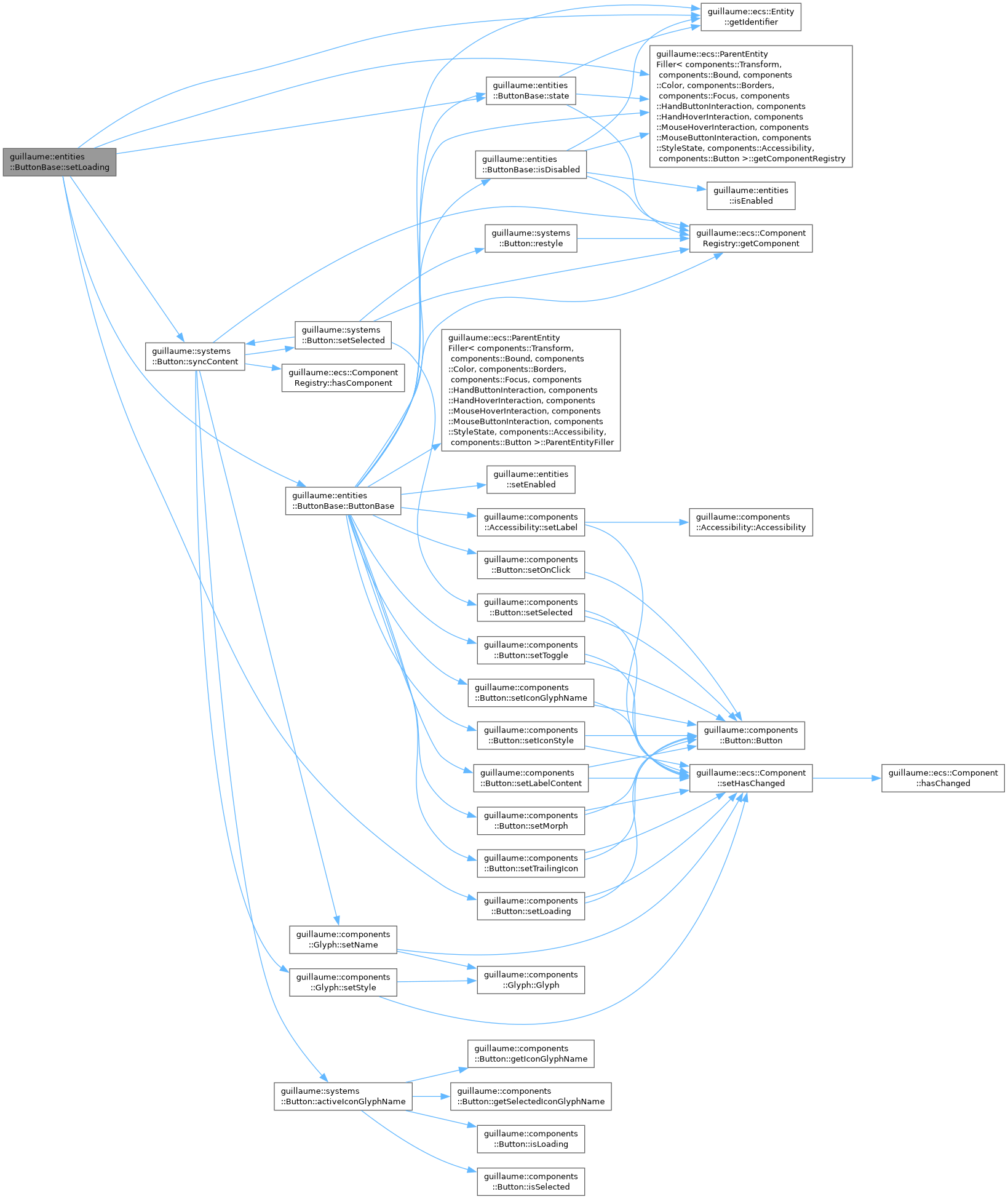
◆ setLoading()
| ButtonBase & guillaume::entities::ButtonBase::setLoading | ( | bool | loading | ) |
Show or hide the loading state.
While loading, the icon child shows LoadingGlyph instead of the icon. The button stays clickable.
- Parameters
-
loading True to show the loading glyph.
- Returns
- This button, for chaining.
Definition at line 275 of file button_base.cpp.
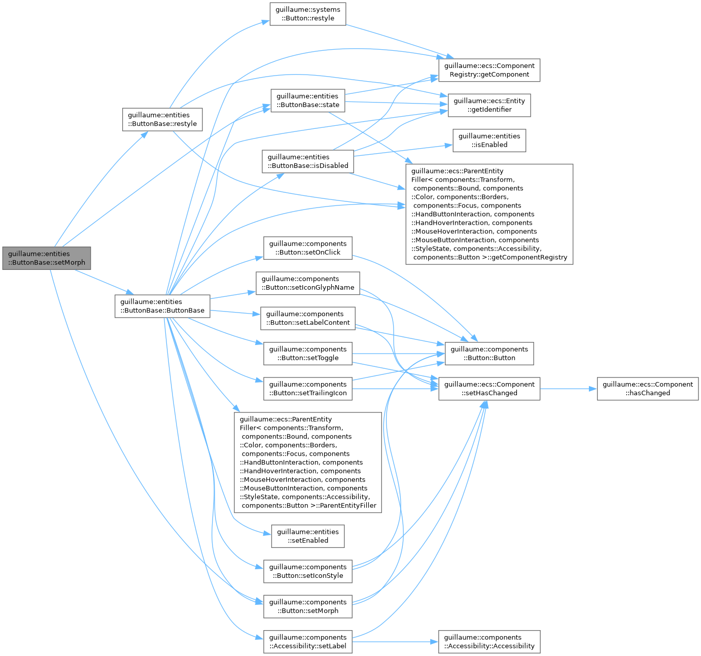
◆ setMorph()
| ButtonBase & guillaume::entities::ButtonBase::setMorph | ( | const bool & | isMorph | ) |
Choose whether the button changes shape when selected, and restyle at once.
- Parameters
-
isMorph True to let the concrete widget's system use a different shape for the selected state. Only systems::CommonButton (Button) reads this flag.
- Returns
- This button, for chaining.
Definition at line 141 of file button_base.cpp.
◆ setOnClick()
| ButtonBase & guillaume::entities::ButtonBase::setOnClick | ( | std::function< void(void)> | onClick | ) |
Set the function called when the user clicks the button.
It is called when the left mouse button or the hand button A is released over the button, unless the release counts as a long press. For a toggle, isSelected() already returns the new state.
- Parameters
-
onClick The handler. An empty function means no reaction.
- Returns
- This button, for chaining.
Definition at line 269 of file button_base.cpp.
◆ setOnLongPress()
| ButtonBase & guillaume::entities::ButtonBase::setOnLongPress | ( | std::function< void(void)> | onLongPress | ) |
Set the function called when the user holds the button.
When the press lasted at least LongPressDuration, the release calls this handler instead of the click handler. A toggle button still flips its selected state.
- Parameters
-
onLongPress The handler. An empty function turns long press off: every release is then a click.
- Returns
- This button, for chaining.
Definition at line 263 of file button_base.cpp.
◆ setSelected()
| ButtonBase & guillaume::entities::ButtonBase::setSelected | ( | const bool & | selected | ) |
Turn a toggle button on or off from code.
Updates the icon and restyles at once. The click handler is not called. Ignored when the button is not a toggle.
- Parameters
-
selected True to select the button.
- Returns
- This button, for chaining.
Definition at line 126 of file button_base.cpp.
◆ setSelectedIconGlyphName()
| ButtonBase & guillaume::entities::ButtonBase::setSelectedIconGlyphName | ( | const std::string & | selectedIconGlyphName | ) |
Set the icon shown instead of the regular one while the button is selected.
- Parameters
-
selectedIconGlyphName The glyph name. An empty name keeps the regular icon when selected.
- Returns
- This button, for chaining.
Definition at line 133 of file button_base.cpp.
◆ setTrailingIcon()
| ButtonBase & guillaume::entities::ButtonBase::setTrailingIcon | ( | const bool & | isTrailingIcon | ) |
Put the icon before or after the label, and restyle at once.
- Parameters
-
isTrailingIcon True to place the icon after the label.
- Returns
- This button, for chaining.
Definition at line 148 of file button_base.cpp.
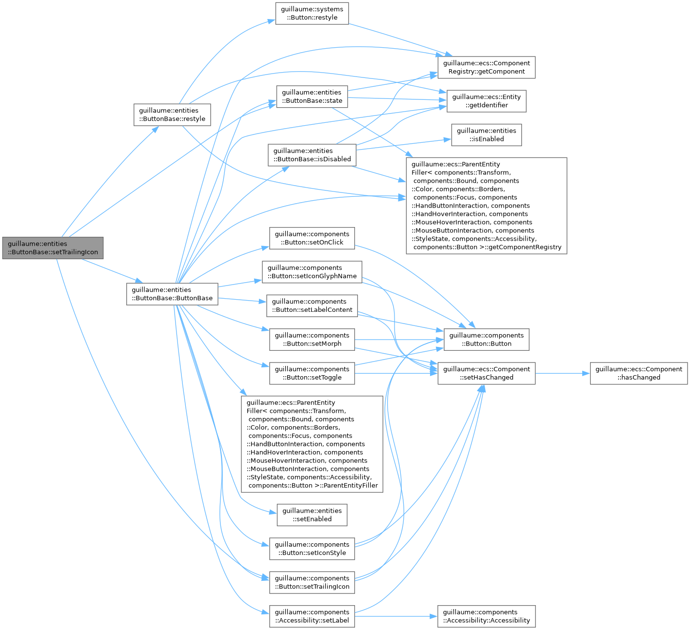
◆ setVisible()
| ButtonBase & guillaume::entities::ButtonBase::setVisible | ( | bool | visible | ) |
Show or hide the button, and restyle at once.
A hidden button ignores press and release and is skipped by keyboard traversal (its Accessibility is not focusable). Its enabled state is kept. Painting nothing is up to the concrete widget's system: systems::FloatingActionButton and systems::ExtendedFloatingActionButton do it; systems::CommonButton (Button) and systems::IconButton do not read this flag, so a hidden Button or IconButton is still drawn.
- Parameters
-
visible False to hide the button.
- Returns
- This button, for chaining.
Definition at line 287 of file button_base.cpp.
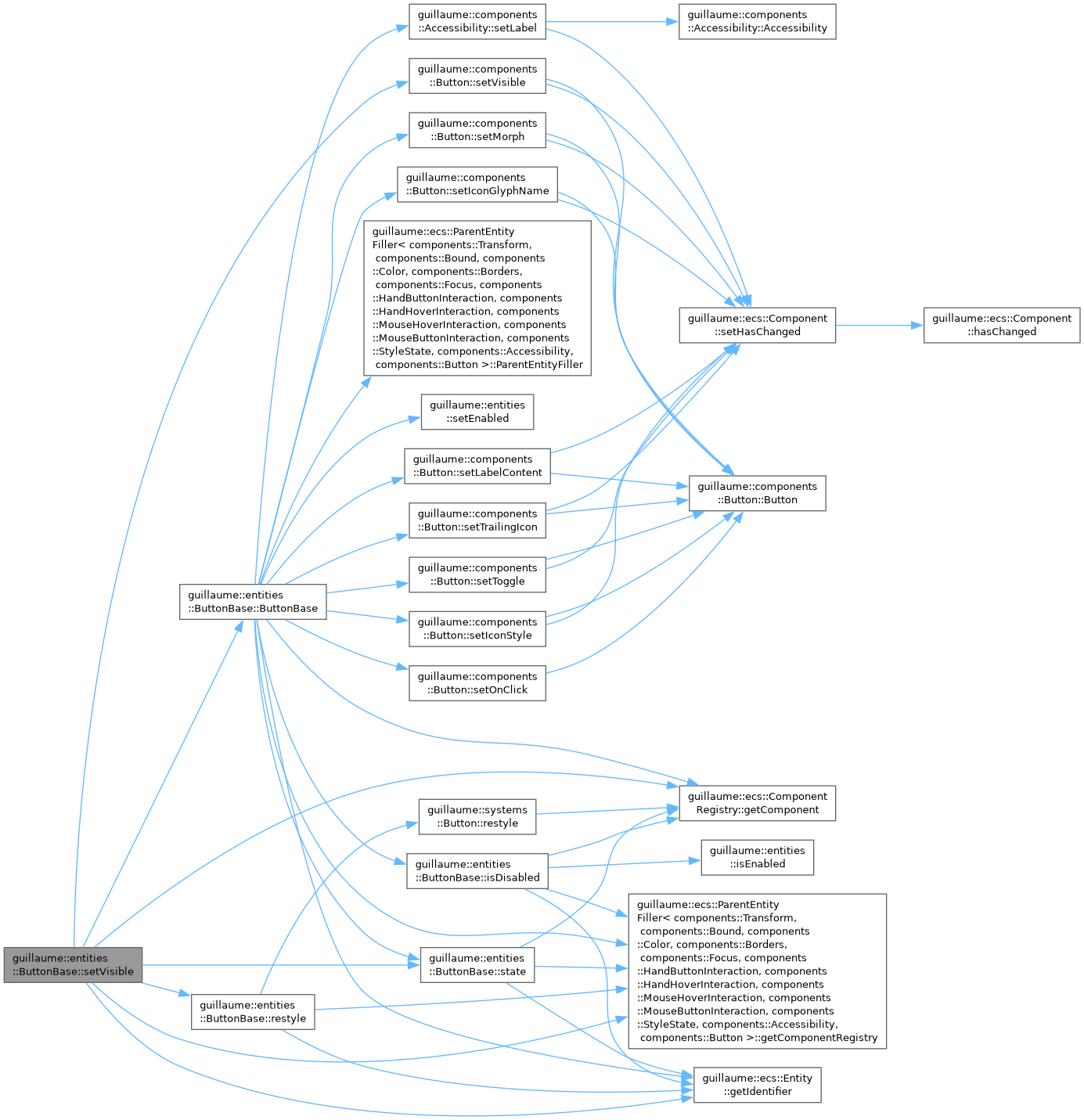
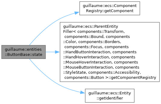
◆ state() [1/2]
|
protected |
Access the shared button state, for writing.
- Returns
- The components::Button of this entity.
Definition at line 67 of file button_base.cpp.
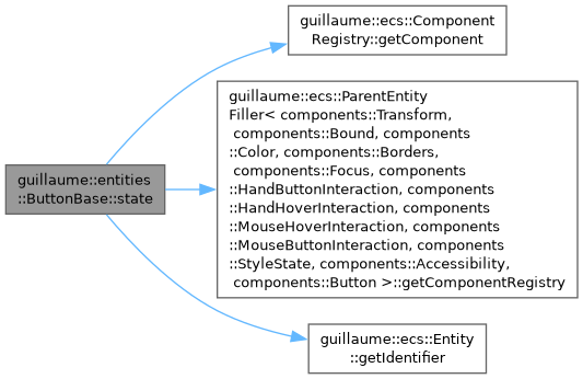
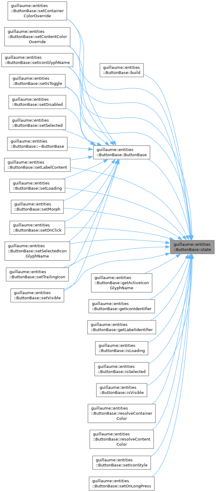
◆ state() [2/2]
|
protected |
Access the shared button state, for reading.
- Returns
- The components::Button of this entity.
Definition at line 73 of file button_base.cpp.
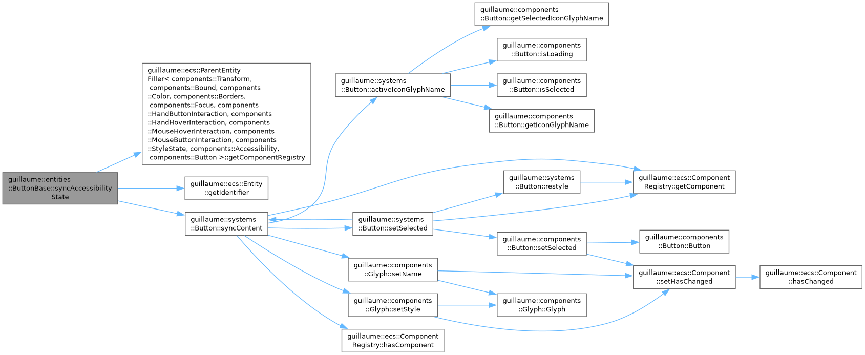
◆ syncAccessibilityState()
|
protected |
Copy the current state to the icon child and to Accessibility.
Forwards to systems::Button::syncContent: the icon child gets the active glyph and style, and components::Accessibility is marked selected when the button is a selected toggle.
Definition at line 107 of file button_base.cpp.
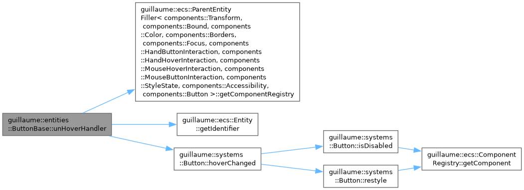
◆ unHoverHandler()
| void guillaume::entities::ButtonBase::unHoverHandler | ( | void | ) |
Tell the button a pointer stopped hovering it.
Same effect as hoverHandler(): restyles unless disabled.
Definition at line 368 of file button_base.cpp.
◆ usesIcon()
|
inlineprotectedvirtual |
Tell build() whether to create an icon child.
- Returns
- True by default.
Definition at line 438 of file button_base.hpp.

◆ usesLabel()
|
inlineprotectedvirtual |
Tell build() whether to create a label child.
- Returns
- True for the widgets that show text. False by default.
Reimplemented in guillaume::entities::Button, guillaume::entities::ExtendedFloatingActionButton, guillaume::entities::FloatingActionButton, and guillaume::entities::IconButton.
Definition at line 429 of file button_base.hpp.

Member Data Documentation
◆ _layerDepthStep
|
staticconstexprprotected |
Depth between two layers, toward the viewer.
Definition at line 611 of file button_base.hpp.
◆ LoadingGlyph
|
staticconstexpr |
Name of the glyph the icon child shows while loading.
Definition at line 318 of file button_base.hpp.
◆ LongPressDuration
|
staticconstexpr |
How long a press must last to count as a long press (500 ms).
Definition at line 325 of file button_base.hpp.
The documentation for this class was generated from the following files:
- headers/guillaume/entities/button_base.hpp
- sources/entities/button_base.cpp
