Widgets: the classes used to create entities with the right components and children. More...
Classes | |
| class | AppBar |
| A horizontal bar with a leading navigation icon button, a title and trailing action icon buttons. More... | |
| class | Backdrop |
| The translucent veil painted behind a dialog or a modal drawer to dim the rest of the scene. More... | |
| class | Badge |
| A small colored pill showing a count or a short label, or a plain status dot (react-native-paper Badge). More... | |
| class | EntityBuilderBase |
| Base of every widget Builder: turns a configuration into a widget that is attached to a parent and owned by an entity registry. More... | |
| class | Button |
| A Material 3 common button: a clickable container with a text label and an optional icon (elevated, filled, tonal, outlined or text). More... | |
| class | ButtonBase |
| What Button, IconButton, FloatingActionButton and ExtendedFloatingActionButton have in common: an icon, a label, a click, a toggle state. More... | |
| class | Card |
| A rounded panel grouping a cover image, a title, a text and action buttons about one subject (react-native-paper Card). More... | |
| class | Checkbox |
| A box the user checks, unchecks or leaves indeterminate, with an optional label next to it. More... | |
| class | Chip |
| A compact, 32 dp high pill with a label and optional icons, used as an action, a filter, an entered value or a suggestion. More... | |
| class | Dialog |
| A modal panel shown above the rest of the interface, with an optional icon, a title, a message and a row of text buttons. More... | |
| class | Divider |
| A thin horizontal line separating two pieces of content. More... | |
| class | ExtendedFloatingActionButton |
| A Material 3 extended floating action button: a wide, raised button with a text label and an optional icon, which can collapse to a square icon-only FAB. More... | |
| class | FloatingActionButton |
| A Material 3 floating action button (FAB): a raised, square button with an icon, for the main action of a screen. More... | |
| class | FloatingActionButtonMenu |
| A floating action button menu (speed dial): a trigger FAB that shows a column of smaller action buttons above it when opened. More... | |
| class | Icon |
| A Material Symbols icon, chosen by name and drawn as one glyph of the icon font. More... | |
| class | IconButton |
| A Material 3 icon button: a small clickable container that shows a single icon and no label. More... | |
| class | Image |
| A picture loaded from a texture file and stretched over a rectangle. More... | |
| class | List |
| A vertical list of pressable rows, with optional subheaders, dividers and accordions that fold nested rows (Paper List.Section, List.Subheader, List.Item, List.Accordion, List.Icon and List.Image). More... | |
| class | LoadingIndicator |
| An animation that loops for as long as work is in progress: a rotating arc or a sliding bar, with no value. More... | |
| class | Menu |
| A pop-up column of pressable items, shown on demand next to an anchor entity (Paper Menu and Menu.Item). More... | |
| class | Mesh |
| A 3D model loaded from a file, with an optional texture. More... | |
| class | NavigationBar |
| A bottom bar of destinations (icon, label, optional badge) of which exactly one is selected. More... | |
| class | NavigationDrawer |
| A side sheet listing destinations, of which exactly one is selected, with optional section titles and dividers (Paper Drawer.Section, Drawer.Item and Drawer.CollapsedItem). More... | |
| class | ProgressIndicator |
| A bar or a ring that fills up to show how far a task has progressed, or that loops when the progress is unknown. More... | |
| class | RadioButton |
| A circle the user selects to pick one option, with an optional label next to it. More... | |
| class | RadioGroup |
| A column of labelled radio buttons of which at most one is selected (Paper RadioButton.Group). More... | |
| class | Search |
| A search field: a leading icon, an editable query with a placeholder, a clear button and an optional trailing icon (Paper Searchbar). More... | |
| class | SegmentedButton |
| A row of joined toggle buttons (segments) from which the user picks one option, or several. More... | |
| class | Snackbar |
| A short message bar that disappears by itself after a few seconds, with an optional action label the user can press. More... | |
| struct | SurfaceConfig |
| Everything needed to set up a surface in one value: where it is, how it looks and how it arranges its children. More... | |
| class | SurfaceBase |
| Base of the widgets that are a rectangle containing other widgets (Card, Dialog, Checkbox, ...). More... | |
| class | Surface |
| A plain container whose background gets lighter or darker with its elevation, and which can cast a shadow. More... | |
| class | Switch |
| An on/off toggle: a rounded track with a thumb that slides to the right when on, an optional icon on the thumb and an optional label next to the track. More... | |
| class | Text |
| A single run of text drawn with a typescale role, a color and an optional explicit font size. More... | |
| class | TextField |
| A box the user types text into, with a label, optional icons, prefix and suffix, and a helper or error text under it (Paper TextInput and HelperText). More... | |
| class | Tooltip |
| A small label that appears next to another entity while the pointer or a hand hovers that entity. More... | |
| class | View |
| A rectangle, colored or transparent, that lays its children out in a row or a column. More... | |
| class | BarDestination |
| One destination of a NavigationBar: a pressable column with an active-indicator pill around the icon, a label under it and an optional badge on the icon. More... | |
| class | DrawerDestination |
| One destination of a NavigationDrawer: a pressable row with an icon, a label and an optional trailing text, or, collapsed, an icon in a pill with the label under it (Paper Drawer.Item and Drawer.CollapsedItem). More... | |
Functions | |
| std::shared_ptr< Icon > | buildIcon (ecs::ComponentRegistry ®istry, ecs::EntityRegistry &entityRegistry, std::shared_ptr< ecs::Entity > parent, const std::string &glyphName, float fontSize, const utility::graphic::Color32Bit &color, components::Glyph::Style style=components::Glyph::Style::Outlined) |
| Create an Icon as a child of a widget, or nothing when there is no glyph to show. | |
| std::shared_ptr< Text > | buildText (ecs::ComponentRegistry ®istry, ecs::EntityRegistry &entityRegistry, std::shared_ptr< ecs::Entity > parent, const std::string &content, float fontSize, const utility::graphic::Color32Bit &color) |
| Create a Text of a given font size as a child of a widget, or nothing when there is no content. | |
| std::shared_ptr< Text > | buildText (ecs::ComponentRegistry ®istry, ecs::EntityRegistry &entityRegistry, std::shared_ptr< ecs::Entity > parent, const std::string &content, theme::TypeRole role, const utility::graphic::Color32Bit &color) |
| Create a Text styled by a type scale role as a child of a widget, or nothing when there is no content. | |
| void | setOverlayVisible (ecs::ComponentRegistry ®istry, const ecs::Entity::Identifier &identifier, bool visible) |
| Show or hide an overlay widget (dialog, menu, snackbar, tooltip). | |
| bool | isOverlayVisible (const ecs::ComponentRegistry ®istry, const ecs::Entity::Identifier &identifier) |
| Tell whether an overlay widget is shown. | |
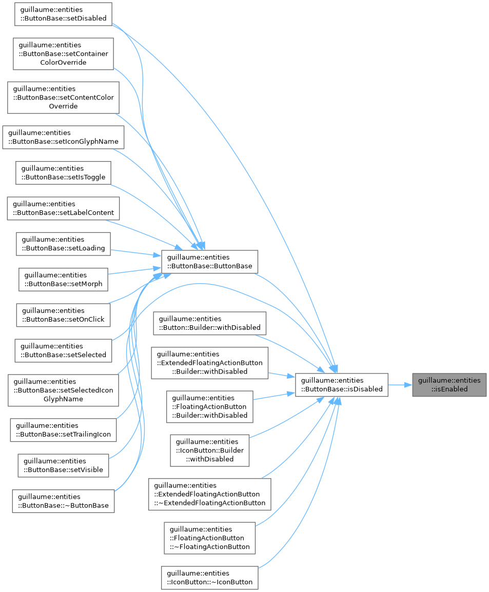
| bool | isEnabled (const ecs::ComponentRegistry ®istry, const ecs::Entity::Identifier &entityIdentifier) |
| Whether an entity accepts input. | |
| bool | isHovered (const ecs::ComponentRegistry ®istry, const ecs::Entity::Identifier &entityIdentifier) |
| Whether the mouse pointer or a hand is over an entity. | |
| bool | isPressed (const ecs::ComponentRegistry ®istry, const ecs::Entity::Identifier &entityIdentifier) |
| Whether an entity is being pressed. | |
| void | makeInteractive (ecs::ComponentRegistry ®istry, const ecs::Entity::Identifier &entityIdentifier, components::AccessibilityRole role, std::function< void(void)> onPress, std::function< void(void)> onStateChange={}) |
| Make an entity hoverable, pressable and focusable. | |
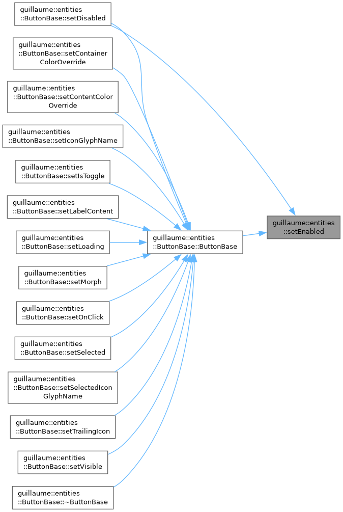
| void | setEnabled (ecs::ComponentRegistry ®istry, const ecs::Entity::Identifier &entityIdentifier, bool enabled) |
| Enable or disable an entity. | |
| utility::graphic::Color32Bit | stateLayerColor (const ecs::ComponentRegistry ®istry, const ecs::Entity::Identifier &entityIdentifier, const utility::graphic::Color32Bit &base, const utility::graphic::Color32Bit &content) |
| Container color of a widget in its current input state. | |
| void | centerChild (ecs::ComponentRegistry ®istry, const ecs::Entity::Identifier &parentIdentifier, const ecs::Entity::Identifier &childIdentifier, std::uint32_t parentLayer) |
| Center a child inside the bound of its parent, on both axes. | |
| void | placeChild (ecs::ComponentRegistry ®istry, const ecs::Entity::Identifier &parentIdentifier, const ecs::Entity::Identifier &childIdentifier, const utility::graphic::PositionF &offset, std::uint32_t parentLayer) |
| Place a child at an offset from the position of its parent. | |
| void | placeNormalized (ecs::ComponentRegistry ®istry, const ecs::Entity::Identifier &parentIdentifier, const ecs::Entity::Identifier &childIdentifier, float normalized, float inset, std::uint32_t parentLayer) |
| Place a child along the width of its parent from a 0 to 1 value, vertically centered. | |
| utility::graphic::PoseF | poseOf (ecs::ComponentRegistry ®istry, const ecs::Entity::Identifier &identifier) |
| Read the pose (position and orientation) of an entity. | |
| utility::graphic::Color32Bit | disabledContainerColor (void) |
| Fill color of the container of a disabled widget. | |
| utility::graphic::Color32Bit | disabledContentColor (void) |
| Color of the icon, label or outline of a disabled widget. | |
| utility::graphic::Color32Bit | schemeColor (SchemeColorRole role) |
| Look up a color role in the color scheme of the active theme. | |
| utility::graphic::Color32Bit | stateLayer (const utility::graphic::Color32Bit &base, const utility::graphic::Color32Bit &overlay, std::uint8_t alpha) |
| Blend a translucent tint over a base color. | |
| utility::graphic::Color32Bit | transparentColor (void) |
| The color written to hide a fill or an outline without removing its component. | |
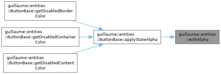
| utility::graphic::Color32Bit | withAlpha (const utility::graphic::Color32Bit &color, std::uint8_t alpha) |
| Copy a color with another alpha channel. | |
Detailed Description
Widgets: the classes used to create entities with the right components and children.
A widget class holds no state and no rule. Its setters write the widget's component and call the widget's system so the change is visible at once. Create a widget with its Builder (which also registers it in a scene) or with its static create().
Function Documentation
◆ buildIcon()
|
inline |
Create an Icon as a child of a widget, or nothing when there is no glyph to show.
Widgets call this from their build() for optional icons, so an empty glyph name simply produces no child.
- Parameters
-
registry The registry that stores the icon's components. entityRegistry The entity registry that owns the icon (usually the parent widget itself). parent The entity the icon is attached to. glyphName The name of the glyph to draw, such as "check". fontSize The glyph size, in dp. color The glyph color. style The glyph style (outlined by default).
- Returns
- The registered icon, or nullptr when
glyphNameis empty orparentis null.
- See also
- Icon::Builder::makeIcon
Definition at line 60 of file content_helpers.hpp.

◆ buildText() [1/2]
|
inline |
Create a Text of a given font size as a child of a widget, or nothing when there is no content.
- Parameters
-
registry The registry that stores the text's components. entityRegistry The entity registry that owns the text (usually the parent widget itself). parent The entity the text is attached to. content The string to display. fontSize The font size, in dp. color The text color.
- Returns
- The registered text, or nullptr when
contentis empty orparentis null.
- See also
- Text::Builder::makeText
Definition at line 89 of file content_helpers.hpp.

◆ buildText() [2/2]
|
inline |
Create a Text styled by a type scale role as a child of a widget, or nothing when there is no content.
- Parameters
-
registry The registry that stores the text's components. entityRegistry The entity registry that owns the text (usually the parent widget itself). parent The entity the text is attached to. content The string to display. role The type scale role that sets the font size and weight, such as theme::TypeRole::LabelLarge. color The text color.
- Returns
- The registered text, or nullptr when
contentis empty orparentis null.
- See also
- Text::Builder::makeText
Definition at line 118 of file content_helpers.hpp.

◆ centerChild()
|
inline |
Center a child inside the bound of its parent, on both axes.
Does nothing when the parent or the child has no components::Bound. Both bounds must be up to date: call it after the child has been measured and the parent laid out.
- Parameters
-
registry The registry holding the components. parentIdentifier The entity the child is centered in. childIdentifier The entity whose components::Transform is written. parentLayer The tree depth of the parent, as returned by systems::Layout::layerOf.
Definition at line 154 of file placement_helpers.hpp.
◆ disabledContainerColor()
|
inline |
Fill color of the container of a disabled widget.
- Returns
- The OnSurface color of the active scheme at the theme::StateLayer::DisabledContainer opacity (12% in Material 3).
Definition at line 143 of file style_helpers.hpp.
◆ disabledContentColor()
|
inline |
Color of the icon, label or outline of a disabled widget.
- Returns
- The OnSurface color of the active scheme at the theme::StateLayer::DisabledContent opacity (38% in Material 3).
Definition at line 131 of file style_helpers.hpp.
◆ isEnabled()
| bool guillaume::systems::interaction::isEnabled | ( | const ecs::ComponentRegistry & | registry, |
| const ecs::Entity::Identifier & | entityIdentifier ) |
Whether an entity accepts input.
- Parameters
-
registry The registry holding the components. entityIdentifier The entity to test.
- Returns
- True when the entity has no components::StyleState or an enabled one.
Definition at line 112 of file interaction_helpers.cpp.
◆ isHovered()
| bool guillaume::systems::interaction::isHovered | ( | const ecs::ComponentRegistry & | registry, |
| const ecs::Entity::Identifier & | entityIdentifier ) |
Whether the mouse pointer or a hand is over an entity.
Reads components::MouseHoverInteraction and HandHoverInteraction directly, so the answer is that of the current frame.
- Parameters
-
registry The registry holding the components. entityIdentifier The entity to test.
- Returns
- True when the entity is enabled and one of its hover components is hovered. False when it has neither.
Definition at line 120 of file interaction_helpers.cpp.
◆ isOverlayVisible()
|
inline |
Tell whether an overlay widget is shown.
- Parameters
-
registry The registry holding the components. identifier The overlay entity. It must have a components::Overlay.
- Returns
- The visible flag of its components::Overlay. systems::Overlay clears it when it dismisses the overlay.
Definition at line 62 of file overlay_helpers.hpp.

◆ isPressed()
| bool guillaume::systems::interaction::isPressed | ( | const ecs::ComponentRegistry & | registry, |
| const ecs::Entity::Identifier & | entityIdentifier ) |
Whether an entity is being pressed.
Reads components::MouseButtonInteraction (left button) and HandButtonInteraction (button A) directly. Pinch and poke are not taken into account here; components::StyleState covers them.
- Parameters
-
registry The registry holding the components. entityIdentifier The entity to test.
- Returns
- True when the entity is enabled and one of those buttons is held on it. False when it has neither component.
Definition at line 142 of file interaction_helpers.cpp.
◆ makeInteractive()
| void guillaume::systems::interaction::makeInteractive | ( | ecs::ComponentRegistry & | registry, |
| const ecs::Entity::Identifier & | entityIdentifier, | ||
| components::AccessibilityRole | role, | ||
| std::function< void(void)> | onPress, | ||
| std::function< void(void)> | onStateChange = {} ) |
Make an entity hoverable, pressable and focusable.
Adds, when missing, components::StyleState, Focus, Accessibility (its role is set to role), MouseHoverInteraction, HandHoverInteraction, MouseButtonInteraction and HandButtonInteraction, then sets these handlers, replacing any already set for the same event:
- hover and unhover (mouse and hand) call
onStateChange; - pressing the left mouse button or hand button A calls
onStateChange; - releasing either calls
onPressthenonStateChange, unless the entity is disabled, in which case neither is called.
The input systems then keep those components up to date each frame.
- Note
- The handlers are stored in the components and run in later frames: capture the registry and the identifier, not references to components or locals. The registry must outlive the entity.
- Parameters
-
registry The registry holding the components. entityIdentifier The entity to make interactive. role What the entity is for assistive technology (button, checkbox, ...). onPress Called when the entity is activated. May be empty. onStateChange Called when the hover or press state changes, so the widget can restyle at once. May be empty.
Definition at line 51 of file interaction_helpers.cpp.
◆ placeChild()
|
inline |
Place a child at an offset from the position of its parent.
Writes the pose of the child: the parent position plus the offset, with the parent orientation, moved toward the viewer by systems::Layout::contentLayerPose so the child never z-fights with the surface of the parent. Does nothing when the child has no components::Transform.
- Parameters
-
registry The registry holding the components. parentIdentifier The entity the child is placed against. Without a components::Transform it counts as a default pose. childIdentifier The entity whose components::Transform is written. offset The offset from the parent position, in dp. Only x and y are used; the depth comes from parentLayer. parentLayer The tree depth of the parent, as returned by systems::Layout::layerOf.
Definition at line 117 of file placement_helpers.hpp.
◆ placeNormalized()
|
inline |
Place a child along the width of its parent from a 0 to 1 value, vertically centered.
0 puts the child against the left inset, 1 against the right inset. systems::Switch places its handle this way (0 when off, 1 when on). Does nothing when the parent or the child has no components::Bound.
- Parameters
-
registry The registry holding the components. parentIdentifier The entity the child travels in. childIdentifier The entity whose components::Transform is written. normalized The position along the available travel, 0 to 1. The value is not clamped. inset The space kept free at the left and right edges of the parent, in dp. When the child is wider than what remains, it stays against the left inset. parentLayer The tree depth of the parent, as returned by systems::Layout::layerOf.
Definition at line 197 of file placement_helpers.hpp.
◆ poseOf()
|
inline |
Read the pose (position and orientation) of an entity.
The other helpers use it to get the pose of the parent a child is placed against.
- Parameters
-
registry The registry holding the components. identifier The entity whose components::Transform is read.
- Returns
- The pose of the entity, or a default-constructed pose when the entity has no components::Transform.
Definition at line 81 of file placement_helpers.hpp.
◆ schemeColor()
|
inline |
Look up a color role in the color scheme of the active theme.
- Parameters
-
role The role to resolve, for example SchemeColorRole::Primary.
- Returns
- The color the active theme assigns to that role.
- See also
- guillaume::getActiveColor
Definition at line 96 of file style_helpers.hpp.
◆ setEnabled()
| void guillaume::systems::interaction::setEnabled | ( | ecs::ComponentRegistry & | registry, |
| const ecs::Entity::Identifier & | entityIdentifier, | ||
| bool | enabled ) |
Enable or disable an entity.
Writes the enabled flag of its components::StyleState, adding the component when missing. Disabling also clears the hovered, pressed, focused and dragged flags, and the input systems skip the entity until it is enabled again. The component is marked changed only when a flag really changes.
- Parameters
-
registry The registry holding the components. entityIdentifier The entity to enable or disable. enabled True to accept input, false to ignore it.
Definition at line 104 of file interaction_helpers.cpp.
◆ setOverlayVisible()
|
inline |
Show or hide an overlay widget (dialog, menu, snackbar, tooltip).
Only writes the visible flag of the entity's components::Overlay. systems::Overlay reads the flag in the Event phase and opens or closes the overlay accordingly.
- Parameters
-
registry The registry holding the components. identifier The overlay entity. It must have a components::Overlay. visible True to show the overlay, false to hide it.
- See also
- components::Overlay, systems::Overlay
Definition at line 46 of file overlay_helpers.hpp.

◆ stateLayer()
|
inline |
Blend a translucent tint over a base color.
This is how a hover, focus or press is shown: the content color is laid over the container color at a low opacity.
- Parameters
-
base The color underneath, usually the container color. overlay The tint, usually the content color. Its own alpha is ignored and replaced by alpha. alpha The opacity of the tint, 0 (no tint) to 255 (opaque).
- Returns
- The blended color.
Definition at line 83 of file style_helpers.hpp.

◆ stateLayerColor()
| utility::graphic::Color32Bit guillaume::systems::interaction::stateLayerColor | ( | const ecs::ComponentRegistry & | registry, |
| const ecs::Entity::Identifier & | entityIdentifier, | ||
| const utility::graphic::Color32Bit & | base, | ||
| const utility::graphic::Color32Bit & | content ) |
Container color of a widget in its current input state.
Material 3 shows hover, focus, press and drag by blending a translucent layer of the content color over the container (the "state layer"). This picks the layer of the entity and blends it at the opacity the active theme gives that state.
The state is chosen in this order: pressed (isPressed()), then the active layer of components::StyleState (dragged, pressed, focused, hovered), then hovered (isHovered()). The interaction components are consulted as well as StyleState because a handler can restyle a widget before systems::StyleState has run in the frame.
- Parameters
-
registry The registry holding the components. entityIdentifier The entity whose state is read. base The container color of the idle widget. content The color of what sits on the container (label, icon); it tints the layer.
- Returns
basewhen the entity is disabled or idle. Otherwisebasewith the layer blended over it, or, whenbaseis fully transparent,contentat the layer opacity.
Definition at line 166 of file interaction_helpers.cpp.
◆ transparentColor()
|
inline |
The color written to hide a fill or an outline without removing its component.
- Returns
- Black with an alpha of 0.
Definition at line 155 of file style_helpers.hpp.
◆ withAlpha()
|
inline |
Copy a color with another alpha channel.
- Parameters
-
color The color whose red, green and blue channels are kept. alpha The alpha of the result, 0 (transparent) to 255 (opaque). It replaces the alpha of color; the two are not multiplied.
- Returns
- The same color with the given alpha.
Definition at line 65 of file style_helpers.hpp.