Configures, creates and registers IconButton widgets. More...
#include <headers/guillaume/entities/icon_button.hpp>
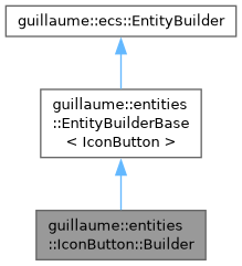
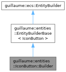
Public Member Functions | |
| Builder (ecs::ComponentRegistry &componentRegistry, ecs::EntityRegistry &entityRegistry) | |
| Construct a builder with the default configuration (see reset()). | |
| std::shared_ptr< IconButton > | buildEntity (void) override |
| Build an IconButton, with its icon child, from the current configuration, without registering it. | |
| void | reset (void) override |
| Restore the default configuration. | |
| Builder & | withIcon (const std::string &iconGlyphName) |
| Set the icon. | |
| Builder & | withSelectedIcon (const std::string &selectedIconGlyphName) |
| Set the icon shown while a toggle button is selected. | |
| Builder & | withIconStyle (const components::Glyph::Style &iconStyle) |
| Set the glyph style of the icon. | |
| Builder & | withOnClick (std::function< void(void)> onClick) |
| Set the click handler. | |
| Builder & | withToggle (const bool &isToggle) |
| Make the button a toggle: each click flips its selected state. | |
| Builder & | withVariant (const Variant &variant) |
| Set the color variant. | |
| Builder & | withSize (const Size &size) |
| Set the size. | |
| Builder & | withDisabled (const bool &isDisabled) |
| Choose whether the button starts disabled. | |
| Builder & | withAccessibilityLabel (const std::string &accessibilityLabel) |
| Set the label read by assistive technology. | |
| std::shared_ptr< IconButton > | makeIconButton (std::shared_ptr< Entity > parent, const std::string &iconGlyphName, std::function< void(void)> onClick, Variant variant, Size size) |
| Build an icon button, register it under parent and reset the builder. | |
| Public Member Functions inherited from guillaume::entities::EntityBuilderBase< IconButton > | |
| EntityBuilderBase (ecs::ComponentRegistry &componentRegistry, ecs::EntityRegistry &entityRegistry) | |
| Construct a builder bound to two registries. | |
| ~EntityBuilderBase (void) override=default | |
| Default destructor. | |
| std::shared_ptr< IconButton > | registerEntity (std::shared_ptr< ecs::Entity > parent) |
| Build the widget, attach it to its parent, hand it to the entity registry, then reset the builder to its defaults. | |
| Public Member Functions inherited from guillaume::ecs::EntityBuilder | |
| EntityBuilder (ecs::ComponentRegistry &componentRegistry, ecs::EntityRegistry &entityRegistry) | |
| Create a builder working on a pair of registries, normally those of one scene. | |
| virtual | ~EntityBuilder (void)=default |
| Virtual destructor. | |
Additional Inherited Members | |
| Protected Member Functions inherited from guillaume::ecs::EntityBuilder | |
| ComponentRegistry & | getComponentRegistry (void) |
| Get the registry in which the builder creates components. | |
| EntityRegistry & | getEntityRegistry (void) |
| Get the registry in which the builder registers the entities it creates. | |
Detailed Description
Configures, creates and registers IconButton widgets.
Set options with the with... methods then call registerEntity(), or use makeIconButton() to do both in one call.
Definition at line 92 of file icon_button.hpp.
Constructor & Destructor Documentation
◆ Builder()
| guillaume::entities::IconButton::Builder::Builder | ( | ecs::ComponentRegistry & | componentRegistry, |
| ecs::EntityRegistry & | entityRegistry ) |
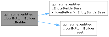
Construct a builder with the default configuration (see reset()).
- Parameters
-
componentRegistry The registry that stores the components of the buttons to build. entityRegistry The registry the built buttons are added to (usually the scene's).
Definition at line 38 of file icon_button.cpp.
Member Function Documentation
◆ buildEntity()
|
overridevirtual |
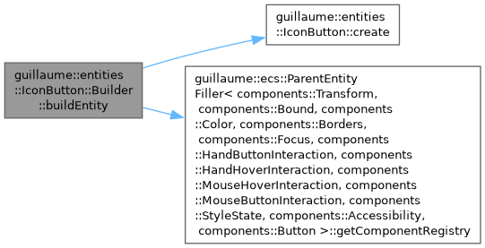
Build an IconButton, with its icon child, from the current configuration, without registering it.
registerEntity() calls it, then sets the parent, registers the button and resets the builder.
- Returns
- The new icon button.
Implements guillaume::entities::EntityBuilderBase< IconButton >.
Definition at line 45 of file icon_button.cpp.
◆ makeIconButton()
| std::shared_ptr< IconButton > guillaume::entities::IconButton::Builder::makeIconButton | ( | std::shared_ptr< Entity > | parent, |
| const std::string & | iconGlyphName, | ||
| std::function< void(void)> | onClick, | ||
| Variant | variant, | ||
| Size | size ) |
Build an icon button, register it under parent and reset the builder.
Options set before the call with the other with... methods (toggle, selected icon, accessibility label, ...) also apply.
- Parameters
-
parent The entity the button becomes a child of. iconGlyphName The glyph name of the icon. onClick The function called when the user clicks the button (may be empty). variant The color variant. size The size.
- Returns
- The new icon button, registered in the entity registry.
Definition at line 128 of file icon_button.cpp.

◆ reset()
|
overridevirtual |
Restore the default configuration.
Defaults: empty icon and selected icon, Glyph::Style::Outlined, no click handler, not a toggle, Variant::Standard, Size::Medium, enabled, empty accessibility label.
Implements guillaume::ecs::EntityBuilder.
Definition at line 54 of file icon_button.cpp.

◆ withAccessibilityLabel()
| IconButton::Builder & guillaume::entities::IconButton::Builder::withAccessibilityLabel | ( | const std::string & | accessibilityLabel | ) |
Set the label read by assistive technology.
- Parameters
-
accessibilityLabel The accessibility label. Default: empty.
- Returns
- Reference to the builder for chaining.
Definition at line 121 of file icon_button.cpp.
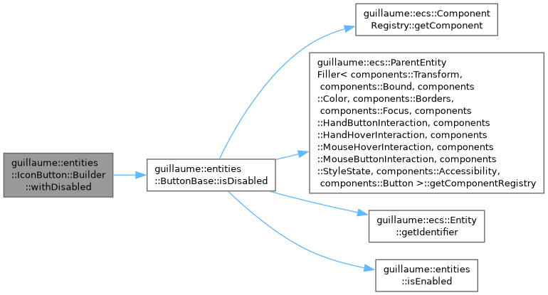
◆ withDisabled()
| IconButton::Builder & guillaume::entities::IconButton::Builder::withDisabled | ( | const bool & | isDisabled | ) |
Choose whether the button starts disabled.
- Parameters
-
isDisabled True for a button that ignores input. Default: false.
- Returns
- Reference to the builder for chaining.
Definition at line 115 of file icon_button.cpp.
◆ withIcon()
| IconButton::Builder & guillaume::entities::IconButton::Builder::withIcon | ( | const std::string & | iconGlyphName | ) |
Set the icon.
- Parameters
-
iconGlyphName The glyph name of the icon (for example "favorite"). Default: empty.
- Returns
- Reference to the builder for chaining.
Definition at line 68 of file icon_button.cpp.

◆ withIconStyle()
| IconButton::Builder & guillaume::entities::IconButton::Builder::withIconStyle | ( | const components::Glyph::Style & | iconStyle | ) |
Set the glyph style of the icon.
- Parameters
-
iconStyle The glyph style. Default: Glyph::Style::Outlined.
- Returns
- Reference to the builder for chaining.
Definition at line 81 of file icon_button.cpp.
◆ withOnClick()
| IconButton::Builder & guillaume::entities::IconButton::Builder::withOnClick | ( | std::function< void(void)> | onClick | ) |
Set the click handler.
- Parameters
-
onClick The function called when the user clicks the button. Default: empty, nothing is called.
- Returns
- Reference to the builder for chaining.
Definition at line 89 of file icon_button.cpp.
◆ withSelectedIcon()
| IconButton::Builder & guillaume::entities::IconButton::Builder::withSelectedIcon | ( | const std::string & | selectedIconGlyphName | ) |
Set the icon shown while a toggle button is selected.
- Parameters
-
selectedIconGlyphName The glyph name shown when selected. Default: empty, the regular icon is kept.
- Returns
- Reference to the builder for chaining.
Definition at line 74 of file icon_button.cpp.
◆ withSize()
| IconButton::Builder & guillaume::entities::IconButton::Builder::withSize | ( | const Size & | size | ) |
Set the size.
- Parameters
-
size The size. Default: Size::Medium.
- Returns
- Reference to the builder for chaining.
Definition at line 108 of file icon_button.cpp.
◆ withToggle()
| IconButton::Builder & guillaume::entities::IconButton::Builder::withToggle | ( | const bool & | isToggle | ) |
Make the button a toggle: each click flips its selected state.
- Parameters
-
isToggle True for a toggle button. Default: false.
- Returns
- Reference to the builder for chaining.
Definition at line 95 of file icon_button.cpp.
◆ withVariant()
| IconButton::Builder & guillaume::entities::IconButton::Builder::withVariant | ( | const Variant & | variant | ) |
Set the color variant.
- Parameters
-
variant The color variant. Default: Variant::Standard.
- Returns
- Reference to the builder for chaining.
Definition at line 102 of file icon_button.cpp.
The documentation for this class was generated from the following files:
- headers/guillaume/entities/icon_button.hpp
- sources/entities/icon_button.cpp
