Maps a common button size, shape and color style to Material 3 metrics and scheme colors. More...
Functions | |
| float | getHeightPadding (components::CommonButton::Size size) |
| Space between the content and the top edge of the container (and, equally, the bottom edge). | |
| float | getWidthPadding (components::CommonButton::Size size, bool compact=false) |
| Space between the content and the left edge of the container (and, equally, the right edge). | |
| float | getIconFontSize (components::CommonButton::Size size) |
| Font size of the leading icon of a button. | |
| float | getSpaceBetweenIconAndLabel (components::CommonButton::Size size) |
| Horizontal gap between the icon and the label. | |
| float | getBorderRadius (components::CommonButton::Size size, components::CommonButton::Shape shape, bool isButtonPressed) |
| Corner radius of the container. | |
| components::CommonButton::Shape | getRestingShape (components::CommonButton::Shape baseShape, bool isToggle, bool isSelected, bool isMorph) |
| Shape a button shows while it is not pressed. | |
| utility::graphic::Color32Bit | getContainerColor (components::CommonButton::Color style, bool isToggle, bool isSelected, bool isHovered, bool isButtonPressed) |
| Fill color of the container, hover or press tint included. | |
| utility::graphic::Color32Bit | getContentColor (components::CommonButton::Color style, bool isToggle, bool isSelected) |
| Color of the icon and of the label of an enabled button. | |
| utility::graphic::Color32Bit | getBorderColor (components::CommonButton::Color style, bool isToggle, bool isSelected) |
| Color of the outline of an enabled button. | |
Detailed Description
Maps a common button size, shape and color style to Material 3 metrics and scheme colors.
Every value comes from one lookup table per enumeration (in sources/systems/button_style.cpp), so adding a size or a color style is a single table row. Functions taking a size or a color style throw std::runtime_error when the value is not an enumerator.
Function Documentation
◆ getBorderColor()
| utility::graphic::Color32Bit guillaume::systems::button_style::getBorderColor | ( | components::CommonButton::Color | style, |
| bool | isToggle, | ||
| bool | isSelected ) |
Color of the outline of an enabled button.
Only two styles are outlined: Segmented, always, and Outlined, except for a selected toggle, which shows a filled container instead.
- Parameters
-
style The color style. isToggle True for a toggle button. isSelected True when the toggle is selected.
- Returns
- The Outline color of the active scheme, or a fully transparent color for a button without an outline. Never throws.
Definition at line 219 of file button_style.cpp.


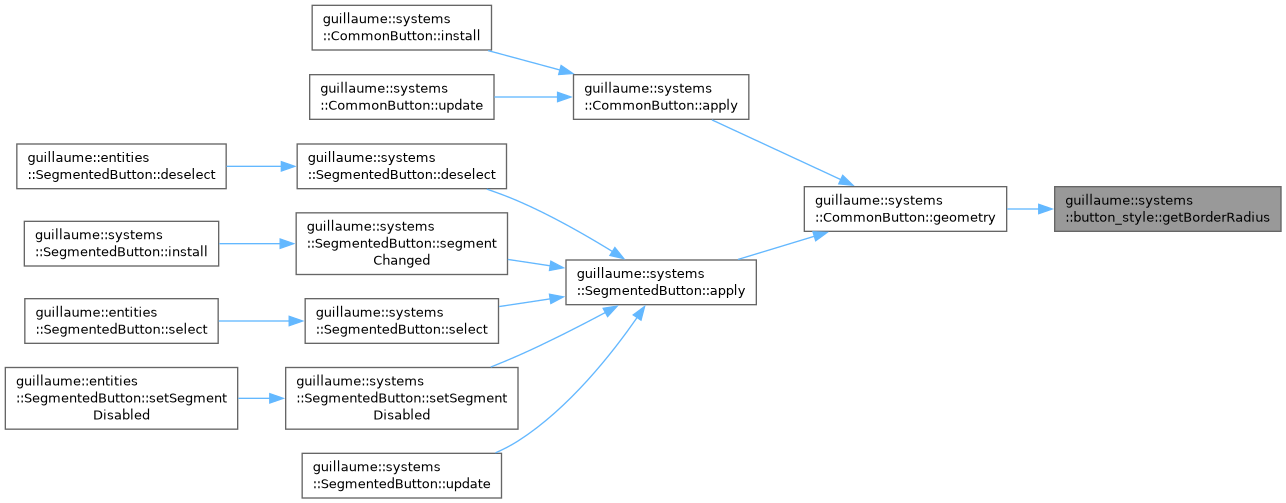
◆ getBorderRadius()
| float guillaume::systems::button_style::getBorderRadius | ( | components::CommonButton::Size | size, |
| components::CommonButton::Shape | shape, | ||
| bool | isButtonPressed ) |
Corner radius of the container.
A pressed button takes the pressed shape of its size whatever its shape. At rest, a Round button is fully rounded (theme::ShapeRole::Full) and a Square one takes the square shape of its size.
- Parameters
-
size The button size. shape The shape at rest, usually the result of getRestingShape. isButtonPressed True while the button is pressed.
- Returns
- The radius, in dp, resolved against the active theme.
- Exceptions
-
std::runtime_error If the size is not a valid enumerator.
Definition at line 168 of file button_style.cpp.

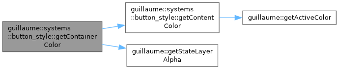
◆ getContainerColor()
| utility::graphic::Color32Bit guillaume::systems::button_style::getContainerColor | ( | components::CommonButton::Color | style, |
| bool | isToggle, | ||
| bool | isSelected, | ||
| bool | isHovered, | ||
| bool | isButtonPressed ) |
Fill color of the container, hover or press tint included.
The base color depends on the style and, for a toggle, on whether it is selected. While hovered or pressed, the content color is blended over it at the theme opacity of that state; a press wins over a hover.
- Parameters
-
style The color style. isToggle True for a toggle button. isSelected True when the toggle is selected. Ignored when isToggle is false. isHovered True while a pointer or a hand hovers the button. isButtonPressed True while the button is pressed.
- Returns
- The container color. Styles without a container (Outlined, Text, Segmented when not selected) give a transparent base, so only the tint shows.
- Exceptions
-
std::runtime_error If the style is not a valid enumerator.
Definition at line 197 of file button_style.cpp.

◆ getContentColor()
| utility::graphic::Color32Bit guillaume::systems::button_style::getContentColor | ( | components::CommonButton::Color | style, |
| bool | isToggle, | ||
| bool | isSelected ) |
Color of the icon and of the label of an enabled button.
- Parameters
-
style The color style. isToggle True for a toggle button. isSelected True when the toggle is selected. Ignored when isToggle is false.
- Returns
- The content color, from the active color scheme.
- Exceptions
-
std::runtime_error If the style is not a valid enumerator.
Definition at line 212 of file button_style.cpp.


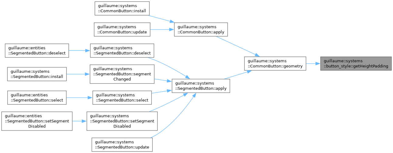
◆ getHeightPadding()
| float guillaume::systems::button_style::getHeightPadding | ( | components::CommonButton::Size | size | ) |
Space between the content and the top edge of the container (and, equally, the bottom edge).
- Parameters
-
size The button size.
- Returns
- The padding of one side, in dp (6 for ExtraSmall up to 32 for ExtraLarge).
- Exceptions
-
std::runtime_error If the size is not a valid enumerator.
Definition at line 146 of file button_style.cpp.
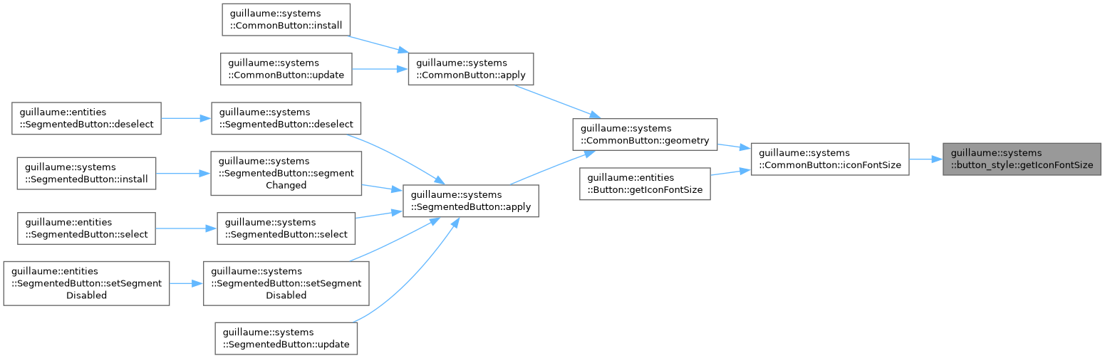
◆ getIconFontSize()
| float guillaume::systems::button_style::getIconFontSize | ( | components::CommonButton::Size | size | ) |
Font size of the leading icon of a button.
- Parameters
-
size The button size.
- Returns
- The font size, in dp (15 for ExtraSmall up to 30 for ExtraLarge).
- Exceptions
-
std::runtime_error If the size is not a valid enumerator.
Definition at line 158 of file button_style.cpp.
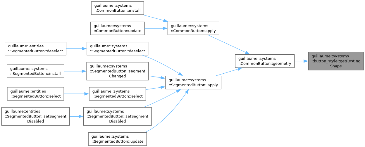
◆ getRestingShape()
| components::CommonButton::Shape guillaume::systems::button_style::getRestingShape | ( | components::CommonButton::Shape | baseShape, |
| bool | isToggle, | ||
| bool | isSelected, | ||
| bool | isMorph ) |
Shape a button shows while it is not pressed.
A toggle button that morphs shows the opposite shape while selected: Round becomes Square and Square becomes Round. Every other button shows its configured shape.
- Parameters
-
baseShape The shape configured in components::CommonButton. isToggle True for a toggle button. isSelected True when the toggle is selected. isMorph True when the toggle changes shape on selection.
- Returns
- The shape to draw at rest.
Definition at line 184 of file button_style.cpp.
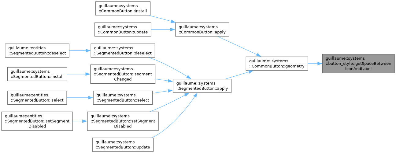
◆ getSpaceBetweenIconAndLabel()
| float guillaume::systems::button_style::getSpaceBetweenIconAndLabel | ( | components::CommonButton::Size | size | ) |
Horizontal gap between the icon and the label.
- Parameters
-
size The button size.
- Returns
- The gap, in dp (4 for ExtraSmall up to 16 for ExtraLarge).
- Exceptions
-
std::runtime_error If the size is not a valid enumerator.
Definition at line 163 of file button_style.cpp.
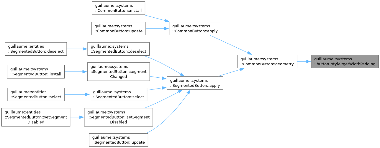
◆ getWidthPadding()
| float guillaume::systems::button_style::getWidthPadding | ( | components::CommonButton::Size | size, |
| bool | compact = false ) |
Space between the content and the left edge of the container (and, equally, the right edge).
- Parameters
-
size The button size. compact True to halve the padding, as components::CommonButton asks for with setCompact(true).
- Returns
- The padding of one side, in dp (12 for ExtraSmall up to 64 for ExtraLarge, before halving).
- Exceptions
-
std::runtime_error If the size is not a valid enumerator.
Definition at line 151 of file button_style.cpp.