Style tables of the common button: paddings, icon size, corner radius and colors for each size, shape and color style. More...
#include <utility/graphic/color.hpp>#include "guillaume/components/common_button.hpp"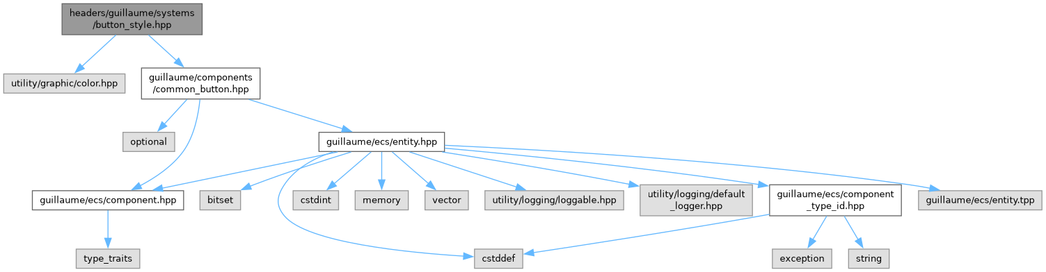

Go to the source code of this file.
Namespaces | |
| namespace | guillaume::systems::button_style |
| Maps a common button size, shape and color style to Material 3 metrics and scheme colors. | |
| namespace | guillaume |
| A C++20 UI framework for desktop and XR, built as an entity-component-system. | |
| namespace | guillaume::systems |
| Rules. Every class here runs each frame on the entities that have the components it declares. | |
Functions | |
| float | guillaume::systems::button_style::getHeightPadding (components::CommonButton::Size size) |
| Space between the content and the top edge of the container (and, equally, the bottom edge). | |
| float | guillaume::systems::button_style::getWidthPadding (components::CommonButton::Size size, bool compact=false) |
| Space between the content and the left edge of the container (and, equally, the right edge). | |
| float | guillaume::systems::button_style::getIconFontSize (components::CommonButton::Size size) |
| Font size of the leading icon of a button. | |
| float | guillaume::systems::button_style::getSpaceBetweenIconAndLabel (components::CommonButton::Size size) |
| Horizontal gap between the icon and the label. | |
| float | guillaume::systems::button_style::getBorderRadius (components::CommonButton::Size size, components::CommonButton::Shape shape, bool isButtonPressed) |
| Corner radius of the container. | |
| components::CommonButton::Shape | guillaume::systems::button_style::getRestingShape (components::CommonButton::Shape baseShape, bool isToggle, bool isSelected, bool isMorph) |
| Shape a button shows while it is not pressed. | |
| utility::graphic::Color32Bit | guillaume::systems::button_style::getContainerColor (components::CommonButton::Color style, bool isToggle, bool isSelected, bool isHovered, bool isButtonPressed) |
| Fill color of the container, hover or press tint included. | |
| utility::graphic::Color32Bit | guillaume::systems::button_style::getContentColor (components::CommonButton::Color style, bool isToggle, bool isSelected) |
| Color of the icon and of the label of an enabled button. | |
| utility::graphic::Color32Bit | guillaume::systems::button_style::getBorderColor (components::CommonButton::Color style, bool isToggle, bool isSelected) |
| Color of the outline of an enabled button. | |
Detailed Description
Style tables of the common button: paddings, icon size, corner radius and colors for each size, shape and color style.
The functions of guillaume::systems::button_style are pure lookups: they take values of the components::CommonButton enumerations and return a metric in dp or a color of the active theme. They read and write no component. systems::CommonButton is the caller: its apply function turns the results into components::Color, components::Borders and components::Layout values. guillaume/entities/button_style.hpp re-exports the same names for the widget classes.
Definition in file button_style.hpp.
